Kohler - A Great American Brand

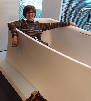
I had the distinct pleasure and privilege of visiting Kohler at their campus in none other than: Kohler, Wisconsin at their invitation. To see and feel the heartbeat of this great American brand was a professional goal fulfilled. 

I visited Kohler's headquarters at the end of October during a perfect fall weekend. It also happened to be the weekend of Kohler's Food and Wine Experience, a weekend filled with food and wine related events, seminars and workshops. I'm not overstating that this was such a great series of events that I'd love to go annually!

There are clearly several posts which I would like to share surrounding this weekend. First, you'll see some interesting pieces of Kohler's history. Second, I'll give you a look at the weekend's events which I know you'll also love. Third and probably fourth as well, you've just GOT TO SEE Kohler's fabulous Design Center! It will be worth the wait, I promise!
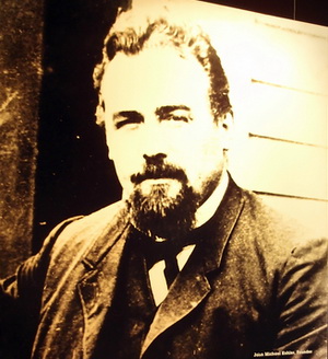
John Michael Kohler was 10 years old when his family came to the US from Austria and settled on a farm near St. Paul, Minnesota. At age 18, he moved to Chicago and became a traveling salesman for a wholesale grocery house and later sold furniture. His territory was the western seaboard of Lake Michigan. He formed a partnership in 1873 with Charles Silberzahn when they bought a foundry and machine shop from Kohler's father-in-law, Jacob Vollrath.
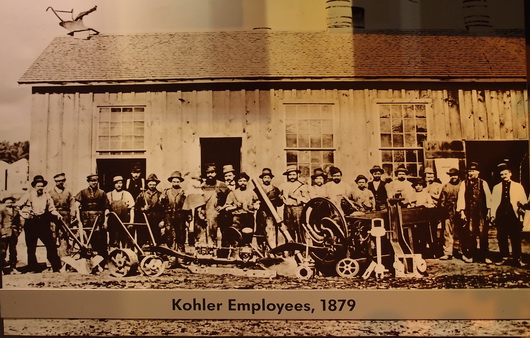
Kohler expanded the foundry to manufacture decorative iron pieces, cooking utensils and plumbing products. At the end of the 1800s a new factory was built in today's existing location, Kohler Village. Halfway through construction the plant burned down. Three months later John Michael Kohler died. Kohler's sons rebuilt the plant and renamed the busines John Michael Kohler Sons Co. in 1901. This is the overview. 

Below, plumbing begins...
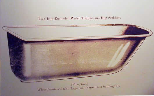
In 1883, John Michael Kohler, and I quote, "enameled the inside of a horse trough/hog scalder, attached four cast iron legs, and sold it to a farmer as a bathtub. By 1891, the company expanded its line to include roll-rim bathtubs, washbowls, and drinking fountains. Acceptance of the Kohler bathtub and other enameled cast iron plumbing fixtures rapidly spread beyond the farm community. Cast iron products attained the reputation of being durable, sanitary, and 'superior as to beauty of design, excellence of finish, and quality of workmanship' " 

Below, a bathroom from 1900
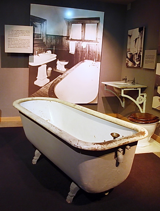
The mission of the company, from a 1900's catalog:

Over twenty years' experience in the manufacture and sale of Feed and Ensilage Cutters, Horse Powers, Feed Mills, and other Agricultural Implements has given us a thorough knowledge of the business. It has always been our aim during this time to manufacture the best goods that ingenuity and money can produce. There are grades of cheaper machines than ours on the market, we thoroughly believe, however, in the maxim, "That the best articles are the cheapest in the long run" and we have made it a rule not to see for how little money we could make an article, but how good we could make it for a moderate price. The fact that farmers who bought our machines twenty years ago are still using them, is conclusive proof of their excellence and a good endorsement. Our cutters and powers are all built on the most improved, scientific and practicable principles. We manufacture both the fly-wheel and the cylindar cutters. 

We trust that the following pages will prove interesting and if in want of any machinery therein illustrated you will give them a fair, unprejudiced inspection and trial. Liberal discounts from lists allowed. Correspondence solicited. Respectfully, Kohler, Hayssen & Stehn Mfg. Co., Sheboygan, Wisconsin, USA.
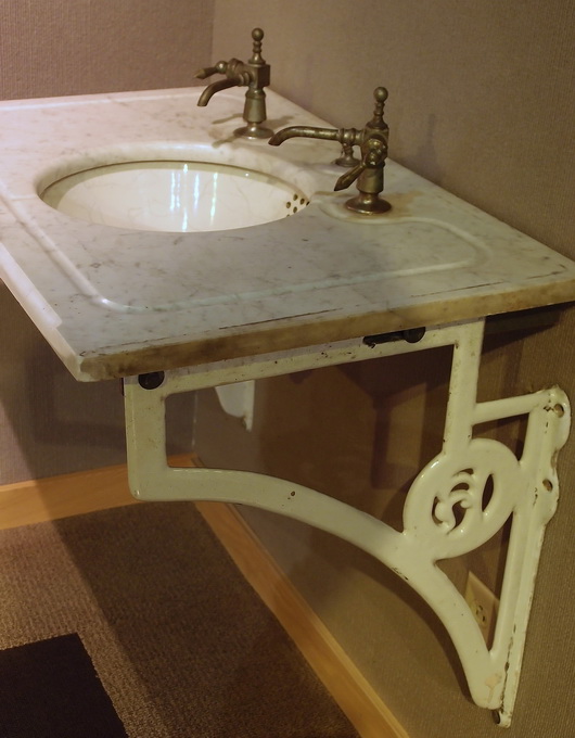
As I put together this post, I truly am honored to have had the opportunity to learn about the history of a great American brand. I also walked through several large, old buildings (with state of the art machinery) that houses Kohlers factories and foundry. I saw the molten iron worked by expert craftspeople. I also saw highly skilled craftspeople work with great precision applying a finish. Impressive procedures, machinery and cleanliness are what I observed first hand. This was no small tour - it was 2 1/2 hours of walking and learning, led by a retired factory worker. It sure was memorable. 

I hope you've enjoyed this first installment of my time spent at Kohler's headquarters. More to come, just wait!

My Lovely Trip To Bornholm, Denmark

Bornholm is such a special place. It is at once simple yet dramatic, heavily textured yet clean, colorful yet sometimes viewed in neutrals for as far as the eye can see. It's where one side of my family tree is documented, so far, to the mid 1800s, having been born on Bornholm. Funny, the other side of my family tree is documented to the very early 1800s far away from Bornholm, also in Denmark, in Jutland, the largest piece of land one thinks of when one thinks of Denmark. 

I went to Bornholm, then to Copenhagen in late August, alone, in search of artisans for my and my daughter's new brand, Scandinavian Made, a webshop of artisans' works that are made in Scandinavia, by the artisan, whose works are available in the US exclusively in our webshop.

I drove around Bornholm, often losing my way and not caring, and found the most amazing artisans! The landscape is incredible, the people are friendly and the food is, to me, amazing!! I've been to Bornholm before, and it always refreshes my spirit. Here are images of Bornholm in late summer, perfect for this cold winter's day. All images taken by me.

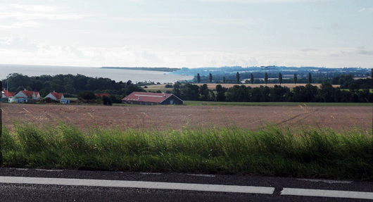
Below, a stop off on the side of the road

Below, one of my most favorite images, ever. The sand on this beach is famous for having been used as hour glass sand, it is so incredibly fine.

Below, stunning rock formations in the sea

Below, on a rugged path, looking down to the sea

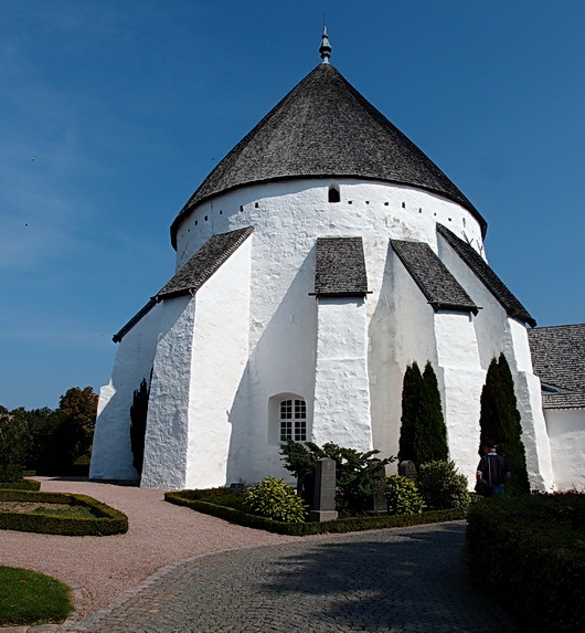
Below, I was moved by the beautiful, ancient, round churches in Bornholm, one in which my grandmother was baptized. Below, a church built in 1150!

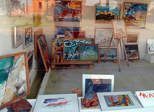
Below, a gallery that I wish were open! Artists have been drawn to Bornholm for many years, as the quality of light is said to be unique and inspiring

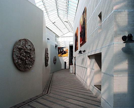
Below, the Bornholm art museum, a stunningly beautiful place

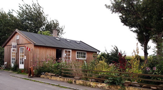
Below - One day, as I was wandering, I came upon this lovely ceramics shop, owned by the artisan, that was open

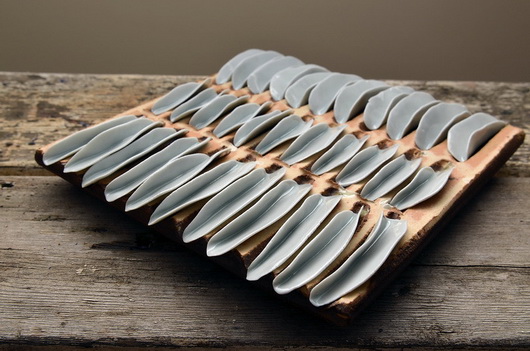
Below - I was truly astounded/touched/moved by the beauty of the pieces I encountered. I saw that these pieces were made by the artisan with what appears to be raw emotion. You can see more of this fabulous artisan's original works in my and my daughter Kelly's webshop, Scandinavian Made

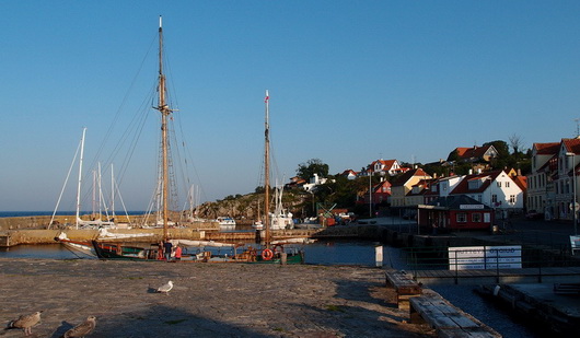
The lovely small villages on the coast are serene

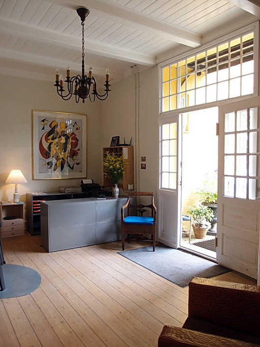
And last but not least, the reception area of a beautiful inn that I stayed at. The decor is that great Scandinavian eclectic combination of classic traditional furnishings set within a modern decorative foundation (floors, furniture, lots of white and art.)

What does this post have to do with kitchens? Everything! It's all inspiration which touches all future projects.

Healthy Kitchen Design - And The Medifast Program

We're thinking about living a healthy life (again) now that New Year's Day will be here shortly. Can a kitchen be designed that actively contributes to, and encourages, healthy eating? I'm not (entirely) sure, but here's how I would approach the design, plus a few tips on healthy eating. 

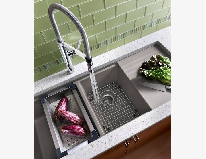
Below, a Blanco sink

SINK AREA

  • Design in two sinks including one prep sink to encourage easy access for prepping fruits and veggies
  • Have colanders near the sink to drain fresh fruits/veggies
  • Have a cutting board near the sink and/or trash for prep work
  • Add a filtered cold water tap to encourage you and your family to drink water
  • Keep the salad spinner nearby

COOKING APPLIANCES & METHODS

  • Have steam baskets or a portable steamer easily accessible to encourage cooking steamed vegetables
  • Alternatively, design a steam oven into the kitchen to cook vegetables, meat and fish in a healthy manner
  • Add a grill pan to the cooktop, a portable electric grill, or design a built in grill into a new kitchen as a tasty, healthy, cooking method
  • Have on hand an electric rotisserie or a built in rotisserie in the wall or oven for flavorful, lower fat, cooking
  • Use a vertical poultry roaster in the oven which allows fats to drip off the chicken
  • Cook with dried and fresh herbs frequently to add a layer of elegant taste to your foods

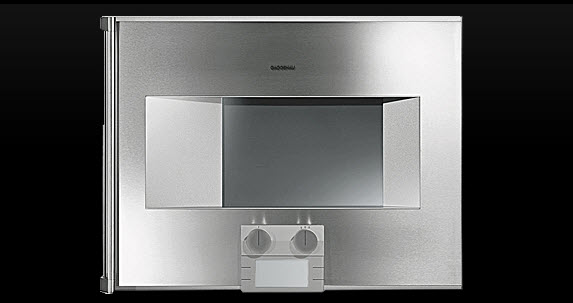
Below, Gaggenau's Steam Oven

SMALL APPLIANCES

  • Leave the cuisinart out on the counter to encourage quick prep of veggies
  • A blender is great for smoothies, gazpacho and preparation of other healthy foods any time of day
  • Keep knives sharp for ease of use with all fresh foods

OTHER APPLIANCES

  • Select the right size refrigerator for your family - too big and too much food will sit in the refrigerator for too long a period of time growing old and tasteless. 
  • Package food properly in the refrigerator to maintain optimum taste and freshness

DINING

  • Eat on small plates occasionally in an effort to control portion size
  • Invest in a good quality oil and vinegar for super tasty salads
  • Eat vegetables you are unfamiliar with to add interest to everyday meals

GENERAL

  • Frequent your local farmer's markets, farm stands or coops to experience the selection of fresh foods in a delightful setting
  • Plant and raise fruits and vegetables!
  • Have healthy foods such as fruits, vegetables, nuts and whole grain foods on hand for snacking
  • Make the shift to whole grains for everything - pasta, bread, cereals, baked goods


MY STORY

BEFORE - Thankfully this hairstyle is goneI've used just about all of these techniques and others in a decision to eat healthy this past year. Last year, the Monday after Thanksgiving (an unusual time to start), I started a journey to lose the weight added over 20 years after the birth of my 3rd child. I did not hold out much hope for success (as usual) and started it with a "whatever."

Day by day, week by week, to my surprise, I became committed to this weight loss program that my doctor recommended to me and the weight came off. It both put me into food rehab and helped me learn to eat healthy at the same time. My total weight loss was ... drumroll .... 75 pounds! THAT amount of weight has been a life changer. Logistically, had I felt hungry (it was rare) I would never, ever, have stuck to it. That was my one requirement - I could not be hungry all day, every day! Hunger is curbed on the plan I went on: Medifast. That was really the catalyst for success for me.

AFTER - Thankfully this hairstyle is gone too!!Before: Flat shoes, shapeless clothes, low energy, and I refused to wear denim jeans for at least 15 years. Now: Heels? Yes-4" high. Skinny jeans? 5+ pairs. Cinched belts? Quite a few. Leggings? YES! I am far healthier, energetic, happier, and confident, than I have been in 20 years. It was a big moment when I purchased my first pair of denim jeans, in the spring, in well over a decade. It was just a principle for me-I would not wear denim jeans while being overweight. 

Medifast is so easy, safe and simply works. I am now a coach for Medifast via their sister site, TSFL-Take Shape For Life. Are you ready to get healthy and slim? I know this: When the time is right, the desire and motivation will be there. In my case, it came a couple of days into the program. If I can do it, you can too.  Contact me for further information. 

So, yes, I know first hand how to design and equip a healthy kitchen based on personal experience living with all of these suggestions made here, for some time. I will add more tips on designing a healthy kitchen soon! 


Kitchen Backsplash Height

The height of the backsplash, the space between the countertop and the bottom of the wall cabinets, is often left as an afterthought by many kitchen designers and homeowners. It's rare in my experience that the client expresses an opinion about the backsplash height. However, If the height of the backsplash is not considered carefully, comfort and function could very well be at risk and affect one's lifestyle in the kitchen - for a very long time.

Below, a backsplash height calculated for a variety of issues: a concealed microwave, height of the client, function and display.

Just this morning, I received a question from a fellow kitchen designer. I wrote back an answer and realized that the answer was good information for a blog post. 

Hi Susan,

In discussions with my design team I am questioning the distance between the counter top and the bottom of the wall cabinets.  Two of my designers, who have over 75 + years of experience feel strongly that “custom design” should be a distance of 15” to maybe 16.5” 

I, on the other hand , being 6’3” tall feel that anything less than 18” (or with a molding applied to hide lighting) 17.5” is too tight a space.  I’m not asking for a definitive answer, but I thought with all of your travels and experience in the marketplace you might be kind enough to share your design thoughts with me about this.

I wish you and yours a very safe and enjoyable Holiday Season, and I very much enjoy reading your blog. Thank you for your time.

My answer:

Sure, I'm very happy to weigh in on this issue. However, you answered your own question! Where possible, which is nearly always the case, one should attempt to customize the height of the backsplash depending on the height of the homeowners and/or primary chef/bottle washer. It's a nuance, actually.

Below, calculations based on multiple criteria as above: client height, storage needs, display.

Two tall homeowners? Increase the height.

Two short homeowners? Shorten the height but beware of countertop appliance heights since that must be dealt with.

Two homeowners, one short/one tall, both helping out? That's a negotiation that might take a little more time and is a personal decision between the homeowners. In that case, the proposed/negotiated backsplash height really must be mocked up so each can experience the height and decide what works and what does not work.

Perhaps, then, tall pantry storage can come into play where access is more "democratic." Or, one area may have a lower backsplash and another could have a higher backsplash if designed to make sense visually. A countertop wall cabinet will help too.

The other issue, of course, is if trim is added below the wall cabinets, potentially shrinking an already short backsplash or not allowing countertop appliances to fit.

Then, you have children. Do the homeowners wish children to take an active role in the work within the kitchen? If so, storage should be planned to be at lower levels via base cabinets (dish drawers) or a pantry with better access.

Below: Kitchen of Cynthia Bogart, editor of The Daily Basics

I'm always compelled to note that there is a 15+" wide cabinet to the left of the range :)

For my clients of typical height, I usually opted for a 17" backsplash and ran it past them to verify that worked for their lifestyle and did not interfere with countertop appliances. I was taught way back that the average backsplash height could be from 15-18". That, however, is like saying "I'd like a brown stained cabinet" ... it's only a starting point.

I hope that helps!!
Regards, 
Susan

What I did not add into this note (and should have) was the issue of physical abilities of the homeowners. Having a family member (in my own home) whose reach and bending ability has changed dramatically, the physical ability of family members is a critical question to ask as well.

Decorating For Christmas In The Kitchen!

I've been thinking quite a bit about decorating the kitchen for Christmas, and that does not mean that it has to be this big, ambitious, undertaking. Chances are you already have nearly all the "ornaments" that you need on hand to do the job.

Prior to decorating my own kitchen for Christmas (disclaimer, we moved to this home 3 years ago and have not yet renovated the kitchen so it's definitely not "me") I was a guest on Martha Stewart radio on Monday, December 2nd to talk about this very topic. So, let's get on with the ideas! 


Around the same time, I had a lovely offer from Balsam Hill, retailer of artificial Christmas trees to use some of their products in my home. Of course, since the kitchen is usually the poor step sister in terms of Christmas decorating, I thought it was a great topic to share. Here we go!

1. Frame a kitchen window with greens and twinkling lights - or a huge, oversized wreath!

2. Change out dining chair seat cushions, placements and other easily changeable fabrics with holiday colors/motifs.

3. scan the kitchen collectibles on display and replace with holiday themed colorful and decorative items.

4. Don't forget the floor - replace the kitchen rug or runner for the holidays to have a fresh look! 

5. Add small twinkling holiday lights around the base of a kitchen island or on the sides and back of an island for a holiday glow.

6. Add a grouping of bulbs to hang just below the bottom of the kitchen table light fixture.

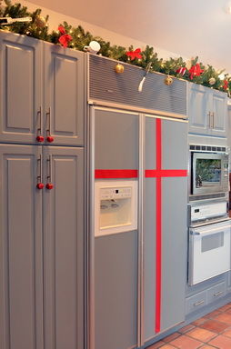
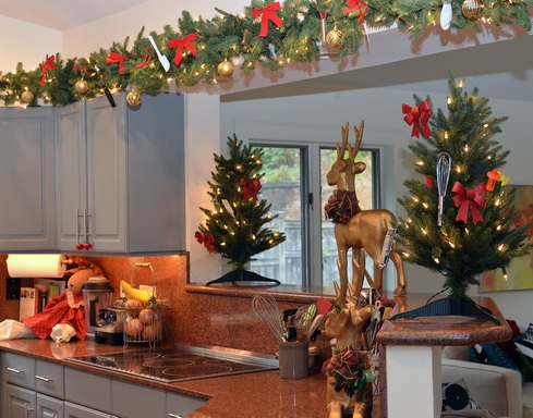
7. Add roping around the kitchen: above the cabinets or under the wall cabinets and tie in dime store kitchen utensils in your favorite holiday color.

8. Gather branches from outdoors, keep natural or spray paint in a holiday color and bundle together with twine and/or add ornaments to the arrangement.

9. Use Japanese Mashing Tape (Washi tape) and tape up past family photos or greeting cards on a wall in the shape of a Christmas tree (a simple triangle shape.)

10. Lots of candles all over - we LOVE the idea of an ebelskiver pan to use as a candle holder when not in service on the stovetop! 

11. Hang ornaments or bells on cabinet hardware (ok, not toooo many bells).


12. Paint cardboard fit to size in your holiday color and fit it to the rear of glass door cabinets for a holiday pop of color, easy to remove after the holiday. 

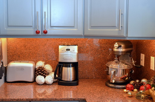
In my kitchen, I really enjoyed digging through my kitchen drawers (and combing through the local five and dime store) to find lots of small kitchen utensils to hang on the lovely roping from Balsam Hill. The two small Christmas trees came from them as well, and I think they are a perfect anchor for the shelf on each side.

Of course, anything goes, keep it simple or ambitious, but above all, don't stress! Have fun! The kitchen will thank you for it (it would be nice if it were grateful enough to clean itself...)


Silestone Kitchen Countertops - Classic Style & Modern Function

I had the pleasure of visiting Cosentino's headquarters, the parent company of Silestone, in Spain about 6 weeks ago. We toured Barcelona, we dined, we traveled to Almeria, we learned - I was a part of a small group invited to have a well rounded introduction to two fantastic areas of Spain and to have a multi-layered understanding of Cosentino's breadth of products.

Of course, we all know Silestone as the original engineered stone material for kitchen countertops, a market focus the company has always had and which remains the centerpiece of Cosentino's efforts. To that end, Silestone continues to introduce interesting, eco-friendly, and highly durable materials into the kitchen and bath marketplace. 

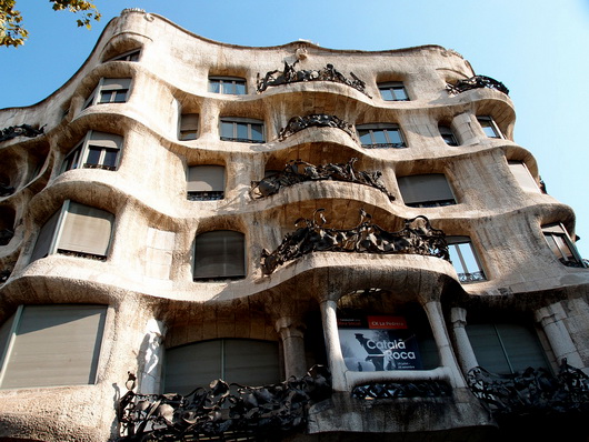
That's a general, and brief, overview, with more details to come. But, I did want to start talking about this trip by showing you some great images of a kitchen that I toured, preserved from the early part of the 20th century. The apartment building in which the kitchen is situated was designed by the amazing Antoni Gaudi called Casa Mila.

Below, the pretty incredible apartment building, designed by Antoni Gaudi...wow!

Below, images of the apartment. But first...I thought it would be fun to imagine which Silestone colors and styles would serve nicely as a modern day substitute in the event the new homeowner wished to, um, rip out the countertops (blasphemous!)

Top left: Grey Amazon | Top right: Lyra | Bottom left: Gedatsu | Bottom right: Sonora Gold

silestonegreyamazon silestonelyra
silestonegedatsu silestonesonoragold

Take a look at these gorgeous images of this historically preserved kitchen...


Get the flash player here: http://www.adobe.com/flashplayer


It was a privilege to walk through this authentic vintage apartment to see this very interesting kitchen.

The work stations look quite defined, certainly, with ergonomic features such as lower countertops in certain areas, adequate countertop space, adequate storage, and storage that starts well above our typical 4" off the floor.

Shelves and glass cabinets add visual aids to storage and the tall cabinets to the ceiling makes good use of extra storage. The cabinetry is built into the architecture of the space in some awkward but interesting ways. The incredible textured window adds glam in a big way. 

Much more coming soon on this incredible trip to Spain!!


Decorex 2011 – Blog Tour Kitchen Inspiration

As part of the fabulous Blog Tour 2011 group, founded by Veronika Miller of the equally fabulous Modenus.com website, our trip to Decorex, part of the London Design Festival, was simply fantastic, end of story. The creativity and innovation was such a joy to experience. Another type of joy was to see the way that classics, that is, materials or design, were updated to create a new aesthetic, a new definition of classic as well as modern. THAT experience = inspiration.

Here are some kitchen design elements that I found interesting at Decorex.

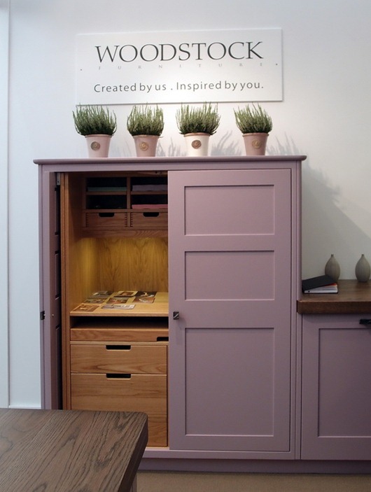
Below, cabinetry by Woodstock – who doesn’t love that name? Of course, the star is the fresh color, but I love the function too and the height of this taller cabinet.

woodstock kitchen

Below, also from Woodstock, the cool mix of light and dark neutrals. Notice, too, the subtlety of the rounded moldings. Love. Backsplash and styling – needs some love…

woodstock kitchen2

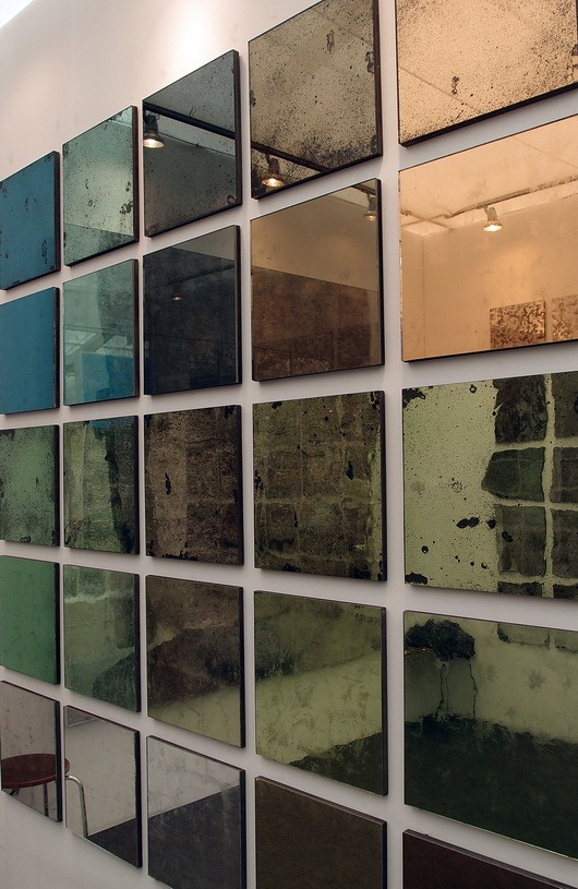
Below, gorgeous Dominic-Schuster mirror – could be a backsplash or wall area maybe? For pantry doors? Yummy! And it comes in a gazillion textures.

dominic-schuster

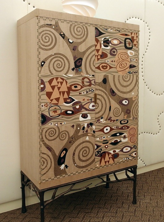
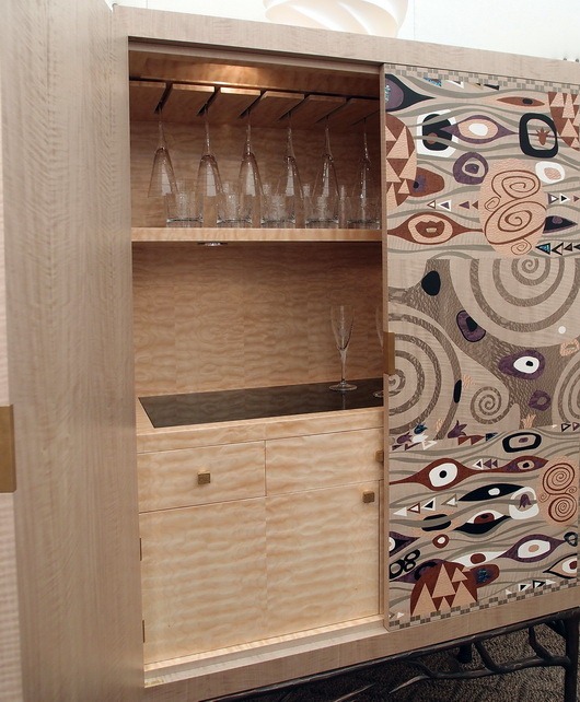
Below, a fabulous update of an armoire, bar cabinet, kitchen pantry, or breakfast room dish storage

archersmith


 archersmith2

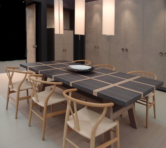
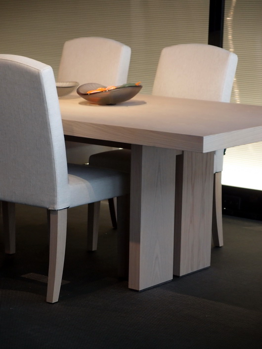
Below, a GOR-juss dining table with Hans Wegner chairs by Isis Furniture

isis furniture

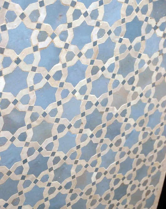
Below, Moroccan tile by Habibi (you are viewing the tile at an angle)

habibi

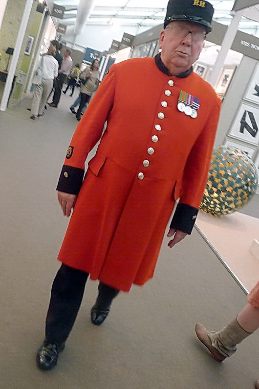
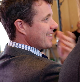
And, a quick shot of this very impressive gentleman who I know does something really important, but he’s also cute!


What’s your favorite??

Decoration & Design Building - Fall Market 2011

Last week, I was honored to be an invited design blogger to attend the D and D Building's Fall Market. The D and D building, in New York City, is simply, a fabulous building which houses world class interior design showrooms. Here, you can see the finest fabrics, furniture, lighting, accessories, window treatments, wall coverings, paint, and many more decorative products for the residential interior. It's awesome in its collective design offerings.

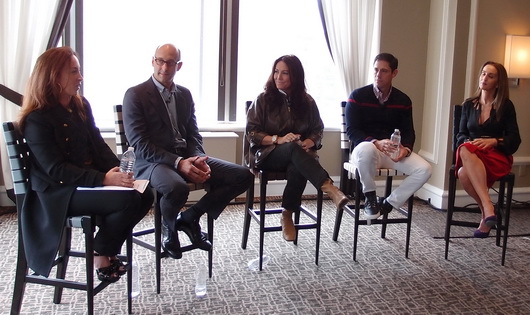
The Fall Market had a great array of educational workshops, seminars, talks and panels, with nationally known designers, manufacturers, and print and online editors. Going from a beautiful showroom to a insightful, spirited, talk, for me, was design heaven! Hanging out with the other invited design bloggers to Fall Market was equally inspiring! This discussion, below, was on Transcending Branding Boundaries, hosted by Editor in Chief of Traditional Home, Ann Maine.

left to right: Beth Fuchs Brenner, Peter Sallick, Windsor Smith, Jonathan Adler, Christina Juarez

I'd like to share some of the WONDERFUL products I came across that are located in the D and D Building!

Pierre Frey

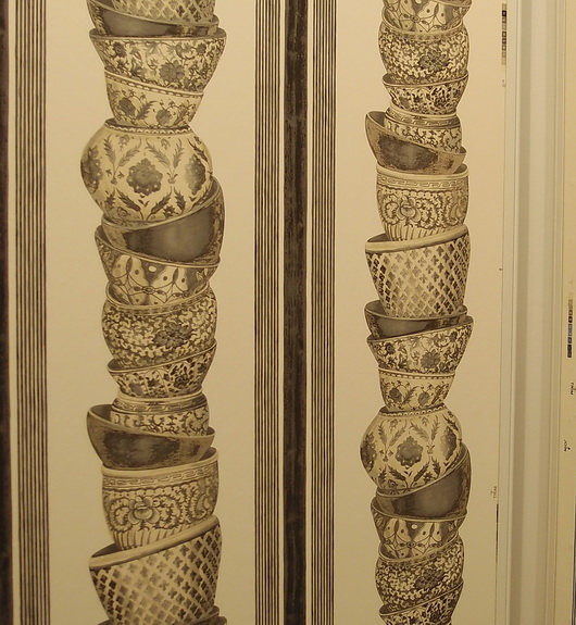
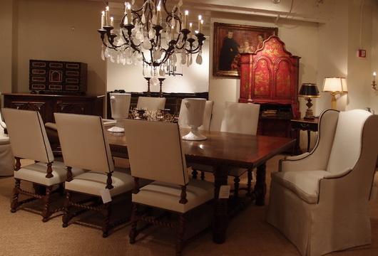
EbanistaBelow, interesting organic designs for dining tables

Evanson

Country Swedish

Country Swedish

Country Swedish

Armani Casa

I hope you've enjoyed these selections from the endless products that basically assault your senses once you enter this building! (That's a good thing!) 

Poggenpohl Kitchen Showroom

During a recent trip to London, I had the opportunity to spend some quality time at Poggenpohl’s Waterloo kitchen showroom. This London trip was arranged courtesy of Blog Tour 2011, an idea conceived by Veronika Miller, founder of Modenus, to bring design bloggers to the London Design Festival. Luckily for me, a visit to a Poggenpohl kitchen showroom was on our agenda!

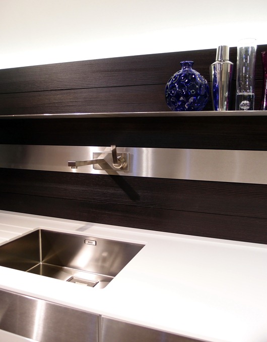
Following are interesting design ideas that I spotted at the showroom – and check out the Blanco sinks!

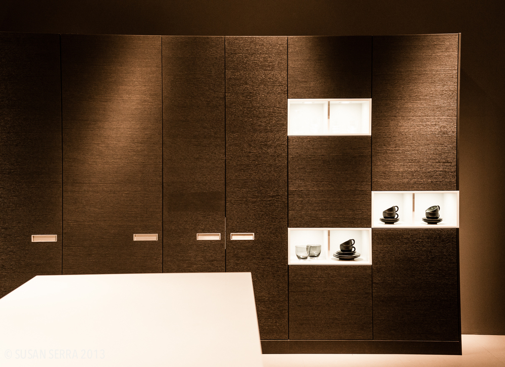
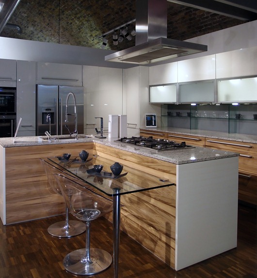
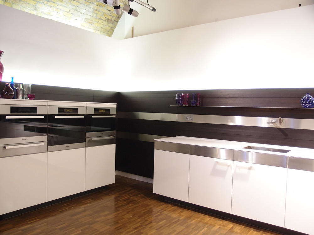
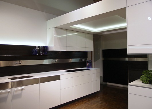
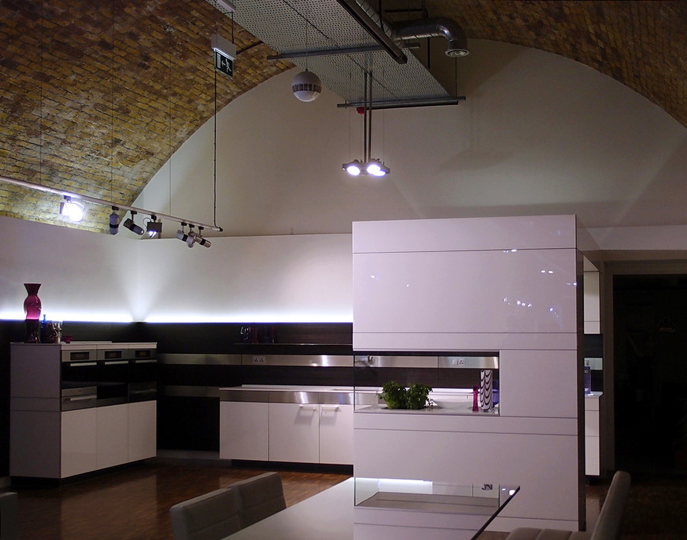
Below, highly textured wood cabinetry paired with sleek white and stainless steel-take a look at the lucite dining chairs and glass table-cool!

poggenpohl 1

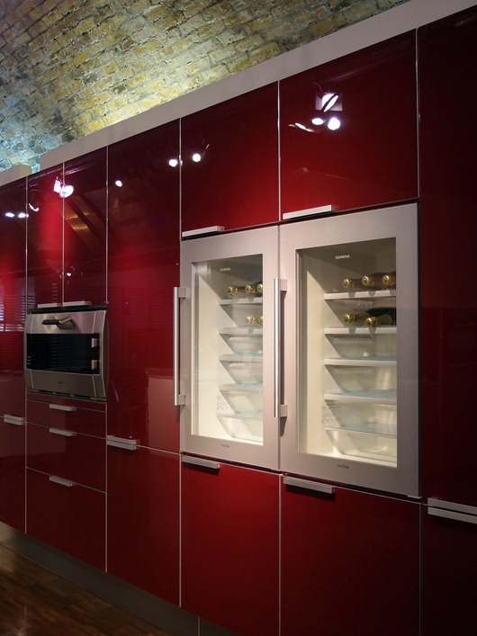
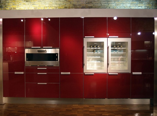
Below, I'm thinking that, after removing the third bottle of wine during dinner, this higher position of the wine refrigerator should prove to be useful!

poggenpohl 7

poggenpohl 2

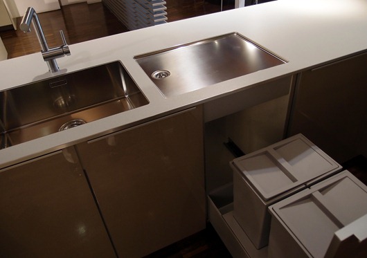
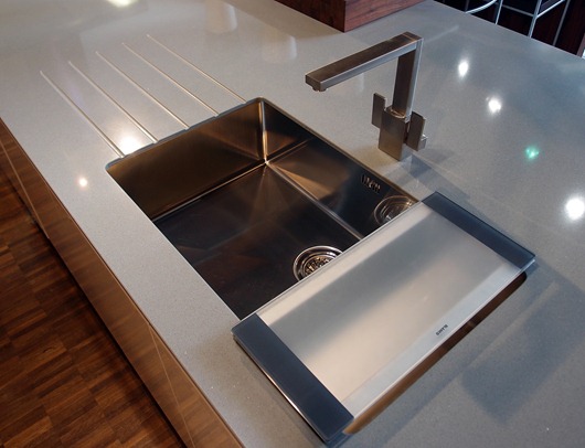
Below, a crisp/tailored undermount sink and separate drainboard by Blanco. I love the look of the separate pieces and the recycling bins below are perfectly situated.

poggenpohl 8

Below, another Blanco sink and interesting countertop shapes and forms.

poggenpohl 5

blanco sink 2

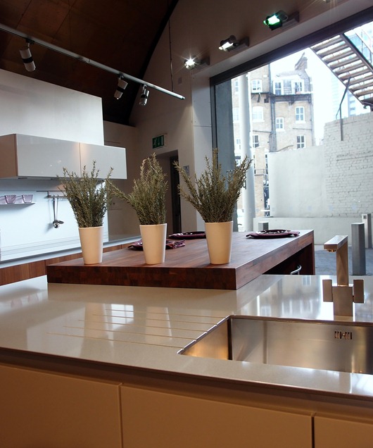
Below, note the difference in countertop thicknesses - the island is thick, the opposite countertop is thin - quite interesting to change it up.

poggenpohl 3

Below, exploiting horizontal lines...

poggenpohl 9

Below, sleek white cabinetry, playing with volume...

poggenpohl10

Below, on trend neutral, flesh tone shades in textured wood juxtaposed with sleek, glossy, cabinetry.

I have more images of this beautiful showroom I will share, but in the meantime, thank you to those at the Poggenpohl Waterloo showroom for giving us such a warm welcome!

Tent London–London Design Festival

I’m here in London, fully immersed in Design Heaven! Part of the Blog Tour 2011 group care of Modenus.com and other sponsors, we are moving about London from one design exhibition to another, spending quality time at each inspiring venue.

Here’s a glimpse of some cool, kitcheny, products I’ve seen so far…

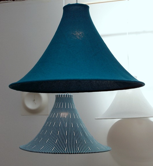
Below: Hanging light fixtures that leaves me warm and fuzzy by Kenichiro Oomori Moving Design

kitchen lamp

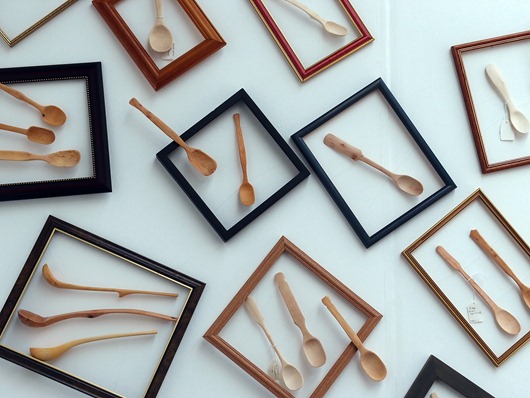
Below, beautifully made wooden kitchen utensils by Stovell Design

kitchen utensils

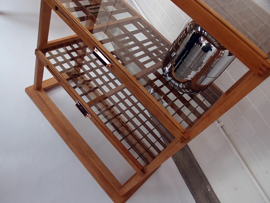
Below, awesome kitchen shelving by Studio Johnmale

kitchen shelving

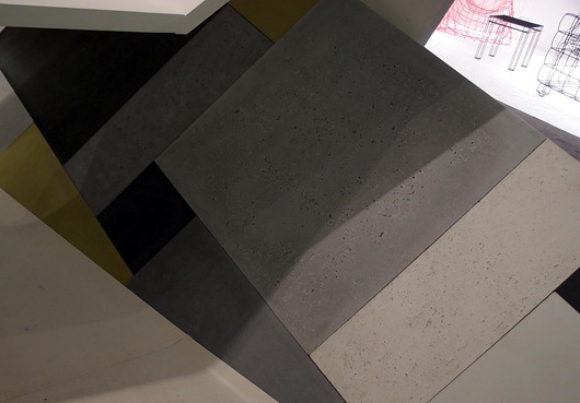
Below, textured concrete tiles by Ivanka Workshop

concrete tiles

More design inspiration coming your way soon from Merry Olde England! Today, I’ll be “working” my way through 100% Design!

London Design Festival, Blog Tour 2011 and Modenus.com

The 9-day London Design Festival and all its 300 events throughout the city commences today! In a few days, I will be on a plane to London with 18 other U.S. design bloggers to do nothing but observe, learn, interact with, breathe, and talk design. I am honored to be a part of this impressive initiative to bring US design bloggers to London. The concept to sort of comingle bloggers from the US and from the UK was that of Veronika Miller, founder of the design-rich website, Modenus. In a moment, we will hear Veronika's own words, as she describes the creative thinking behind BlogTour2011.
As a kitchen design professional, I am especially grateful to be included in this group. I have paid increased attention to the world of interior design, apart from kitchen design, in recent years having taken the time (and money) to travel to many design shows and events. As the kitchen is ever more connected to surrounding rooms and products and materials from surrounding rooms are finding their way into the kitchen, it is very important to be an astute observer of what's happening in interior design today. I will look for products, materials and design concepts which can be brought into the kitchen in a seamless way to create the "flow" that connected well designed spaces have. I just cannot WAIT to take it all in!
Here is some great information about Blog Tour 2011 and its fearless leader, Veronika Miller. Oh, and Veronika? She goes to an ENORMOUS number of design shows throughout the year. She may be one of the most knowledgeable people on interior design products and materials there is and that is no exaggeration.
Events in London just on one day!1. Veronika, how and why was this idea born, to bring US design bloggers to the UK to find design inspiration? 
Blog Tour was born, as are many good ideas, over a drink and some scribbles on a paper napkin. We had just created a very successful gathering for bloggers at Arch Digest Show in NYC in March at which bloggers kept telling me that Modenus should host blogger events more often. People see us as a hub for interior design resources so it was a natural next step to create something that would boost design bloggers' visibility whilst helping Modenus report from trade shows and design exhibits with content from select groups of bloggers. 

 It was a spontaneous moment between Troy Hanson at MMPI and Modenus which resulted in such a fun and inspired concept, something with a distinctly international tinge reflecting Modenus as a platform that is based in the US and the UK. So, over a few dirty Martinis in Hell's Kitchen NYC, BlogTour was born.

2. What are your professional goals for this trip; what does success look like?

Bloggers have an opportunity to immerse themselves in design inspiration, meet international designers, journalists and peers and flex their social media muscle to show just how much buzz they can create for an event or a brand. I think it's important to show that design bloggers can be very influential and professional contributors to digital media. Many of them should absolutely be considered as media partners for larger brands or design related initiatives.

Sponsors benefit from the immense buzz created through each BlogTour group prior to every event and by actually meeting bloggers in real life at their showrooms or at one of the exciting venues we've chosen to include in our itinerary. Making a brand visible through digital and social media is, of course,  very important but making it tangible through real life relationships is vital

Modenus was launched, and has grown, exclusively through social and digital media. BlogTour is a natural extension of Modenus and, as well as everything else, has further increased the visibility and reputation of Modenus in the US, UK and around the globe.


3. The agenda is so well rounded outside of the Decorex event. How do you hope these other opportunities for design exploration will inspire design bloggers?

London Design Festival is unique in that it offers 9 days of design events which are anchored by big trade shows like 100% Design, Tent London and just after LDF, Decorex. We've covered London Design Festival for several years now and know how inspiring British design can be and how important it is to focus not only on the larger brands but on the hundreds of creative artisans and artists who exhibit independently or at smaller venues or even through pop-up shops.

Designs can be over the top and  provocative and other times just beautiful and inspired but the point is that that, in my eyes, it is in those smaller shops and venues that great design trends are born. I think bloggers will take away a lot of inspiration for future blog posts or design work and hopefully benefit from the great personal relationships they'll be able to forge while in London.   

4. I know that I, as a design blogger, welcome opportunities to get up close and personal with manufacturers' products any way that I can. It's always a learning experience. I'm curious - what are the BlogTour sponsors' expectations and plans to interact with the design bloggers in an effort to showcase new design or technology in their products? 

We are thrilled and honoured every time a sponsor steps up to join BlogTour in London or any of the tours scheduled for 2012 because it is such a new concept but we realize they are seeing the same potential we're seeing.

Some of the sponsors will indeed be meeting us at  their showrooms or at a dinner venue in order to spend some time up close and personal with our American bloggers as well as some of the UK bloggers, while others appear to be quite happy to allow BlogTour to promote their brands through Twitter and other social media outlets to help them grow their own social media following. 

 Modenus has always worked with every vendor on a customized basis to meet their marketing and budget needs and BlogTour is no different...we listen and come up with a solution that will give them the type of exposure they seek. 

 Thank you to all of our BlogTour sponsors: 

BLANCO America
Samuel Heath
Victoria & Albert Baths
Poggenpohl
Wallunica
Achica Living
 
DuVerre Hardware
Spirit of Sports
 

Decorate - A Book by Holly Becker of Decor8 Blog

BUY THE BOOKBUY THE BOOK!Decorate, a new book by Holly Becker of the iconic blog, Decor8, is an ambitious book (that's the word that comes to mind). There is an enormous number of images for maximum visual delight, clearly and well written text as well as the ability to quickly drill down to the essence of each chapter and core message via quotes, lists, tips, shaded content boxes and other visual aids.

I love this kind of reference material. Give me the option to read or to look quickly for information. To me, this is a useful format, or mix of formats.

I am privileged to have been quoted in the kitchen section of this book in numerous places. It is an honor to me that Holly Becker sought out my insight on the topic of kitchen design. That said, while Holly Becker is a respected and treasured blogging buddy/colleague/friend since early 2007, I have declined to review books by other design industry peers, some of whom had been colleagues of mine (past tense-unfortunately, declining to review a book costs relationships) for many years. It's lovely that I am quoted in this book, but if I did not find the book to have real value in terms of solid and quality design information, I would pass it by and not review it.

In the kitchens section, on page 148, the introductory paragraph is such an inspiring yet succinct, description of what the role of the kitchen can be in our lives. To get this philosophy right, puts anyone on the right track who is planning a kitchen renovation. 

There are countless references to personalizing the kitchen in Decorate that are truly creative. It takes some thought to be creative, which means it takes quality time. More often than not, the content that I see around the web or elsewhere which focuses on creative solutions for kitchen storage, design, whatever it is, is sorely lacking in creative thinking.

The suggestions, tips, ideas on personalizing the kitchen in Decorate, are both enlightening and fresh and are accessible to nearly everyone (perhaps with the exception of the Michael S. Smith sink for Kallista) ;) 

The sections of the kitchen chapter are sort of divided into how we live - Casual Eating, Cook's Kitchen, Built-in Storage, Urban Kitchen and others. I find that the text teaches by describing various lifestyle scenarios which helps the reader to visualize a look more completely. But, it goes even further, describing the feelings that certain creative ideas may elicit, such as mismatching china, how to design in comfort and other creative ideas. At the end of the day, when you stand at the doorway to your kitchen, it's lovely to feel the way you had hoped you would feel at the start of the process, when finally surveying the result of all that work. 

Most of the kitchens in the book are white and modern, but with personal touches, which is the point of the book. You will not find cookie cutter kitchens from manufacturers' brochures here. These are each a personal expression and illustrations of that classic design conflict of function vs. aesthetics that each of us has to reconcile for ourselves - hopefully under the guidance of a kitchen design professional who is understanding of the client's needs and desires.

I'm also thrilled that the social kitchen, a concept that I've talked about for some years, has a special section as well. The advice is there for the taking, without scolding or demanding or even nudging. It's positive and enthusiastic voice is the voice of the Holly I know and many of us are familiar with. The rest of the book? It's awesome. Decorate.

Copenhagen Design Week

A fantastic collection of talks, exhibitions, showrooms, design tours and more, Copenhagen Design Week covered every area of both beautiful and socially responsible design. I've gone to design shows in quite a few countries including many shows in the US on a regular basis.

Honestly, I've never been so inspired, never have been so touched both personally and professionally, as I have been by attending this series of exhibitions. It was more than a design exhibition, it culminated with a reawakened design philosophy within my brain and my soul. The Index Awards, at which I was present at the Opera House, was a centerpiece of the week. Please read more about the Index Awards.

This is a very long post, but these words by the Acting CEO of the Danish Design Center touched me in a significant way, and I hope you can take 10 minutes or less to read through this piece to capture its beautiful and important meaning. In its entirety:

Thank you so much Aura/Ida Corr for the lovely song and for creating the right atmosphere.

Your Royal Highness, ladies and gentlemen,

I offer you all a warm welcome to the Copenhagen Design Week.

For the second time, Copenhagen Design Week welcomes international designers, architects, CEOs, design managers, researchers and students to six days devoted to design.

As we kick off this week of great design events – I think three questions needs to addressed:

  1. Why design?
  2. What is design?
  3. How can design help?


Why design?

What is the importance of design? Why should we bother? What is it that design can do for you? For me? For all of us?

Society is changing and the world as we know it is slowly turning upside down. We face new challenges and opportunities. Our life expectancy is growing and so is the world population. The Western welfare systems are under pressure while the middle classes are booming in Brazil, Russia, India and China. Resources are dwindling while demand is growing and the whole economy is under reconstruction.

In short, we need to think…

The facts of the modern, global society call for action. We cannot address new challenges with traditional solutions. And we cannot wait for someone else to take action.

All of us – nations, global communities, companies and individuals – need to think – and to design new solutions for our longer and safer and cleaner lives.

It is time to design the world we want to live in, and anyone interested in form, function, shape and seduction should pay attention.


But what is design?

Magazines – and the popular belief – will tell you, that design is all about beautiful things. And this is absolutely right. Beauty lies in form and function, and beauty lies in great design…. In Jaguars and Egg Chairs, in Yves Saint Laurent dresses and Erik Magnussen’s jug. Beauty lies in intelligent solutions. Beauty lies in Novo Nordisk’s insulin pen that empowers people with diabetes. Beauty lies in the fact that they are no longer patients. But people.

Beauty lies in products and solutions that help us become better people. And design can really do that. Design can really change who we are, what we do and how we behave.

Smart phones are not making us smarter, but they are changing the ways in which we navigate and interact in our daily lives. They are changing our physical and social behaviour.

We are a designing species, and the designs we make design us in return. This basic understanding is, I believe, the central element in the Danish design DNA.

The first golden age of Danish design coincided with the building of the welfare state in the 50s and 60s. The chairs, the lamps, the cutlery, the buildings were all part of an effort to create new ways of human interaction. Danish design has always been intimately linked to our humanistic and democratic traditions: The traditions of Folk High Schools and Co-ops; the tradition of sustainable solutions and pragmatic products; the tradition of designing for the community and of social inclusion.

We are at the beginning of a second golden age of Danish Design. And this time we are not alone, because the whole world is at the beginning of a golden age of design.

Today, design is much more than styling; much more than form and function. Today design is an instrument for developing innovative, competitive and sustainable products and solutions in order to meet the complex challenges of today’s society.

A holistic grasp of the big picture is a key condition for creating meaningful design solutions.  The humanistic tradition has for decades been the basis of Danish product design, and it is now a driving force in the role of the designer in a complex world.

So, design has come to mean more than giving form; it is increasingly becoming a strategic element in innovation processes in the private as well as in the public sector. To help this process along, the Danish Government last year established the Design 2020 Committee with the vision of making Denmark a society where the use of design is integrated at all levels to improve the quality of peoples’ lives, creating economic value for businesses and improving efficiency and quality in the public sector.


How can design help?

It is very simple, really. The essence of design is thinking human. The essence of design is making products and solutions for human beings with minds and bodies and desires and aspirations and social needs and wishes.

Design is not the answer to every question we can ask. But it is my experience that if you involve designers in your search for answers, the answers will involve thinking human. Beauty lies in this.

Talk in an antique boat given by IKEA - participants on each side of center tableI am proud and happy to welcome you all to Copenhagen Design Week. The programme is full of beautiful solutions to complex challenges, and they will show us ways to a more sustainable future based on the ability and the willingness to Think Human.

Copenhagen Design Week explores and raises awareness of the impact of design, architecture and the environment on human life. In a world of constant change, design has the potential to transform ideas and social values, meet desires and needs – and, not least, create good business outcomes.

We firmly believe that Copenhagen Design Week will show us the way to a more sustainable future based on the ability and the willingness to Think Human. There is plenty of work to do – but the future starts now.

Dance with the Egg Chair at Official Opening of Copenhagen Design WeekLet me conclude by pointing out three things you cannot miss during the Design Week.

First of all - go to Kvæsthusmolen by The Royal Danish Playhouse on the Copenhagen harbor front. Here you will find the Design Zone, which is the venue for the main exhibitions during the Copenhagen Design Week.

Here you will see how design and architecture meet local and global challenges.

Secondly – Kvæsthusmolen is also the venue for the INDEX: exhibition, and you will be able to study the winning projects. The INDEX: exhibition illustrates that design has the environmental, social, and economically sustainable tools to make the world a safer and better environment for people.

And naturally, I recommend a visit to our exhibition right here, in the Danish Design Centre. The exhibition, Challenge Society, pinpoints the role of designers in solving the grand challenges of our society.

HRH Prince Frederik applauding enthusiastically after a performance at the official opening of Copenhagen Design Week (yes, he was one row in front of me!)But please be aware – that this is only a fraction of all the exciting experiences that lie ahead during the Copenhagen Design Week.

I would like to extend my heartfelt thanks to the Danish Ministry of Economic and Business Affairs and the Danish Enterprise and Construction Agency for supporting the Copenhagen Design Week.

An essential aspect of creating and carrying out an event such as the Copenhagen Design Week is to establish strong partnerships. Therefore, I would also like to give a warm thanks to our main partners: IKEA and Nokia. We deeply appreciate your financial support and your expertise on design and your contributions during the Copenhagen Design Week.

Finally, please let me offer my sincere thanks to the Copenhagen Design Week team. You make me proud.

Danish Design Center immediately following the opening of Copenhagen Design WeekI bid you all a warm welcome and encourage you to seek out some of the many exciting design experiences that Copenhagen is brimming with this week.

Now it is my huge pleasure to give the floor to Mr. Frank Jensen, the Lord Mayor of Copenhagen.

After that, Tina Højlund of the Royal Ballet will perform the Egg Chair Ballet, followed by Aura, who will take us back to where we started with one of her songs.


Thermador Pro Grand Steam Range

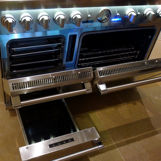
In June I attended a press event at the fabulous Thermador facility in Scottsdale, Arizona to be among the first to view their new, stunningly bold pro range, the new Pro Grand Steam Range. Manufacturers of the first pro range ever in 1950, not to mention in stainless steel at that time, Thermador's latest pro range has features in this new version one would not have dreamed of back then.

Did I say this range is bold? I like bold. I mean, if you're going to do something, be bold! Be awesome and be innovative too, for goodness sakes. Push the envelope, think out of the box and all that. Here's what we have in terms of features:

Steam Oven - If you want to cook in one of the most fabulous ways to achieve superb quality for your cooking efforts, steam oven technology provides the best of all worlds ... namely, a healthy cooking method, moist, flavorful foods with a crisp crust as required. Plumbing? None - just fill the handy reservoir.

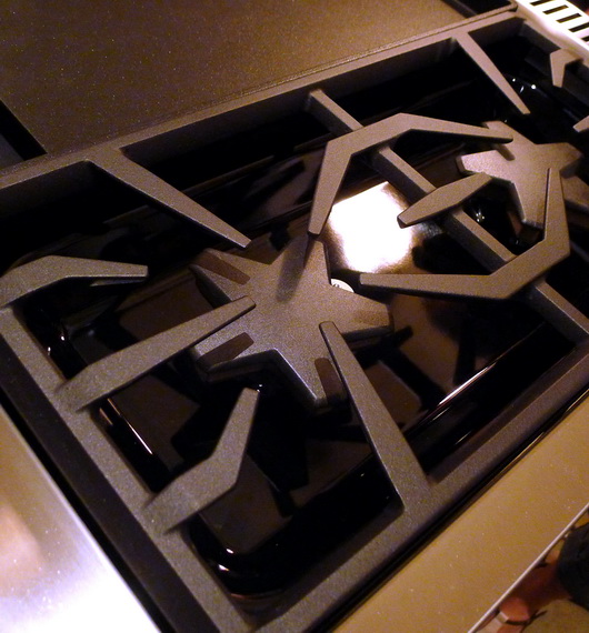
Star Burners - Quite simply, the star burner gives you more real estate within the flame. Add 22,000 BTUs for the power star burner, and the impatient will be impatient no more. For me, that would mean a killer sear on my filet mignon and salmon. I like power! Extra low simmer technology too.

Spacious Oven - A 5.1 cubic foot convection oven offers ample cooking space with nine cooking modes.

Universal Design Features - Soft close hinges, full access racks, easy grip handles and a wonderful electronic oven display and light feature to illuminate words and numbers on the knobs just below. It's also just a little bit sexy - that blue light.

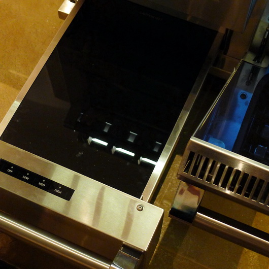
Warming Drawer - I almost forgot! If that's not all, coddle your freshly cooked food in the warming drawer - PERFECT for all those holiday sides and just about anytime something needs to sit ... without losing its wonderfulness.
Grill/Griddle Option - Sweet. Why should I have to decide between grilling the perfect burger and the great features of a griddle? Sauteeing vegetables, making pancakes, home fries and so on.

The fit and finish is of very high quality. I am especially in favor of the universal design features. Yes, it's a bloody fortune at nearly $14,000 MSRP, but this is clearly an investment product. Some things, in my philosophy, are just worth the lifestyle enhancement not to mention longevity, that is purchased along with the basic functions of the product. I've spent a bundle on a few products that were, let's say, seemingly above my financial demographic. I never regretted it, ever. So, a lesson in budgetary restraint? Not from me. If you feel it, it just may enhance your life - that is, if you can swing it financially. If you can, go for it, it's a ridiculously beautiful cooking center.


Modern Dining At Las Vegas World Market 2011

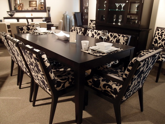
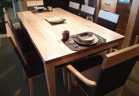
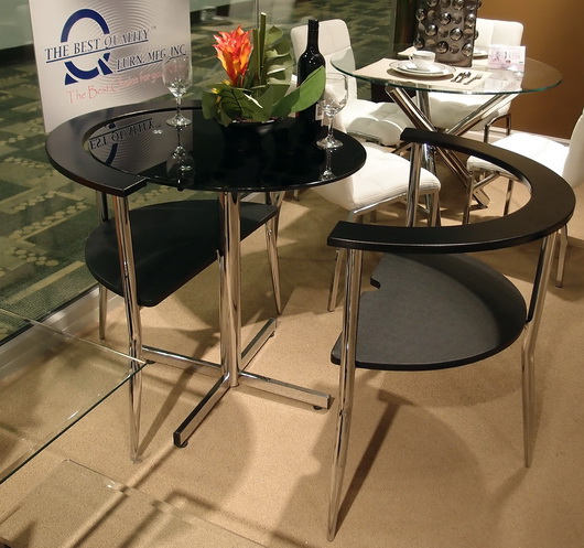
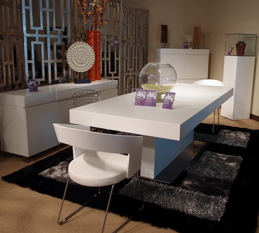
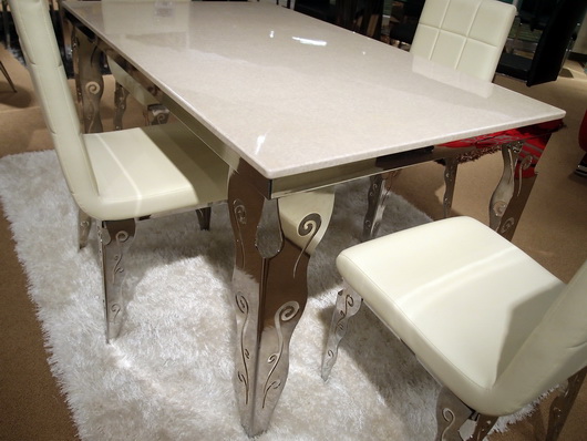
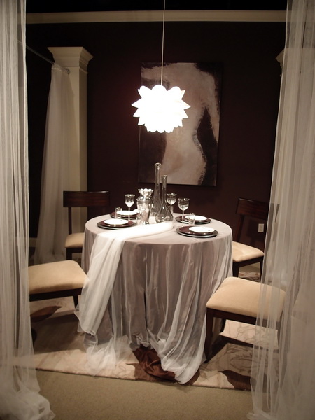
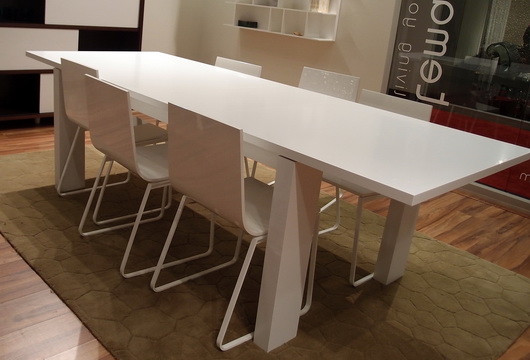
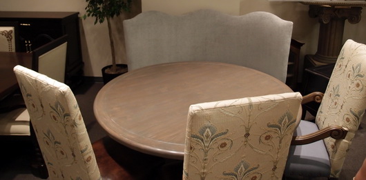
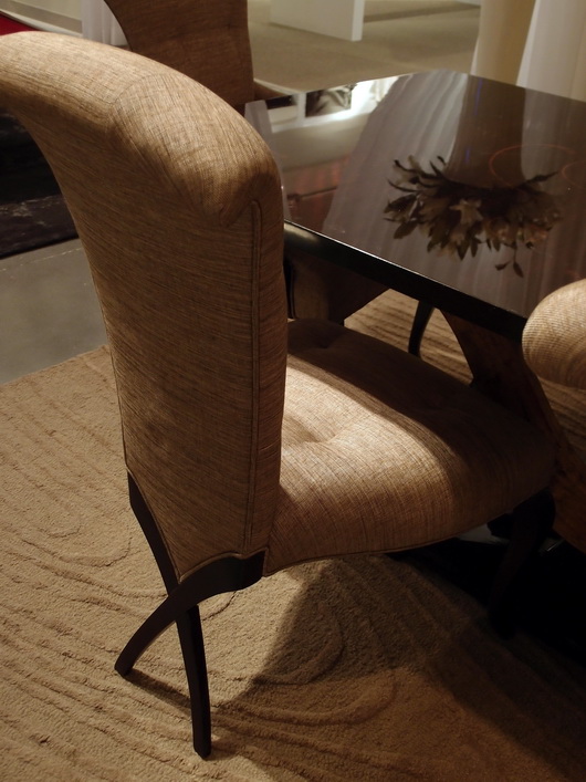
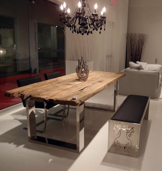
I saw some great pieces, continuing my dining theme from Las Vegas World Market that I need to share with you. Some dining tables and chairs were simple and clean, some super innovative yet elegant, with very exciting decorative details.

Many of these sets are quite affordable. In some cases, it might be advisable to add on a glass top to protect the surface of the table. In some cases a frosted or other patterned glass top could look great and add protection. Oversized glass is also an option, which adds area for dining as well as a nice aesthetic statement.

Take a look!
 

Bermex Bermex Bermex Diamond Sofa Diamond Sofa Tip Top Furniture Aspen Home Temahome

Las Vegas Market - Dining Inspiration

Earlier this week I walked through the Las Vegas World Market Center, the enormous gravitational center for residential furnishings that struts its stuff twice a year. Vegas is a place that makes me smile, so I'm happy upon arrival. 

Rossetti

I came with a "kitchen context" unlike most interior designers, architects and buyers; a context in which I think about the transition, stylistically, of the kitchen to surrounding spaces. The dining area is a critical element of kitchen design and what a great place to dream of the ideal dining experience. Following are dining tables seen at the Las Vegas Market.

Rossetti

I always put a strong emphasis on the dining area in the earliest stages of designing a kitchen. Unfortunately, I often see it, if already designed within preliminary floorplans presented to me by my clients, as almost an after thought. I find nearly always, the dining area needs more space devoted to it.

Bramble

Making space available for friends and family to travel easily around the dining area and designing adequate space so that lingering at the table is an enjoyable and not a confining experience, are two important elements of a well planned dining space. 

Urbana Home

Durability of a table's surface and of the chairs as well is the measure of longevity and beauty. Ask questions and observe product construction and durability. Ask if materials and surfaces can be refinished or easily cleaned down the road. Be practical and realistic to determine if your lifestyle can withstand a white painted tabletop.

Rossetti

Venturing away from the kitchen, I'm a strong advocate for multiple dining areas in the home. I especially love a dining table, perhaps a 54" round table, depending on the size of the room, situated in a family room.

Lexington

This secondary or tertiary table within the home will serve as an alternative place to dine - maybe on weekend evenings or weekend mornings or the occasional weekday change of scenery. It's definitely about a change of scenery - why eat at the same table every single evening if another table can be accommodated in another space? A little far to bring in food from the kitchen? That's what trays were made for and I promise the effort is SO worthwhile. I've lived it, thus, my endorsement.

What does your ideal casual dining space look like?

Las Vegas Market Summer 2011 - Kitchen Design Interpretation

I'm here in a fabulous hotel suite in Vegas at the invitation of the Las Vegas Market as part of a small group of bloggers. Our mission is simply to walk/work/discover the Market in our own unique way. No requirements, no expectations. Ideal!
Transitions by Sigla My perspective is different than most interior designers who attend Las Vegas Market. In fact, it greatly benefits the home furnishings industry to invite kitchen designers to see the Market. As the kitchen and surrounding rooms become ever more integrated, I, for one, feel a need to understand the current state of home furnishings and design to tap into what designers are thinking and what manufacturers are creating. Of course, also perhaps to specify furniture as opposed to cabinetry in some kitchen areas, to create the look of seamless integration among surrounding spaces as well.

My eye is unique from all others, my perspective toward public rooms surrounding the kitchen is different, and following is a collection of "dots" that I connected while at Market. It was fun!

Antigua FurnitureHappiness is ... the word "happy" came to mind over and over. Living in a pleasant, easy way seemed to be a continuing theme in the furnishings I discovered. Pleasant/simple lines, fabrics, materials and PATTERNS were mostly very easy to live with, often "pretty" and had this wonderful back to basics/simple creativity that I found lovely.

The Rug Market

Lots of linen - I did not see as much gray as I did at High Point Market in the spring, although there was a good amount across all furnishings and accessories, but there were beautiful muddied beiges and lots of beige linen fabrics, that whole Belgian country vibe. A resurgence of French Country was talked about at Market as well.

Christopher Guy

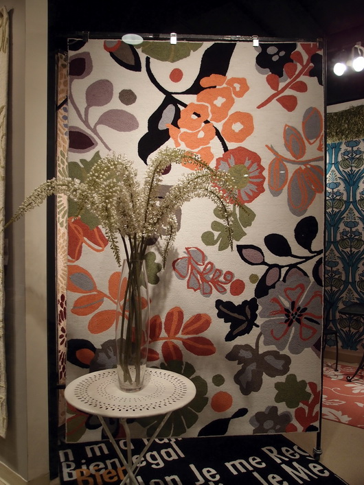
Mixed Media - Experimentation with different materials in unexpected ways was interesting to see - in rugs, case goods and upholstered pieces. The effect was usually very well done in my opinion.

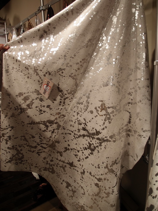
Saddleman's of Sante Fe

Small Scale - Definitely seen throughout Market were smaller scale furnishings across the board, in every category of furniture. Smaller scale furniture seemed to then shed excess ornamentation, allowing for simplicity and elegance in smaller sizes.

Linon

I'll share more of my impressions and inspiration from the Las Vegas Market soon! And more images. I'm very glad I went - it's great to be immersed in the design world!


Le Tour de France - French Country Kitchens

I'm engrossed in le Tour de France, the fabulous cycling event which takes place across France each July for 3 weeks, ending in Paris on the last day. I watch it every day it's on (truthfully, morning and night) and am emotionally transported to the beautiful small villages, the stunning landscape, fields of sunflowers, majestic mountains, and amazing 11th century chateaux...and, the fierce cycling competition too! There are few sights as beautiful as the peleton racing across the French landscape.

Image by Graham Watson

So, what if one were to visit le Tour and rent a Chateau as many do? It's on my list to do one year. Take a look at some of these wonderful, authentic, French country kitchens found in homes and chateaux scattered across the Loire Valley, in today's Stage 8. These are beautiful homes to rent (but I'd also like to rent a chef to cook French cuisine, right?) Images from Luxury Retreats

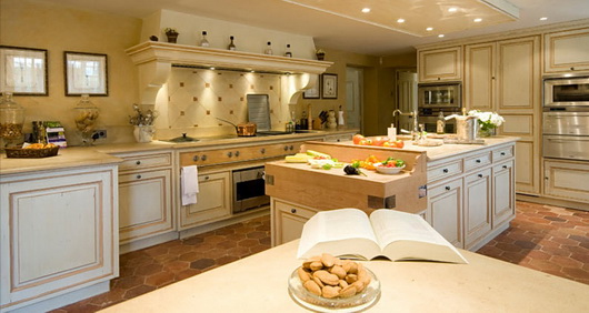
Below, a classic French style - the hood blends into the architecture in a seamless way, the cabinetry is traditional with mustard color on the island as well and is sort of built into a sort of foundation which defines the kitchen. 

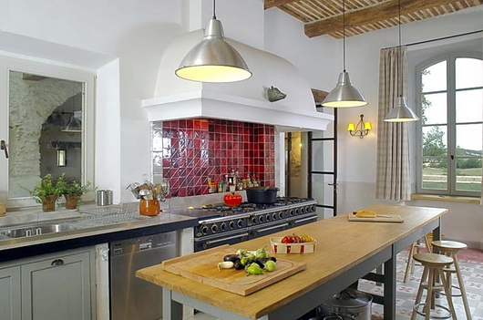
Below, this one may be my favorite. It's SO gorgeous yet simple. The white (and white hood) form a light and spacious backdrop. The red tile backsplash is a perfect focial point to the cooking area. The wood beamed ceiling is beautifully graphic and other simple lines update this otherwise traditional French Country look.

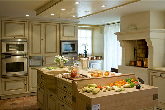
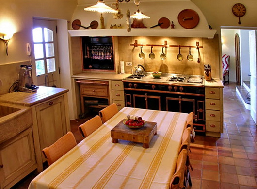
Below, another traditional kitchen. Creamy, dreamy, warm monochromatic colors with minimal contrast. Of course, who would not want a cooking fireplace/oven in the kitchen? The sink is sensual and the terracotta tiles, while out of fashion right now, are classic, timeless, and wonderful.

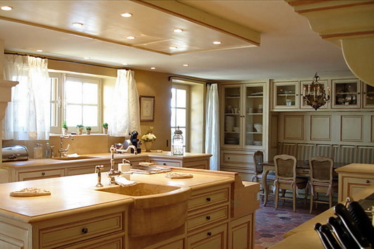
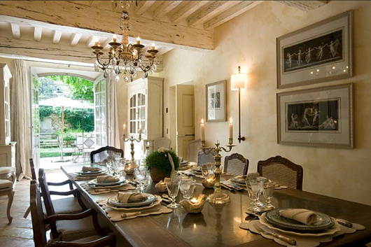
Below, this dining room is: (pick your adjective!) Again - that creamy color throughout all architectural surfaces in various textures creates perfect flow. Even furnishings, doors and trim blend in seamlessly. Defines a timeless look in my opinion. 

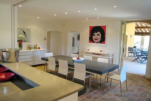
Below: Fabulous. The shots of red are the glam that many French interiors incorporate so effortlessly - it's like it's in the dna of the population! Here we have warmth, coolness, color, texture, clean surfaces - an interesting mix of contrasts.

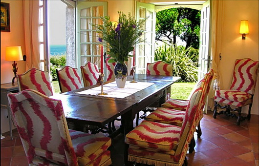
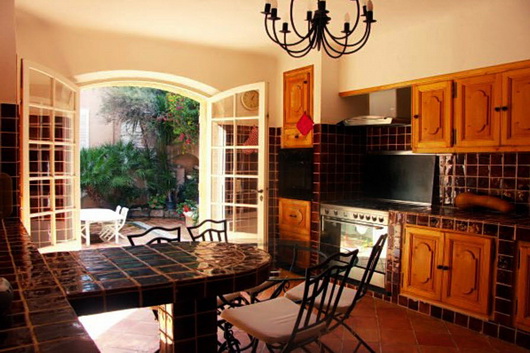
Below, I think when dining in this room, the conversation MUST be stimulating, don't you? It certainly sets the scene for joy, frivolity, and good times. The open doors to the outdoors add the element of nature and light.

Below, a small but awesome kitchen! Wow, just look at these elements - the copper pieces above the integrated hood, at one with the architecture of the room. The built in rotisserie and fabulous cooking center. A rustic sink and rustic built in/inset cabinetry. And that mustard colored striped table linen - love!

Below, some drama is clearly going on in this kitchen - the dark, rich, brown/black tones of tile surround built in cabinetry in this traditional design. Not the most beautiful kitchen, but the simple shapes, forms, colors and textures do bring style to this kitchen.

Somehow, I think I'd be happy with any meal that is prepared in these kitchens! They look like cooks' kitchens. I'd also love to tour each one to look closely at all materials used and to just sort of drink in the feeling of an authentic French Country kitchen. A cultural authenticity is the thread across these kitchens - can't you just feel it?

To see other posts I've done on le Tour in previous years, take a look at this post on French Country kitchens and this one on kitchens in French Chalets. This is such pure pleasure for me, I may add more throughout the Tour in the coming weeks. Do you like the French Country style?


Reusing Kitchen Cabinets in a New Kitchen Design

BEFORE KITCHEN PLANReusing kitchen cabinets to create a new kitchen design is both a real challenge and extremely gratifying. I've done it, albeit in an experimental way in a previous personal kitchen. In my case, it was an opportunity to try out some design ideas and at the same time hold us over until we were ready for the big remodel down the road. Here is a reader's question on the topic of reusing kitchen cabinetry:

"I read the article on reusing cabinets and there are some great tips there. You mention the fact that reusing cabinets in a new configuration can be difficult but didn't elaborate further. That is exactly what I am trying to do but need some expert advice!

I am in desperate need of a new layout in our kitchen, but our cabinets are in great shape. I have played around with the design and think I have something that will work. I am not a "handy" person so I was hoping to get some pointers on what to look at to determine if the existing cabinets could still be recycled in the new layout.

Do you have any advice on what I should do to detemine if the new kitchen design will allow for reuse of our cabinets? Or is this a project I need to get a contractor in on now to ensure they can physically do it?

Thanks,
Carly"

AFTER KITCHEN PLANHi Carly, 

Thanks for writing! The word that describes reusing kitchen cabinetry is: "puzzle." Finding the right configuration for a brand new design using existing cabinetry can be done, but it will entail very open thinking, meaning that you need to be open to new design ideas, new and different ways to add storage into your kitchen to supplement your existing cabinetry, and a good dose of positive thinking.

You will need to draw the room to scale and then the puzzle begins. An open mind will allow you to experiment with a variety of configurations. There is no absolute way to find "the" right solution. Trial and error and positive "play" in a relaxed setting is how you will find your design solutions.

Of course, you should consider where your existing cabinetry offers the best access near certain appliances and work centers. Narrow drawer cabinets will be useful near the refrigerator or sink. Wider drawer banks or cabinets with doors will be useful near the cooking area.

Watch for the size and proportion of doors and drawers. For sections which you will need to fill in with new cabinetry, do not attempt to match a new color with the old; it most likely will not work - instead, select a painted finish in a new area of the kitchen that makes sense and balances well with surrounding cabinetry.

A trained eye knows how to configure different sizes and proportions of cabinetry. My advice would be to find a local kitchen design professional who can help you on a consultation, or hourly fee, basis at least to get you a head start.

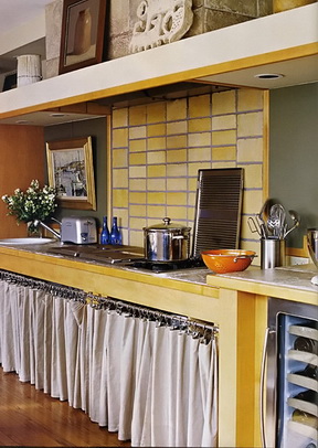
Filling in with metro shelving, curtains and furniture pieces can result in a very interesting kitchen, one which could be super chic in that bohemian/modern sort of way. I know this is true because my reused kitchen cabinetry, once transformed, was published in a national shelter magazine ... thus, the positive thinking! 


::Surroundings:: Guide to Decorative Living Kitchens Feature

Nearly under the wire in bringing you the latest issue of the Surroundings online magazine for May/June on my favorite topic, kitchens, Linda Merrill brings us some great kitchen design information in this issue.

If you don’t know Linda, I’d go so far as to say that she is one of THE hardest working, and most innovative, design bloggers. Linda not only writes the blogs: SurroundingsSilver Screen Surroundings, and Master of Your Domain, she also hosts The Skirted Roundtable and publishes her ::Surroundings:: Guide to Decorative Living digital online shelter magazine every other month. I thought I was hard working! 

Bornholm Kitchen 4In this issue, I am truly honored to be featured in Linda’s digital shelter magazine. Linda has featured me in an extensive interview and we talked abut my new collection, Bornholm Kitchen. There is no doubt that it is most gratifying to get the respect of my peers. With that as a foundation for this new product introduction (and a barometer), I feel confident about the future. Thank you Linda for this lovely feature.

I also like Linda's feature on "Appliances That Designers Love" and who doesn't love to look at Kitchen Bling, another feature in this issue? Linda does her research and does it well.

Take a look at Linda’s digital magazine and follow her in her various venues online. You will learn something – she’s a thinker on all things design focused.