Holiday House Hamptons

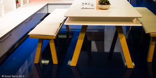
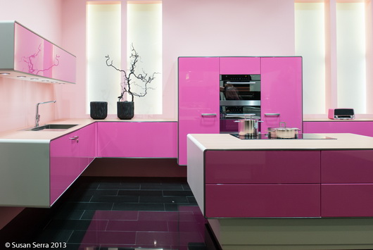
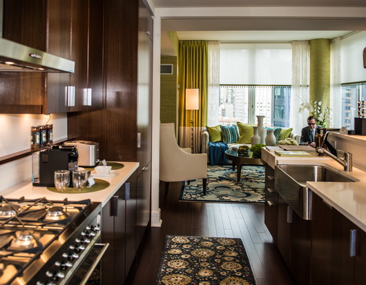
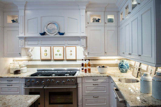
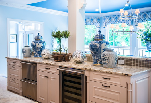
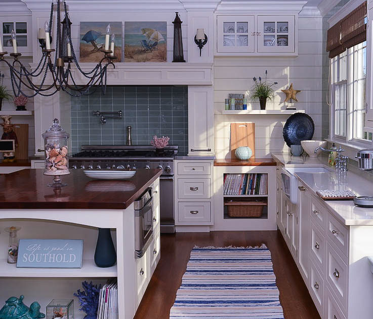
Last week I dressed up in all white (as was requested) and went to a fabulous press event in Bridgehampton for the opening of Holiday House Hamptons. Celeb designers were there, everyone in white, and it was a perfect summer day. Following are images of the kitchen and breakfast room, designed by Jennifer Duneier.

As a kitchen designer, I like to point out pros and cons and anyone is welcome to discuss, agree, disagree, etc. so please do! Here's my take on this kitchen.

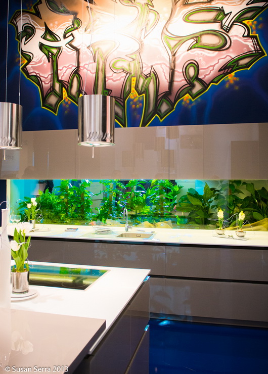
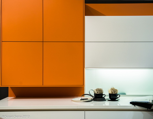
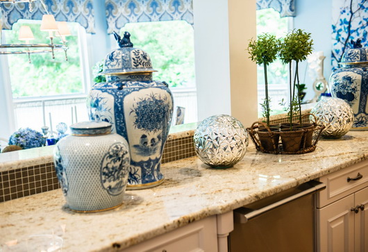
It's eye catching! There's a sort of "no fear" approach in terms of bold color. At the same time, there is restraint by only using two main color-colors, each of which allows the other to be a visual player. 

The softer color of the backsplash, bold in its pattern, yet softer in tone, supports the brighter colors in the kitchen to make them be the stars. The backsplash is a supporting role, yet it's not. It works because the wall is otherwise uncluttered, given the bold pattern, let me put it that way-it's a good thing! I'll also say that I was initially struck by color, not pattern when I first saw the kitchen, but that's just me and is not a positive or a negative.

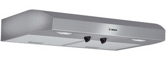
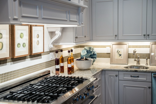
I'm not sure I would have added the vertical metal stripes on the hood, but there is interest in lines and circles used near one another, allowing for another focal point on that wall, and it is simple in its execution. And, classic.

The marble works well and adds to the cool/warm design. It was smart not to add the strong tile on to the other walls.

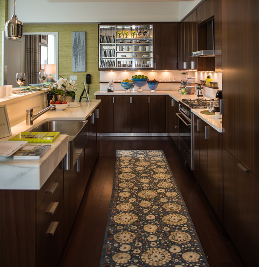
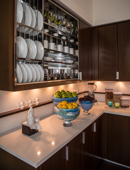
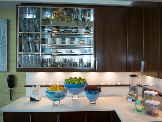
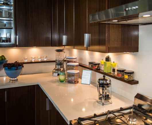
Now to the cabinetry

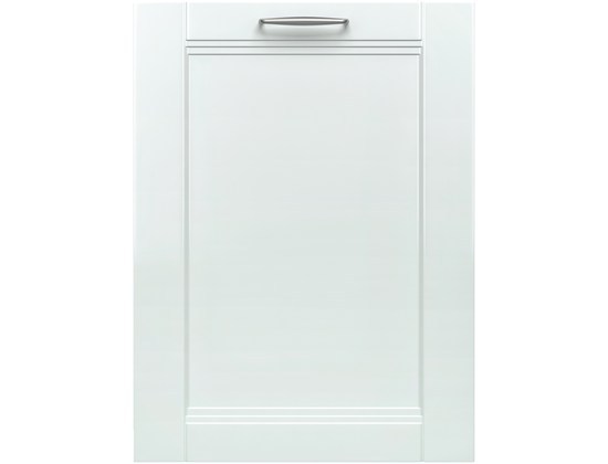
I have a few issues here. The door design is absolutely fantastic - stunningly different, interesting, original. Love it. 

Personally, I would not have wrapped the cabinetry around on to the range wall. I'm more conservative with cabinetry and don't like to fill all spaces in with cabinetry. There are other alternatives. 

I would also have done something more interesting to the right of the refrigerator. My guess is that the designer wanted to keep things simple and have the cabinetry be sort of cohesive "blocks" in a sense. I think there would have been other opportunities, lots of them, to add interest, but not clutter, on this wall. 

One thing that could have been done is to use fewer cabinets but have them float on the wall, allowing for about 15-18" or so of wall space on either side of the cabinets. That would still be simple and they would appear more "dressed", less utilitarian. 

One could also put up simple but industrial stainless steel shelving which could tie in the appliances and strong hardware, as long as there were few, but properly proportioned items on the shelves. Or span a stainless shelf in between 2 cabinets. There are lots of other things that could have been done on this wall. 

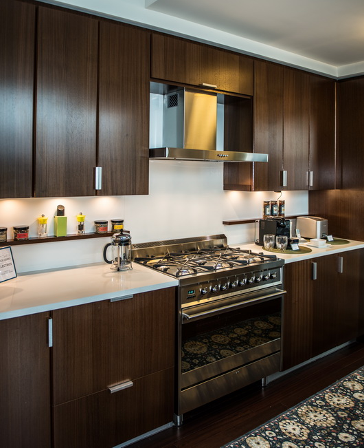
I'm not sure the island had to be that long - it is definitely an obstacle to the refrigerator. Making it a little shorter at the range end would help immensely in traffic, especially as people are walking back and forth in real life. It's always a challenge when there are windows and doors and room connections going on, to find places for appliances, so I understand why the refrigerator is placed there. 

That said, which way should the refrigerator be hinged? Given the location of the sink and range, possibly the other way.

I may have added a cabinet that sits ON the counter to the far right of the sink which would also be more of a furniture look than what appears to me to be too large (wide) of a cabinet in that location. Given the elegance of the kitchen and breakfast room, to my point of view, that cabinet just appears to have too much of a "box" look. It's subjective, for sure.

Very cool lighting and love the turquoise ceiling! It was a fantastic event. What do you think of this kitchen? Would you change anything?

Mecox Gardens - Finding Design Inspiration

Saturday, I took a day trip out to the Hamptons. It had been gloomy most of the week, cold and miserable and the morning was a) a Saturday-yay! b) sunny c) much warmer - all good reasons to go exploring on the east end of Long Island.

Designers find inspiration everywhere and my day trip began with a visit to the stunning, new, Parrish Art Museum, a fantastic place to expand your vision. I cannot overstate what a beautiful museum this is. The backdrop of this elegant, organic building (in design and materials) was perfect for appreciating the art within.

This was followed by a stroll through the truly fabulous shops in Bridgehampton, a visit to Tom Colicchio's new, gorgeous, restaurant and hotel, Topping Rose House built in 1842, by the way and newly restored, and more sensory stimulation as I picked up a few things at a favorite market, Citarella. Even my purple potatoes in my salad nicoise were a visual pleasure! I do enjoy being in the Hamptons in the off-off season-it's easier to slow down and take it all in.

I allowed time before heading home, to stop at Mecox Gardens in Southampton. I've visited Mecox Gardens shops in New York City, Southampton and East Hampton many times. I love the design vignettes they put together in their shops and I also love the jumbled look of objects just waiting to be discovered.

Below: The main entrance

I hope these images convey the beauty and style of the objects. So many of these objects can make their way into the kitchen, now the most important living area of the home.

The modern kitchen has indeed been redefined. Since many of these objects have a sculptural quality to them, you can create a focal point that may be experienced as a foundation in a modern style but might also have a traditional, cottage, handcrafted, natural or other characteristic as a sort of companion to the modern object, often adding warmth. The modern kitchen may well have a mix of a few styles to create a unique look. Your personal take on modern interpretation will also benefit from guidance by a design professional to communicate the style message effectively. Take a look and be inspired!

The day was a mix of new and old, modern and tradition via art, architecture, home furnishings, even food. Taking some time out just to explore and soak in disparate types of beauty, just because, is a prescription for, you guessed it, design inspiration!

How To Design A Kitchen - Kelly's Kitchen Renovation

The design of a kitchen is not just about choosing where to place cabinetry and appliances and then filling in the blanks. Actually, there are many, homeowners and pros alike, who attempt to make the design of a kitchen a simple affair in favor of speed to quickly move forward on the project. But, it shouldn't be that way. 

This was Kelly's existing kitchen. The floorboards are approx 6" wide, so you can tell the space between the table and the cabinetry and entrances is small! It simply has no focus or interest; a case of "fill in the blanks."When I design a kitchen, I don't plan around any one element first, such as cabinetry, appliances, countertop space, other storage, windows, dining area or traffic flow, allowing one single element to drive the rest. Each of these elements mentioned are not only important, but critical to consider nearly equally with one another. What that means is that all elements must be considered at the same time! Really!

So, it becomes an exercise in: "if this, then that" over and over again. That's where the vision comes in - to quickly and frequently look at the "big picture" in different ways and evaluate it objectively. I love the initial chaos of it all! You're actually in limbo for a little while. It starts by my doing a number of floorplans for comparison purposes. Autokitchen renderings brought the kitchen to life throughout the process. Don't miss many universal tips in the solutions entries below - that's where the answers lie!

This is the final plan chosen among about 5, and the orientation is the same as the image above. The door is removed (another exterior door is a few steps away from the kitchen at left but down another few steps to the outside), the short wall serves as a divider and the dining area is expanded..among other changes! The shallow leg adjacent to the sink wall was designed into the new floorplan-it was not existing.

This approach becomes more intense when I am designing a small kitchen, such as Kelly's. There is no room for error! Following is my thought process on designing Kelly's kitchen, just below. You will see that some solutions are repetitive - that's because some solutions killed two birds with one stone (what a saying!) 

  • Storage: Kelly would kill me if she ended up with less storage (and she kept asking me if she would) so storage played a big role. However, the boring, unattractive upper wall cabinets and base cabinets were visually intrusive and too "kitcheny" not to mention depressing so those had to go. Somehow storage had to be equally beautiful and ample AND far less intrusive to the eye.
  • Solution: I designed a pantry into the plan, I encouraged Kelly to evaluate what she really needed in her existing cabinetry, we utilized a very cool backsplash rail system for utensils, and I designed ample drawer storage for serveware and cookware into the floorplan. Cabinetry was dramatically reconfigured AND beautiful!
  • Entertaining: There is no dining room, so the kitchen MUST seriously double as an entertaining area.
  • Solution: I found room for a big, bold, dining area with a banquette on two sides, offering flexible seating and the ability to extend the table and put a chair at the open end if necessary, accommodating 8-10 people, seated. Too often, I have seen dining areas be an after thought in kitchen designs. This dining area was a critical piece to the floorplan.


  • Selecting Appliances: The existing refrigerator was 30" wide, much too small to suit their needs. The dishwasher was beyond repair, the range was very worn and stuck out like a sore thumb and the hood was a sorry excuse of a hood!
  • Solution: Bosch appliances filled every need for this kitchen redesign. We chose a 36" Bosch refrigerator with lots of great features. I recommended Bosch's safe, powerful, and efficient induction cooktop and a Bosch convection oven that would be built below the countertop for a sleek look. The Bosch dishwasher is a workhorse with a convenient top tray for utensils and is one of the only dishwashers that can accommodate a tall toekick that we needed for our cabinetry. I wanted to make a design statement by using a moderately priced and sized Bosch hood, which we outfitted with a tall black chimney pipe for a cool look. Kelly will discuss the performance of these appliances soon!
  • Sink/Faucet: Kelly wished for a large sink and we found a wonderful modern style cast iron sink by Kohler, the Indio. The color is sophisticated, it blends beautifully with the countertop and has a cutting board as an accessory which adds to the prep space. The Kohler Karbon faucet is sculptural in its design and functions beautifully. These choices were critical to the look of the kitchen...we wanted the sink to be understated, the faucet to have an artistic quality to it and we needed both to be high performance.
  • Countertop Space: Kelly is an avid cook, so counter space was important!
  • Solution: I designed the countertop, by Silestone, to have as few every day items on it as possible, freeing up most all of the counter space for prep. We wanted the countertop to blend with the sink, again, as an understated design element, working beautifully with the cabinetry. Part of that design was to use a useful and beautiful rail system by Kessebohmer
  • Small Appliances: Small appliances needed a home - in any kitchen, they creep on to the countertop and before you know it, you end up having very small, shallow pieces of prep space. I vowed this would not happen in the new kitchen - but how?
  • Solution: A new shallow "leg" was planned to be an "L" off of the sink wall solely to house small appliances. All cabinet L-shaped turns do not have to be 24" deep! Kelly also wanted a spot for the waste bin that she loved (true!) so I included that in a featured area of that section for a hip, useful, look. I didn't see the need to persuade her to rethink where to put the trash.
  • Traffic Flow: Existing traffic flow was simply horrible and needed to be changed. The door and table location in the existing kitchen made a sort of maze which was difficult to move around. The area around the table was cramped and cooking/prep traffic was inefficient.
  • Solution: I offered several plans, some with a more open traffic flow than others. Kelly chose the one with the most freedom of movement in the kitchen work area. I quickly thought it would be a good idea to put the table 90 degrees in the other direction, design in a smaller table than the existing oversized table, use a banquette for added space and expected that it would improve the traffic flow times a million! It did.

  • Seating needed to be mega maximized since there is no other dining space in the home and they like to entertain friends and family, not to mention the needs of 2 growing kids who are constantly on the move.
  • Solution: Nearly right away, I thought the table should be turned 90 degrees from its existing position. Most of my plans included a round table in the corner, also with a long L-shaped banquette, but we later decided on a rectangular table. The banquette offers lots of freedom in seating for kids and adults.
  • Non Cooking Activities: Kelly sews and does all kinds of projects with the kids, so there needed to be comfortable and adequate accommodations for project work.
  • Solution: A good sized table and a big, flexible banquette allow for good flexibility for seating and working. The kitchen is not only about storage and appliances! It's about lifestyle needs!
  • Windows: The lack of windows made the space seem smaller and the small windows that were in the kitchen did not look or perform well.
  • Solution: A quick, early thought of mine was to add large windows to visually expand the look and feel of the entire kitchen, allow those dining to enjoy the lovely view beyond and create a dining space with a more open feeling, in part, so one didn't feel so connected to the "work space" of the kitchen. The window at the sink area goes right down to the countertop!
  • Aesthetics: Aesthetics had to be on EQUAL footing with a functional floorplan in order to have a comfortable, visually interesting and spacious feeling kitchen.
  • Solution: To gain a spacious feeling we used lots of white (including refinishing the floors in a very light finish), large windows, strong horizontal lines, expansive surfaces of tight or small patterned materials and designed a floorplan for freedom of movement. The cabinetry reads as furniture, creating a seamless transition from the living area beyond. Functionally, we positioned open shelves with useful items far away from the dining area to not be obtrusive, found a home for small appliances to enhance the countertop use around the kitchen, added a pantry and used drawers and interior roll out accessories for efficiency. The dining wall, painted dark gray, evokes a more elegant and separate feeling in the dining area. We incorporated shelving for useful items and to create changing decorative displays of artwork and objects.

  • Lighting: The light fixtures in the ceiling did not work aesthetically and there was no accent lighting or task lighting in the existing kitchen.
  • Solution:  We relocated a ceiling fixture, did much reswitching and added lots and lots of task lighting and accent lighting which completely transformed the kitchen into a living environment which can accommodate many focused lifestyle uses and moods. We used Hafele products, which are state of the art in aesthetics and function. More on lighting soon!


The "Wall": The short wall to the left of the existing sink wall turned out to be in the perfect position in the new kitchen plan as a dividing wall for the dining space.

We tried hard to work within the existing footprint. While a variety of about 6 or 7 plans were provided by me to Kelly and Dave, in the end, there was not a compelling reason to move the sink. We moved the refrigerator and cooktop a little bit, but that was easy to do. Their desire was to keep labor costs low and work with what they had. 

Could you honestly pick one of these items above and say it should be the driver of the design? Not in my world - they are all important pieces to the design puzzle, all very nearly equally important! It is important as first mentioned, to be able to quickly analyze: if something is changed, what is the pro or con and what does it effect next? The reason this post is so long is because there are so many issues in any kitchen design to tackle, and I bet I'm forgetting a couple more!


Thank you to partners: Kohler, Silestone, Bosch, Hafele, Kessebohmer, autokitchen and Kravet who donated products or services and who had the vision to know this renovation would use their products in interesting and creative ways!

Red Kitchens for Valentine's Day!

By: Susan Serra

I've been working on this for days in spurts of inspiration! I'm not a huge fan of Valentine's Day; I mean, it's sweet and all that, but I've never really been excited about it, but for some reason this year red kitchens are beckoning to me to be enthusiastically showcased and I'm happily running with it!

You've got to be gutsy to go red, no doubt about that. You can do red in accents or in bold swaths of visual volume. I happen to LOVE red countertops with medium toned wood. Seriously, this is one of the unsung great combinations if the right undertones coordinate. 

I think red in traditional kitchens, which I don't have featured here, look sort of farmhouse-like and add lots of cheerfulness to a country kitchen. 

Red in modern kitchens are clearly meant to be a design statement - the form of the cabinetry itself is the intrinsic design statement. Here we go!!!

Below: HTH kitchen showroom in Copenhagen

Below: Nolte

Below: Express-Kuechen

Below: Marazzi Design

Below: Creativ, Euphoria

Below: Ballerina kitchen display

Below: Poggenpohl kitchen showroom in London

Happy Valentine's Day!!!

westedge Design Fair, October 3-6, 2013

We are deep into design fair season, which takes place in the first half of each year (for many design fairs.) I'm going to go back and forth between the word "fair" and "show". In the kitchen industry, designers tend to use the word "show." We often say to colleagues we see at design shows "Have a good show." In Europe, they use the word "fair." But, I digress!

I attend a fair amount of design shows (no mixed use intended) during the year and love the hunt for new products....like, LOVE.

westedge (all lower case) is a NEW design fair that takes place in the fall, which I'm really excited about. High Point is in the fall, and I've been there a few times, but westedge will be different. I expect that it will be a showcase for innovative design, whether that innovation translates into modern, updated tradition, or other original design concepts. It will be special.

I know the directors of the westedge design fair, and together, Troy Hanson and Megan Reilly have managed some of the most renowned design fairs in the U.S. They are on top of every single detail to create the best experience for both the exhibitor and the attendee. I know this from both perspectives, having worked with Troy and Megan before. 

With this venue, this team, and this time of year (perfect to seek a fresh design perspective and linger a bit more in a summer vibe too) I know this will be a show of GOOD design. My guess is it will be curated. The website is very small and somewhat sparse right now, but it's also very early in the year. 

I'm compelled to write this post just because of my faith in this team and their vision. I'll be watching the site as it grows and can't wait to hear more as time goes on! 

Kitchen Trends at IMM LivingKitchen 2013 - Blues!

As I walked throughout the different sections of the IMM Cologne Living-Kitchen fair in Germany, one of the common threads I spotted was the use of blue. The blues ranged from dark teal to more cobalt in color. Most commonly, they were deeper shades of blue with a touch of warmth. 

I found this color range to be dramatic and fresh. I would not call it a strong, mainstream trend at the show, but if you are considering blue in your kitchen design, here are some ideas for incorporating this different color, in different ways.

Below: It is not often that a dark color is designed as wall cabinetry with white cabinetry below, usually the opposite, but in this case, the tall, dark, toekick section adds a solid foundation to balance the upper section. 

Below: A perfect example of less is more, allowing the faucet to be featured as a sculptural piece.

Below: A quiet deep blue backdrop ties in with blue accessories, allowing the white cabinetry to "pop".

Below: A gutsy move to design in a blue floor, the gloss and richness of the color adds style. I'm not sure I'm fully on board with the choice of table on this floor.

Below: Graffiti as art, perhaps inspired by plants, surrounded by blues and greens and coordinating blue floor. I'm ok with the cabinet color, but I would have chosen a different backsplash to work with the graffiti.

Below: Simple, straightforward cabinetry that's interesting and very attractive to look at. The wood planking above adds needed warmth.

Below: An active mix of texture and clean lines and finishes, it's a good looking area which doubles as storage.

Below: I can see this color could highlight many other colorful accessories and useful items - I really like the use of this blue in this context.

I'm wondering - since we are moving ever more toward the kitchen as a living area, and as we coordinate with surrounding rooms, perhaps it's a natural time to consider using blues in the kitchen? Hmmmm...I think that's an intriguing concept!


Gloss + Color Blocking Kitchen Design Trends - LivingKitchen 2013

Continuing my (enthusiastic) march toward sharing the many trends that I spotted at IMM Cologne's LivingKitchen, today's two trends which I saw quite well represented are:

  • Gloss cabinetry
  • Color blocking in cabinetry

Cool, right? They definitely are two hip trends, often mixed up with other kitchen design trends that I listed in my first post on this show.

There is no doubt that nearly every European cabinet manufacturer puts their most creative foot forward in an effort to present eye-catching displays - and it certainly works, like a magnet to design lovers! Well designed, tasteful, cabinet designs are very enjoyable to see, and to learn from too - always, to learn from. Part of the learning process is to look for design attributes which "speak" to you, adding to your global (as in overall) view of design. At some point soon, I will share what I discovered that spoke to me personally. 

To my eye, these kitchens are uncluttered, which gives an opportunity for a design to be fully appreciated. While I would not say these trends were mainstream, they were quite prominant.

GLOSS CABINETRY


COLOR BLOCKING CABINETRY

Of course, committing to color could be risky, depending how it's designed into the kitchen. If designed into the kitchen in a way that could be temporary, which is possible, it could be an easy "out" to replace one section of cabinetry, should you get tired of it. In that scenario, put that chartreuse section of cabinetry in the garage, basement, or other area to add to household storage needs.

Some design decisions are the type where, once you are on the "other side" of the decision, which happens during installation, you don't always know exactly how you will feel. That's surely where a design professional can reduce the anxiety by providing expertise and drawings to work it through as completely as possible. I definitely think many of these designs are innovative, bold, and worthy of study. 


Kelly's Kitchen Series - Appliances by Bosch

Kelly's turn.....

We are so excited to begin our series on my kitchen renovation!  The entire experience has been a wonderful learning process, an opportunity to collaborate with my mom, and only a slight exercise in patience! Following is an overview of the beating heart of the kitchen - the appliances. 

Since we couldn't design the kitchen without knowing which appliances we would be using, we enthusiastically jumped into the appliance world. There's something about appliances that gets this girl - and I suspect most homeowners - excited to learn about all the new features, modern technology and sleek designs. My interest in fashion temporarily took a sharp right turn in favor of an appliance obsession! Bosch appliances were the perfect match for our aesthetic and functional needs.

My husband, Dave, and I, assessed our needs and wants, while keeping in mind how each appliance would fit in with the overall design and function of the finished space. Here's what we chose and why.  In a later post I'll follow up with performance notes.

We finished our kitchen just 2 months ago and in that time, my cooking processes have changed in a number of surprising ways I'll get into soon!

Refrigerator

We had a few requirements entering into this decision. 

  • We knew we wanted a side-by-side refrigerator to give us easier access to the freezer without having to bend down and dig through a single crowded drawer, and 
  • We had to have more space than our current 30" refrigerator provided.  
  • A counter depth easily semi-built in design 
  • Functional interior accessories and features

Enter the Bosch 36" Side by Side!  This refrigerator fit the bill perfectly, offering many great features such as easily customizable digital programming, filtered water and ice maker, and an energy efficient cooling system. This was a dramatic improvement over our previous, much smaller, refrigerator.

Bosch 36" Counter Depth Side by Side Refrigerator - 800 Series, Stainless Steel


Oven

We debated briefly between a slide-in range vs. an under counter oven with separate cooktop.  We chose the latter in order to achieve a more built-in, streamlined look to complement the minimalist design of the cabinetry. We loved how the continuous form of the countertop allowed the eye to flow uninterrupted.

But, Friday night pizza night? More about that shortly-including convection drama (my mom would call me - um, repeatedly - and ask "are you using the convection settings???")

Bosch 30" Single Wall Oven - 800 Series, Stainless Steel
 

Cooktop

Once we decided on a separate oven and cooktop type of installation, we knew an induction cooktop was the way to go.  Bosch's impressive induction offerings were right up our alley with their AutoChef sensor, easy to use touch controls, and super fast heating ability.  We chose the 30" size instead of 36" to maximize our counter space which, given our lifestyle, was a higher priority.

Bosch 30" Induction Cooktop with SteelTouch Control and AutoChef - 800 Series, Black & Stainless

Hood

We debated between designing in a low profile hood (used in typical under cabinet installations) vs. a very cool chimney-style hood.  Originally, I thought I wanted a more substantial-looking hood that would signal "serious cook with serious ventilation needs," but after consulting with my mom, we set out to re-imagine and subsequently design-in a fresh look for this otherwise functional workhorse that typically sits obediently around wall cabinets above and alongside the hood.

More on this later, which was one of the more exciting and innovative elements to design into the kitchen.

Bosch 30" Under Cabinet Ventilation - 800 Series, Stainless Steel

Dishwasher

Our existing dishwasher was loud, leaky, and as unattractive as you can get, and it didn't fully clean the dishes! Yuk! Dishwashers have come a very long way in performance and aesthetics since ours was installed in the "dawn of kitchens age", it seems.

We chose a custom-panel dishwasher to support a visual flow of our cabinetry, and not disrupt our goal of a "furniture" feel kitchen.  We also needed it to be quiet, as our sofa is situated a mere few feet away from the dishwasher and we often run it during our prime-time TV viewing hours. But, what we discovered in its functional abilities went so much further than good looks - more later on that.

Bosch 24" Panel Ready Dishwasher - 800 Plus Series
 

I can't wait to elaborate on the performance of these appliances.  In short, we couldn't be more pleased, and are blown away by the tremendous enhancement they've been to our lives.  Ultimately, I'm really glad we followed a few important guidelines when choosing appliances and didn't get swept up in either the aesthetics or current trends when making our decisions.  

Here's what we kept in mind to make the most educated decisions possible: 

  • Bigger is not always better - really evaluate if, for example, you will use a full 6 burners often enough to sacrifice the necessary counter space. 
  • Energy-efficient may not seem like an exciting feature, but over time, you will appreciate the cost savings in your electric bill
  • Think about your overall lifestyle when evaluating appliance needs - for example, our need for a quiet dishwasher, due to the positioning of our kitchen or a low profile hood
  • Look at the overall footprint of your space in terms of whether minimalist, sleek appliances designing in appliances as focal points works for you.

Our thanks to Bosch for donating appliances in support of this kitchen renovation. More, soon, on my kitchen renovation - details, products, design issues, and what kept us awake at night!


Modenus + BlogTour = Inspiration Defined

Modenus is a web based interior design resource with carefully, even lovingly, curated products found in all corners of the world presented in an organized, and beautiful, directory. The products on Modenus are at a level beyond "the usual." The site is a delightful journey of discovery. Veronika Miller, founder of Modenus, personally travels to design shows in the U.S. and abroad, continually in search of new, different, and fabulous products for designers and homeowners to find. But, that's only part of Veronika's mission. 

It was upon my return to my bubble (my office) after an eight day, very busy, design focused trip to Denmark and Germany 10 days ago, that I thought more about Veronika, which compelled me to write this post.

Veronika, a designer herself, going back some years, fully understands what it means to work day in and day out as a creative professional. Understanding what designers need, she developed and launched an extension of Modenus, called BlogTour. Veronika and her team select a group of influential design bloggers and take them to a city to participate in that city's "design week" shows and events. 

Image: Susan Serra | Thinking of design as I walk in London with the BlogTour group!

Veronika understands that designers and those who love design are creative people, open minded to new points of view, design concepts and product inspiration. But, beyond this insight, what really happens on BlogTour is a little bit of magic.

Veronika, on behalf of Modenus, knows that this love of design that design bloggers have translates to a heightened awareness of design in all of its forms, particularly when experienced in a new location, outside of the design blogger's bubble.  Design bloggers (some are working professionals) attend events of a diverse design nature during BlogTour. These varied events over the course of 5 days (with much free time to walk the design events in one's own way) open the design bloggers' collective awareness to:

  • new experiences where one has the luxury of being a "follower" and can just take it all in
  • new friendships with people of different states, regions, countries adding interesting social dimension
  • discover cutting edge, exciting, products, design concepts, solutions and materials as well as products of other period styles and themes
  • engage in endless conversations on design with lots of smart people in different design disciplines
  • view design in a historical context, whether walking down the street, visiting a museum, or a 100 year old pub
  • observe many different design disciplines, whether graphic design, industrial design, packaging, mechanical, fashion, crafts...and more
  • listen to speakers, noted local and sometimes internationally known designers and manufacturers who speak just to our group
  • more...more...more via many types of visual arts and printed materials, as tools which stir the senses

Veronika's mission, in a nutshell, is to nurture designers in an effort to achieve all of the above benefits just mentioned, in a location (often) far from home. BlogTours have taken place twice in London (one of which I attended), New York City (twice) and Germany (with a bonus day in Amsterdam.) 

One of many design events we attended along with other, both small + large venues around London

Just 2 weeks ago, I went to Cologne, Germany as part of the BLANCO Design Council group tour to IMM Cologne LivingKitchen. The Modenus Cologne LivingKitchen edition of BlogTour with all of its enthusiastic, top design bloggers, were there as well. Both groups gathered together at planned events. We talked design, saw old friends, forged new friendships and had a whole lot of fun. Heartfelt thanks and appreciation go to BLANCO as well, for their continuing demonstrated commitment to inspiring designers via their own version of a tour to the LivingKitchen fair for members of their Design Council (I am a member).

My point here is that for some reason upon my return, I realized in a much bigger way than I do typically, that designers NEED to get out of their design bubble (their offices) as often as possible - and going far away is a bonus.

While truly a guardian angel of designers, perhaps a designer whisperer as well, Veronika Miller a.k.a. Modenus needs partners to make BlogTour happen. Product sponsors underwrite the costs - a huge win-win for sponsors to have attention focused on their products by top bloggers who write about them from their own unique point of view. It's a gift that never stops giving for sponsors (as well as for organically discovered non-sponsored products found at all the events). Once all the blog posts are up, google search takes it from there. Then, there are all the other social media channels humming with design bloggers' authentic opinions on what they have seen and learned during their trip. It's a win-win-win for designers, sponsors and most of all, other trade professionals who could not attend design week and, of course, countless homeowners, those with commercial design needs, among others.

My own BlogTour experience was truly the best design focused experience I think I have ever had - and I do not say that lightly. Being completely immersed in different TYPES of design expanded my creative thought process immensely in ways I have described above. I went to London ready to be fully open minded. Veronika knows this will happen to those who love design. 

Veronika works through a variety of issues before and during any given BlogTour such as delays, changes in plans, spot decisions, ridiculous travel logistics and remains focused and moving forward. I wonder if she has ever been called a guardian angel of designers. That's what she is. I'm grateful to have attended BlogTour. It made me a little bit better of a designer. 

Refreshed interpretation of a traditional woven rug

My passport has been getting a lot of use these last few years as I travel to design events. Upon my return from this trip, as I now think back on it, it's all so worthwhile...and important to my growth as a designer. Interestingly, at a Twitter chat which took place earlier this evening (I've been working on this post for 3 days) these tweets authentically support the BlogTour experience I am speaking of, so I share them here.

 so true! RT : A4 biggest takeaway: theres a whole world out there - embrace it, learn from it#blogtourcgn

 A4 also, to be better designer + blogger get out and live life more, seek to see new things, meet new people

 What blogtours are all abt “: A4 biggest takeaway: there's a whole world out there - embrace it, learn from it #blogtourCGN 

Just recently, Modenus was tapped by the NKBA and other industry sources to bring fresh ideas and insight to the venerable trade show, KBIS 2013 as clear recognition of the understanding Veronika and her team have of designers and what their needs are. I can't wait to attend!

Discover the products in Modenus, read the blogs and other design news within the Modenus site, AND read the blogs of those who have gone on BlogTour - you will find passion, renewed design insight and a little bit of magic that has been cultivated by the BlogTour experience.

Kitchen Cabinet Trends - IMM Cologne LivingKitchen 2013

SO! Now the fun part starts as I begin a series of follow-up posts to my initial breakdown of kitchen design trends I spotted while at IMM Cologne LivingKitchen a couple of weeks back. The first category to focus on is cabinetry style. Without further ado, the gorgeous images!

Cabinetry Style 

Below: Without equivocation, neutrals remain the stronghold of today's cabinet finishes. White painted or laminate cabinetry, light woods (more than I've previously seen in the past several years) and greige dominate. Black cabinetry is well on the periphery, as are dark wood finishes.

What do you think of these styles? Due to this image-heavy post on just the first kitchen design trend noted, I'll leave it here for now and will be covering all of the trends noted as quickly as possible!

Kelly's New Kitchen - It's Personal, Smart, and Flexible

Kelly's kitchen (see Kelly's picture on the right sidebar and wave!) was just finished a couple of months ago after a year of planning and 2 months of renovation! While our images quickly show the overall design of the kitchen, there are MANY features, both aesthetic and functional, that bear dissecting and sharing with our readers. 

Design is often the art of nuance, and this kitchen is all about nuance!! You'll see how soon - this is the start of our series! In each post, we will provide important tips, insight on how a designer thinks, the collaborative process and product information.

When you design a small kitchen, in this case, close to 200 sq ft, (small for the suburbs, huge for Manhattan-and we have (separate) personal living experience in no less than 6 Manhattan kitchens) every decision, no matter how small, is critical! With no additional dining space in the home and needing to accommodate a wide range of activities, it's a design that is either pass or fail once kitchen living begins post-renovation.

Kelly's new kitchen reflects the choices and compromises of real life needs and desires of a young family in their first home. It's a mix of DIY, designing around architectural elements we chose to keep in place and others that we chose to remove and replace. It's about designing with the end always in sight, including the surprisingly important decorative layer.

The kitchen (as many do) needed to serve these purposes:

  • A social kitchen - comfortable to be in for long periods of time
  • Able to accommodate as many people as reasonably possible
  • Appear as spacious as possible while balancing storage needs
  • Allow for a decorative layer including "real" artwork and treasured artifacts
  • Capable of change, which we will talk about in depth later, possibly the most exciting aspect of this kitchen renovation
  • To add an enhanced dimension of efficiency and function to the cooking process
  • Accommodate multi-functional activities (more about that later)
  • Reflect a highly personal design aesthetic overall

We are fortunate to have wonderful partners who donated their products and who had the foresight to see that this kitchen design would provide intelligent and interesting solutions to common design issues. We're proud of how it all came together, and as mother and daughter, we didn't even have a whole lot of drama during the process! Ok, we each took turns with some creative techniques of persuasion...true enough! I may or may not have coached Kelly on how to present controversial design ideas to her husband, a "trust but verify" kind of guy. ;)

So, thank you to our partners:

Next up, Kelly talks appliances - what was selected and why, where they should be best positioned, features, design integration, and more. Here's our nuclear family-the only one missing is baby Annabelle.

Kitchen Design Trends At IMM Cologne - LivingKitchen 2013

As I get settled in to closely study the nearly 1800 images that I took in a 3 day period at the fabulous IMM Cologne's fabulous LivingKitchen trade fair, I see that this first post needs to simply be an overview of the trends that I spotted. The images that I captured of the stunning displays at the show demand multiple posts, an expanded visual documentation of these trends-coming next. 

I will also be spreading the image love throughout my other social channels, so please follow me here: The Kitchen Designer blog - right here! Sign up for the feed top right or via email, under my picture on the sidebar:   Twitter  +  Google+  +  Facebook +  Pinterest (Pinterest will have both blog images as well as lots of new images from my hard drive). I'm barely beginning to add those images, so check back.

As I look through the images, there are two main categories of design that come to the forefront for me. The first category is those companies whose sole purpose is to be on trend and second, those companies whose purpose it is to do their own thing without much, or less, concern for trends. BOTH types of design are extremely creative, but that word, "trend" can manifest itself in a tricky way if the entire kitchen design one puts in one's home in 2013 is solely based on the hot, new, trends. Like chocolate, trends are fun to indulge in, but an all chocolate diet (while enjoyable to dream of) will cause problems later! Don't trend-binge design! 

Since I also attended this show when it was last held two years ago, it's an interesting exercise to compare both sets of images that I took to get a better sense of how design has evolved in Europe. Here and there, I will be mentioning what's evolved since 2010. And, a thank you to the U.S. and German teams at BLANCO for inviting their U.S. Design Council members, of which I am one, to experience this show with them, providing opportunities for our group to bond as colleagues and friends.

Here are the 2013 Kitchen Trends I Spotted - Brief notes are below with more details/features/thoughts to come in subsequent posts! "M" means it's a mainstream trend throughout the show. "P" means some dots were connected throughout the show but it is not mainstream. "P+" means more than peripheral, less than Mainstream.

Cabinetry

Cabinetry Style:

  • White (lots), light woods, and greige colors - NEUTRALS as a foundation - M
  • Use of texture/natural elements integrated into the design, whether in countertops, backsplash, or cabinetry, often driftwood-y looks, real or faux - M
  • More warmth in the designs overall than I found two years ago-definitely, added comfort - M
  • Gloss or glass combined with texture/more glass in general - P+
  • Color blocking - the color accent of choice for this show was orange! P
  • Blue/dark gray, usually medium to dark GE's new slate finish is on that one! P+
  • Warm, modern design overall - M
  • Usually soft contrast in coordination of material colors in a kitchen display, but sometimes bolder contrasts - P+
  • Use of horizontal lines in overall design (not new, but an important European design element) - M

Cabinetry Features:

  • VERY long drawers, lots of countertop lifts for multi-use (countertops/wall cabinetry/more) and as always-useful, very cool drawer inserts - M
  • Seemingly even shorter toekicks - P+
  • More cabinet cubicles than open shelves-often in unexpected places, always with lighting - P
  • As in 2010, lots of fun and playful geometry in cabinet design - P
  • Integrated benches to rest, sit, or display decorative or useful items - P
  • Tight/seamless appliance integration - M
  • Integrated handles or long, modern, pulls - M
  • Same countertop as cabinet fronts - P
  • Channels between drawers and under countertop - P+
  • Concealed close-like tall and wide sections  - P+
  • Open concept philosophy, considering a kitchen's design connection to surrounding living areas-very clear to me - M
  • Intersecting design elements - P+
  • Open cubicles designed into tall cabinetry for interest - M

Accessories

  • Organic in nature via textural ceramics, hand carved wood pieces, real greens and other handmade items - M
  • A fair amount of skins seen on floors and benches - P+
  • Rather than pattern, accessories communicate the style and theme - M
  • Large in size (perhaps to call attention to the display since it is a trade show) - M
  • Lots of rail systems - attention to universal design, seemingly even shorter toekicks - P+

Countertops

  • All thicknesses - super thin, thick, or in between - M
  • Different materials next to one another in a flush installation - P+
  • Patterned countertops - plaid, modern art, new designs (new look, not a trend) - P
  • Glass - P
  • Wrapped countertops - waterfall on each exposed side (not new, but it's still current and is SO chic) - P+
  • Lifts to raise/lower or conceal a cooktop - much more prevalent than two years ago - P+
  • Cooktops integrated flush with the countertop - P+
  • Built in dining configurations - M
  • Intersecting design elements - P+
  • Stainless steel with integrated/seamless stainless sink - P
  • Virtually no granite or marble - just simple, understated, tightly patterned surfaces - M

Backsplashes

  • Simple, plain, continuous, whether wood, engineered stone, or glass - M
  • Sometimes a 1/2-3/4 height, leaving wall space below the upper wall cabinets - peripheral trend - P
  • Very little tile - M
  • Real wood or faux - M

Appliances

  • Hoods - Look like lamps (not new, but getting nicer) - P+
  • Hoods - double hoods over cooktop - P+
  • Hoods - Integrated/toned down/hidden hoods and blowers - P
  • New, warm, greige mid tone to dark glass appliances - P+
  • Stainless/color mix (reminds me of Whirlpool ICE - P
  • All appliance types very seamless/tightly integrated into cabinetry - M
  • More white appliances seen - P+
  • Ovens concealed - as seen last time too - P+
  • Ovens as an important design element - M
  • Flexible, open, vessel placement (anywhere) on induction cooktop - P+
  • INVISIBLE refrigeration - M
  • Sinks & Faucets - matte, modern, quietly elegant - M

General 

  • Doubles - double hoods, double light fixtures, double cabinets, other doubles - P+
  • Not much vintage/retro/industrial representation - a touch here and there but mostly warm/earthy/modern design - M
  • Occasional attempt at what looks like American Shaker - P

Cool Factor! - Images to come, for now, just descriptions (these are sometimes one-offs)

  • Countertop lifts 
  • Glass patterned countertops
  • Framed multiple ovens
  • Nearly invisible induction burners integrated into countertop
  • Choice of touch screen or knob controls
  • Plaid cabinets
  • Colored glass cabinetry applied as modern art (wait for the image)
  • Awesome, seen more than once, patchwork of wall cabinetry
  • Glass countertop, cabinetry and glass supports in one display
  • Loved the function of a glass sink surround
  • Glass drawer inserts
  • I'm sure I'll select more! 

Lighting

  • LED lights for shelving, around cabinetry, in open shelf cabinets - M
  • LEDS een as a feature in color in appliances (not a trend, just something new)
  • LARGE lighting fixtures, oven seen in doubles over an island - M
  • Simple, rounded, modern shapes in fixtures, often in matte finishes - M

Flooring

  • Lots of light, textured, natural wood, very light, very Scandinavian - M
  • OR, gray or white solid flooring of some sort, with no pattern, perhaps vinyl - M

Dining

  • Benches - M
  • Benches with cushions or skins - M
  • Modern design - M
  • Natural, matte, wood surfaces or matte stone tabletops - M
  • Fresh, modern, designs - M
  • Surprisingly, chairs are often matching or closely coordinated - M

This post is so long that I'm only going to show one image that I took from the show - shortly, LOTS AND LOTS OF IMAGES to illustrate my points above!!!

Leicht Display-Image by Susan Serra


International Kitchen Design 2013 - Introduction to IMM Cologne

Attending the Living Kitchen fair in Cologne, Germany, as a special guest of BLANCO and member of BLANCO's Design Council, is the equivalent of closing your eyes as you prepare to go to sleep and soon after, entering dreamland - kitchen dreamland!

The kitchen dream is intense, one of those really vivid dreams; it takes you to wonderful new frontiers in kitchen design and technology. There is beauty in many forms, you're surrounded by great people, many of whom are real life friends! This kitchen dreamland, Living Kitchen, is an international fair, showcasing kitchen products from 20 countries and takes place in 11 halls, set up like a campus.

For the moment, I'll share a few fun images of large, graphic, design elements that are part of a booth's design as well as accessories that embellish an individual kitchen display to get us warmed up for the posts coming shortly!

At last count, and this is probably close to the final count, I see that I took 1,744 images, with possibly a small amount of more images to count.

I worked this show as I do all shows-with a hunger to find common threads in different product and lifestyle categories among hundreds of displays. And, I love the process of the hunt and discovery!! 

Just prior to arriving in Germany, I spent 3 days in Copenhagen to visit family, collect my Scandinavian magazines that I love so much (19 of them, this time) and run through a number of showrooms to see the latest in Scandinavian design, which I will compare to what I saw in Germany. I have about 650 gorgeous images from those few days - more, beautiful, discoveries!!


I've already categorized all of my images, looked through them to find those common (mainstream) threads, uncovered some peripheral trends, and evaluated a bunch of products and/or design elements that qualify for "the cool factor" which I will also show...and more. There is a wealth of information and images to come, so stay tuned!!


So much more eye candy to come!

Cultivate.com Renovation Diaries - Kelly's Kitchen Remodel

Kelly and I are extremely excited to announce the start of a series in Cultivate's Renovation Diaries on Kelly's kitchen remodel which starts today!

We are, right now, in the thick of the remodeling process with (literal and emotional) sparks flying, changing decisions, agonizing over details, declaring the progress GOOD (sometimes after a change or three) and all that goes along with a remodel of the heart and soul of a home executed by a bunch of hearts bound together as a family.

Join us for this five-part series on Cultivate, coming to you on each of the next five Mondays, beginning today.

I'm not controlling. Just because we had this email exchange about our Cultivate portrait:

On Thu, Sep 27, 2012 at 8:13 AM, Kelly Serra Donovan <Kelly's email address> wrote:

other way around!

On Thu, Sep 27, 2012 at 7:53 AM, Susan Serra <susan's email address> wrote:

We could do a funny pic of me inside the house and you peeking through the window...just a thought!

It has no bearing on my thought process - really! ;)

We would like to acknowledge the generosity of our partners - Bosch, Silestone, Kohler, Hafele, Kravet and Kessebohmer who shared our vision by donating products to create a "different" type of kitchen that, with smart product choices and an innovative floor plan, would provide inspiration to others to make your kitchen "your own." Cabinetry is by our brand, Bornholm Kitchen and the kitchen will feature beautiful accessories from Scandinavian Made as well as from Kelly's personal collection.

The first five posts as well as the big reveal will be seen on Cultivate, and after that series is over, end October/early November, we will have much more to talk about on this remodeling journey right here!

Kohler Colors by Jonathan Adler

As color, wonderful, bright, bold, free-spirited, color, has moved into the center of our lives, seen in our clothing, in our interiors in so many forms, in our outdoor living areas - and in all sorts of graphic design online and in print (and that is just for starters-as we know, color has upped its presence everywhere) it makes me think that such a significant part of Kohler's culture has been color-focused.

Kohler has had a love affair with color, and few would disagree. Kohler has quietly kept an exceptionally wide range of colors in its collection of products year after year. Although white is king in the kitchen and bath and always a classic, nevertheless, Kohler's commitment to color has been enduring - and passionate! Even if you really dislike a color, I KNOW, as a designer that any one of Kohler's colors is able to play the perfect role, whether bold or understated, a focal point or a quiet design element, in every kitchen and bath - yes, even those peachy, fleshy tones (pair them with white or charcoal for a sophisticated look!)

Take a look at this very interesting, brief, history of Kohler's colors. I loved looking at Kohler's color timeline.

Jonathan Adler Colors

It is with real interest that I observe Kohler's special edition colors by Jonathan Adler. I view these four colors as decidedly non-trendy colors, which is to say, they are colors that you can use to clearly personalize your kitchen or bath that will stand the test of time, and I do not say that lightly.

The colors, Piccadilly Yello, Greenwich Green, Palermo Blue and Annapolis Navy, are not neon - the color darling of the moment. THESE colors can be translated into a kitchen design that can be centered around elegance, country comfort, modern design, or one with a playful theme. These colors are versatile....thus, personal!

Quite honestly, I purposely did not read the press release about these colors because I wanted to go by my instincts as a designer when I went to see the collection in person. It's often a practice I employ for many new product introductions. I knew as soon as I saw this collection first hand, taking my time to work through the colors and sink configurations, that design flexibility is built in, in a very, very smart and aesthetically pleasing way. Surely, that was Kohler's intent-intelligent design flexibility.

I have to say that Kohler is providing the tools for pretty much wherever your design inspiration will take you...so many tools!! The Jonathan Adler collection is available for a limited time but the colors will prove to be enduring - sweet!

Kips Bay 2012 Kitchen

Last month I went to see the Kips Bay Decorators Showhouse in New York City where there were not one, but two great kitchens, and I will feature the second kitchen soon. The walnut species kitchen and living area of this first kitchen were designed by James Rixner, interior designer from New York city. Here are my thoughts on this kitchen!

Below: The view from kitchen to living area. Someone tell me, what's not to like...not much! The kitchen is (relatively) simple, clean, modern, colorful and interesting. What I love is the use of white, seen in the kitchen and in the furnishings. To my eye, the white shade, especially in the kitchen, serves to reflect light, always a good thing in a small space and it also sort of tones down the feeling of formality.

In addition, the seamless white countertop and backsplash allows the space to flow, undisturbed by visual clutter (I'll get to that later.) Less is more is a mantra I always have in my head and having the strong interest of the rug as a patterned visual anchor...on the floor, in this case, is an excellent place to use pattern. I don't think I would have used the stainless steel apron sink, but that is another quibble where there is no right or wrong to attach to it. The rug's connection (and the floor as well) to the living area also makes perfect sense visually. Love.

Below: Here is where I will talk about visual clutter and in one respect, it is a quibble. For those who have not lived in a New York City apartment (among my immediate family, 3 of us lived in NYC apartments for a collective total of 22 years) a few things out of place have a way of pretty much drastically affecting the feeling of spaciousness. To my eye, there are too many accessories in this kitchen. It's also a simple fix to edit the accessories here.

Below: Another quibble - the shelf is so shallow, I would have continued it across range or included a stainless steel shelf of the same dimension. You never know what a coop board will or will not allow, however.

Below: A visually strong feature, I think I would have designed this stunning stainless steel wall cabinet to be in the center of this particular countertop section with an equal amount of wood on each side, probably ending in line with the base cabinet corner, but it's an interesting and creative feature, very much so.

Below: I do really like the shallow wood shelf that runs along the backsplash. It is useful and a great feature, as it is elegant, simple, and just different. I like it.

Below: Another view of the shelf. It works for me. The stainless material throughout in various places ties in beautifully, accentuating a cool/warm feature, allowing each element to "pop."

Below: Yes, it's a narrow ledge for casual dining, but, hey, it's New York City and you are lucky to have that alternative dining spot!

Below: To me, this is near perfect. I'm good with all of it. Too many accessories? Maybe, and that's a quibble.

Below: Warm, stunning, lively, absolutely beautiful.

Below: Love the glass table and love the white. I also love the varying shades of blue and the analogous color scheme.

This kitchen is a beautiful execution with a feeling of elegance, the right amount of comfort and great function. What do you think?


Crossville Tile - Kitchen Luxe

Crossville Tile invited me to view their tile in the kitchen of a fabulous designer showhouse, designed by Ulrich Kitchens, deep in the (highly desirable, trust me) woods in New Jersey. The show home, "Hidden Acres Estate" is part of the Traditional Home 2012 National Showhouse Tour. 

I don't normally associate Crossville tile with being a luxury tile brand, so it was with a good dose of curiosity that I attended this small but prestigious event.

While I love quality and I love beautiful things, I am always open to good design whatever the cost. Good design does not need to be expensive. Creativity does not need to come with a large price tag. Good design comes by way of making smart design choices regardless of cost (in this case, being open to lower cost products) and being a snob about seeking "the best" in every product or material is not always best for the design.

Sometimes more is less and usually, less is more. So, I'm a designer who has adopted an openness to a high/low price strategy in my design projects and particularly in my home long before the concept made an impact in design publications online and in print. I don't look down at it, I applaud it. Geez, this turned out to be a policy piece! Now for the pretty pictures! Comments below...

Below: I do like the strong continuity of the horizontal lines, but I think I would have brought the upper line up and around, then down, inside the hood section while leaving the lower horizontal line as is. The inside could be left as is or designed with another motif of some sort, tile or a decorative object(s) hung in that spot. 

Below: I do love the white grout used in the mosaic tile. This appears as a classic look and it's a smart design choice to use this middle shade of gold/brown which looks great with the granite and cabinetry. Charming!

Below: A closer look at how a well priced, simple, tile complements exquisite and formal accessories. High/low done well.

Below: A good look at this different pairing of mosaic and subway tile which just may skirt a "trendy" look - time will tell

Below: Clearly, a formal yet modern look that works

Below: How gorgeous are these chairs??

Below: A lovely arrangement at a gracious entrance from the kitchen to a nearby room

It was a lovely day!


Gaggenau CX480 Full Surface Induction

Last week I attended an event in New York City to introduce the Gaggenau CX480 full surface induction cooktop to the US. I had seen this amazing cooktop at The Living Kitchen show in Cologne, Germany just over a year ago, and I would not be overstating it to say that it was the buzz of that show.

Here's what this amazing piece of cooking equipment does:

 It is full surface induction which makes the entire cooktop into one big cooking zone

  • It has TFT touch display - This means it has LCD touchscreen technology
  • Cookware is automatically recognized by shape, size, and position
  • Heat is produced only where it is needed
  • The booster function increases heat output by 50%
  • If cookware is moved, the cooktop detects the new position
  • Cooking settings can then be immediately transferred
  • It has intuitive operation

The ability to create a good (hot/fast) sear, in my cooking repertoire, is important - I sear meat or fish at least once a week. It is one of the easiest and most "professional" ways that any homeowner can cook just like a celeb chef. Nice sear...

Gaggenau introduced the CX480 at a pop up location that I cannot "not" show you. Gaggenau truly exemplifies fantastic design and product innovation at its best.

I have followed Gaggenau's product line since the mid 80s and have owned some of their products. They perform. They last. They are gorgeous!

Likewise, Gaggenau creates amazing (not an overstated word) displays in showrooms, shows and events. So, take a look at this fabulous pop up showroom which was only open for less than a week! 

I do love Gaggenau - there is "nothing not to like" as we say in New York, so New York was the perfect place to introduce this cooktop. 


Joss and Main - Scandinavian Rug Sale

We are excited to announce the sale of our rugs fir the first time on Joss and Main - a special sale for the next 72 hours. The rugs that we have curated in our web shop, Scandinavian Made, have these characteristics in common:

They are hand woven by an individual artisan

All the rugs, whether vintage or new, are made in Sweden

They are made with wooden looms

They are exclusively runners of different lengths and widths

They reflect the unique artistic aesthetic of the weaver and are an original piece of art

They have been carefully curated by me (Susan) and Kelly Donovan with our eyes focused on interesting design, use of color, pattern, texture and overall beauty

It's not always easy to visualize just how a rug may look in your home, especially when you are looking quickly through an assortment of patterns and colors. Here are some tips to find the right Swedish rug from our collection:

1. In an otherwise neutral space, a shot of color, any color, will bring the space to life! 

2. Think of these Swedish rugs as works of art and add them to the room's interior design in more formal rooms such as living areas, library, office, bedrooms, not just the hallway and kitchen.

3. Vintage rugs with a modern pattern look particularly great in combination with modern furnishings.

4. Change is good - change your rug with the seasons or rotate them in other rooms of the home.

We are so passionate about each of our rugs and are so happy to share this very, very old authentic artform with our readers. 

A word about rugs in the kitchen - these rugs are a no brainer in the kitchen! For color, comfort, gorgeous texture, visual warmth, workhorse strength and elegant design in the kitchen and/or breakfast room, they are not only perfect, they can absolutely elevate the design via their handmade quality. Love these rugs!


Tile Trends - A Brief History Of The Kitchen Backsplash

Everywhere I look, I see small rectangular tile used on backsplashes and upper walls in the kitchen. It's getting a little bit worrisome to me. It's worrisome because, having been a kitchen designer since the very late 80s, I have perspective. Perspective helps my clients, and I hope it helps you too.

It started (my professional association with tile) with 4x4 ceramic glazed tiles and pretty fruit and vegetable or flower designs, often seen with corner motifs, sort of that Country Floors look. Definitely gorgeous. Funny, I'm seeing it more and more frequently again and it's still every bit as beautiful. Like Terracotta flooring, it was very popular, then went away. Now it is returning, at least on the periphery, to fashion again.

Then came 4x4 tumbled marble tile or matte, earthy, or light shades with fancy border tile. Tile was laid on the diagonal as a lower border against the countertop with a thin border tile above with square 4x4s above that (not on the diagonal), all over the backsplash on the diagonal with a square border at the countertop level, or maybe just in the cooktop area.

Later, probably near the start of the 2000s or a bit later, we began seeing 3x5 subway tile, which we still see, although not nearly as often as a few years back in terms of the "big trend". A very popular trend, subway tile harkened back to a more simple time, a period look, yet removed from the olde world look of tumbled marble 4x4s from the 90s and early 2000s. Mosaic tile in every possible color and material came on the scene first as an accent, then later on the entire backsplash.

Glass tile, too, in aqua/blue shades, emerged as a very popular option some years back for the modern kitchen, especially in the mosaic form but was/is also seen in subway sizes large and small.

In the past couple of years, maybe a year earlier, we saw a strong trend toward very small rectangular, then longer rectangular subway tile shapes. These shapes are seen in matte finishes, iridescent and/or glass finishes and in typical glazed ceramics, and of course, marble, travertine, etc. It seems that at this moment, everyone LOVES small rectangular tile.

It occurs to me that I should not show full kitchen shots of my clients' kitchens to emphasize my point because in a sense, it certainly could be construed that I am encouraging the point of view that their kitchens be perceived as dated or "in waiting" to become dated. Classic or dated? That seems to be the question. 

The inspiration of this post came to me as Kelly and I recently looked at images of my work going back close to 20 years. When I viewed simple kitchen cabinetry, meaning UNadorned with the old world moldings, etc. of the 90s/early 2000s, which usually included a 4x4 tumbled marble backsplash, the kitchen looks dated due to the tile backsplash, and the cabinetry does not. That holds true for other tile motifs that I mentioned above, seen in other kitchens. Granite countertops? Yes, they played a role to a certain point, but this post is about tile.

These tile images except for the top image, are from Home Depot....probably a pretty good barometer for what is on trend for the unwashed masses. I shop at Home Depot too on a (rare) occasion, or in a pinch but hopefully with a designer's eye, so put me in that category too.

We all think that a tile type or shape is classic and in one sense, it is. When you see that particular shape nearly everywhere you look, especially in a very high end kitchen in a crazy expensive home, it may be amazingly beautiful, both dream worthy and swoon worthy, but it's still a trend. Possibly, it is a huge trend and from my perspective, probably a tile trend that will last 10 years or less (kitchen trends last much longer than fashion, but alas, they then trend downward fast.) Therefore, your kitchen will look dated to most of the world at large as a new shape and material has made its debut to the masses, washed and unwashed.

What is the answer then to deal with trend cycles? Next post, I will share my thoughts on how to think through the backsplash tile issue. I will talk about what is classic, what is trendy, if you should or shouldn't care about all this because "I love my kitchen anyway", and we will figure it out. I have several solutions for you to deal with this issue.

I already knew my responses to much of my work in terms of what is dated and what isn't, but when Kelly sat with me and said, as only a family member or very close friend would say: "that's dated, this is dated, that's dated too, you can't add that/submit that/show that" it told me what a young, design savvy woman thinks and sees right away, NOT being fully immersed in the kitchen world as I am-she is more general interior design focused. She knew immediately from her perspective what "felt" dated as I knew from my different perspective. I thought that was interesting, which was the inspiration for this post. Talk soon....