Architectural Digest Home Design Show - BlueStar Range Colors

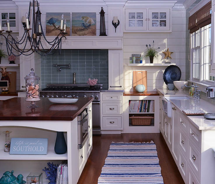
I've gone to the Architectural Digest Home Design Show since its inception and what a fantastic show it is. Here's the thing about the AD show:

There is a fantastic mix of equal numbers, it seems, of small, medium, and large companies exhibiting at the show. Products range from one-of-a-kind handmade decorative works from small studios to uber-technologically advanced products from global companies which makes the show exciting and inspiring. The MADE section of the show consists solely of handmade decorative products. The design and technological innovation seen at this show is abundant.

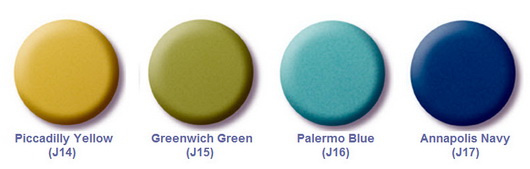
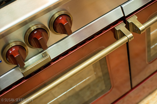
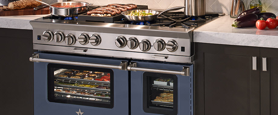
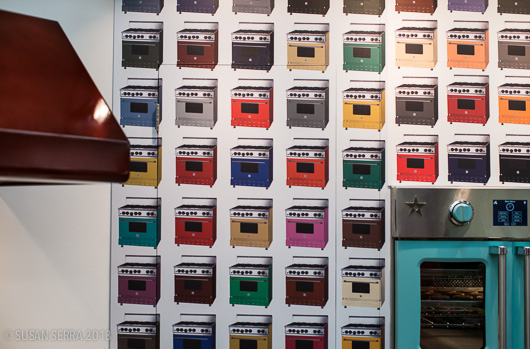
I'll start out my coverage of the show with some images of BlueStar, a professional range for the home, which includes separate ovens and hoods. They just keep getting better and better in their design and features. There were always so many people at the booth, I had to take snippets of the products (I hate random people in my shots!) A new boost up to 24,000 btus for their gas burners is impressive; their French door ovens just make sense ergonomically, and their new electric ovens solve the energy choice issue for many. A selection of 750 colors isn't bad either.

Choose from 750 colors & mix the metal finishes!

Coordinate the hood color with your BlueStar range for a perfect match
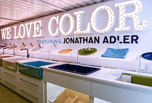
Hello Gorgeous!

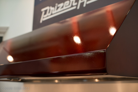
A beautiful, different, finish on the range

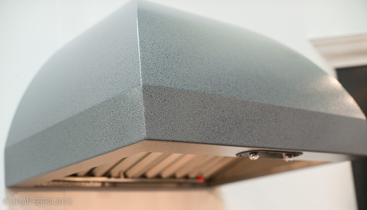
Again, a matching hood with a smart, matte, finish

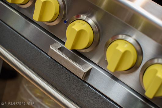
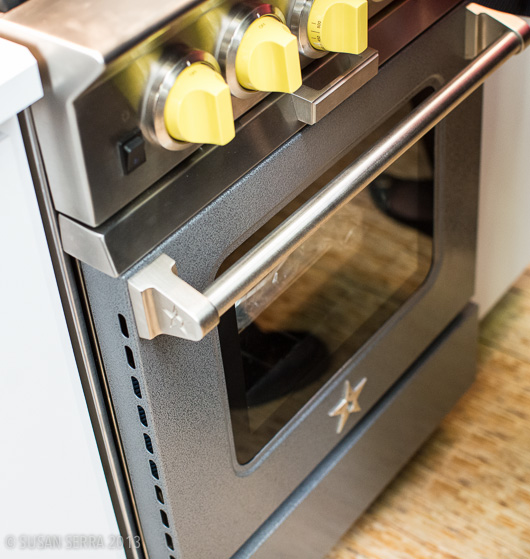
Here it is, top to bottom-a sunny yellow accent can do so much
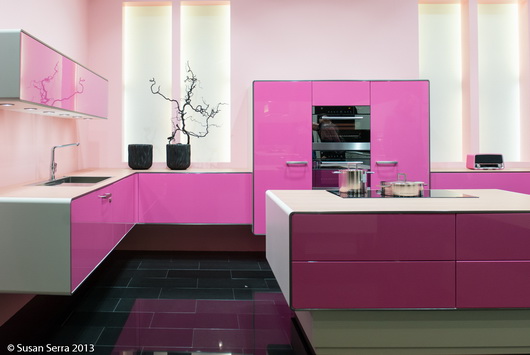
For the pink lover

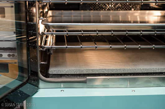
A baking stone that fits perfectly inside

The controls of the new electric oven

Yes, I also had a green cupcake at the BlueStar booth!

I just felt like starting coverage of the show with color from BlueStar, but trust me, there are so many wonderful products I'll be sharing with you.

By the way, some months back, I was talking to someone from a major appliance brand and I predicted that the next thing we will see in appliances is a matte finish. The matte finish will emerge in response to those who want a more "quiet" look to their appliances for any number of reasons, not the least of which is the movement of many homeowners toward the open floorplan concept. I saw two appliance brands with matte finishes at the AD Show, both of which were new.

In addition, a matte finish, done well, can often be viewed as a more sophisticated finish, more furniture like, if you will, or let's say, compatible with a furniture look. AND, given the recent trend toward simple, basic finishes, for example, in woods which are more frequently seen in a matte finish, appliances will follow. Bye-bye fingerprints too!

You heard it here first!

Kitchen Trends at IMM LivingKitchen 2013 - Blues!

As I walked throughout the different sections of the IMM Cologne Living-Kitchen fair in Germany, one of the common threads I spotted was the use of blue. The blues ranged from dark teal to more cobalt in color. Most commonly, they were deeper shades of blue with a touch of warmth. 

I found this color range to be dramatic and fresh. I would not call it a strong, mainstream trend at the show, but if you are considering blue in your kitchen design, here are some ideas for incorporating this different color, in different ways.

Below: It is not often that a dark color is designed as wall cabinetry with white cabinetry below, usually the opposite, but in this case, the tall, dark, toekick section adds a solid foundation to balance the upper section. 

Below: A perfect example of less is more, allowing the faucet to be featured as a sculptural piece.

Below: A quiet deep blue backdrop ties in with blue accessories, allowing the white cabinetry to "pop".

Below: A gutsy move to design in a blue floor, the gloss and richness of the color adds style. I'm not sure I'm fully on board with the choice of table on this floor.

Below: Graffiti as art, perhaps inspired by plants, surrounded by blues and greens and coordinating blue floor. I'm ok with the cabinet color, but I would have chosen a different backsplash to work with the graffiti.

Below: Simple, straightforward cabinetry that's interesting and very attractive to look at. The wood planking above adds needed warmth.

Below: An active mix of texture and clean lines and finishes, it's a good looking area which doubles as storage.

Below: I can see this color could highlight many other colorful accessories and useful items - I really like the use of this blue in this context.

I'm wondering - since we are moving ever more toward the kitchen as a living area, and as we coordinate with surrounding rooms, perhaps it's a natural time to consider using blues in the kitchen? Hmmmm...I think that's an intriguing concept!


Gloss + Color Blocking Kitchen Design Trends - LivingKitchen 2013

Continuing my (enthusiastic) march toward sharing the many trends that I spotted at IMM Cologne's LivingKitchen, today's two trends which I saw quite well represented are:

  • Gloss cabinetry
  • Color blocking in cabinetry

Cool, right? They definitely are two hip trends, often mixed up with other kitchen design trends that I listed in my first post on this show.

There is no doubt that nearly every European cabinet manufacturer puts their most creative foot forward in an effort to present eye-catching displays - and it certainly works, like a magnet to design lovers! Well designed, tasteful, cabinet designs are very enjoyable to see, and to learn from too - always, to learn from. Part of the learning process is to look for design attributes which "speak" to you, adding to your global (as in overall) view of design. At some point soon, I will share what I discovered that spoke to me personally. 

To my eye, these kitchens are uncluttered, which gives an opportunity for a design to be fully appreciated. While I would not say these trends were mainstream, they were quite prominant.

GLOSS CABINETRY


COLOR BLOCKING CABINETRY

Of course, committing to color could be risky, depending how it's designed into the kitchen. If designed into the kitchen in a way that could be temporary, which is possible, it could be an easy "out" to replace one section of cabinetry, should you get tired of it. In that scenario, put that chartreuse section of cabinetry in the garage, basement, or other area to add to household storage needs.

Some design decisions are the type where, once you are on the "other side" of the decision, which happens during installation, you don't always know exactly how you will feel. That's surely where a design professional can reduce the anxiety by providing expertise and drawings to work it through as completely as possible. I definitely think many of these designs are innovative, bold, and worthy of study. 


Kohler Colors by Jonathan Adler

As color, wonderful, bright, bold, free-spirited, color, has moved into the center of our lives, seen in our clothing, in our interiors in so many forms, in our outdoor living areas - and in all sorts of graphic design online and in print (and that is just for starters-as we know, color has upped its presence everywhere) it makes me think that such a significant part of Kohler's culture has been color-focused.

Kohler has had a love affair with color, and few would disagree. Kohler has quietly kept an exceptionally wide range of colors in its collection of products year after year. Although white is king in the kitchen and bath and always a classic, nevertheless, Kohler's commitment to color has been enduring - and passionate! Even if you really dislike a color, I KNOW, as a designer that any one of Kohler's colors is able to play the perfect role, whether bold or understated, a focal point or a quiet design element, in every kitchen and bath - yes, even those peachy, fleshy tones (pair them with white or charcoal for a sophisticated look!)

Take a look at this very interesting, brief, history of Kohler's colors. I loved looking at Kohler's color timeline.

Jonathan Adler Colors

It is with real interest that I observe Kohler's special edition colors by Jonathan Adler. I view these four colors as decidedly non-trendy colors, which is to say, they are colors that you can use to clearly personalize your kitchen or bath that will stand the test of time, and I do not say that lightly.

The colors, Piccadilly Yello, Greenwich Green, Palermo Blue and Annapolis Navy, are not neon - the color darling of the moment. THESE colors can be translated into a kitchen design that can be centered around elegance, country comfort, modern design, or one with a playful theme. These colors are versatile....thus, personal!

Quite honestly, I purposely did not read the press release about these colors because I wanted to go by my instincts as a designer when I went to see the collection in person. It's often a practice I employ for many new product introductions. I knew as soon as I saw this collection first hand, taking my time to work through the colors and sink configurations, that design flexibility is built in, in a very, very smart and aesthetically pleasing way. Surely, that was Kohler's intent-intelligent design flexibility.

I have to say that Kohler is providing the tools for pretty much wherever your design inspiration will take you...so many tools!! The Jonathan Adler collection is available for a limited time but the colors will prove to be enduring - sweet!

French Kitchen Design - Paris Inspiration!

As the Tour de France (which I LOVE to watch every year, often multiple times a day) is heading toward the great finish in Paris this weekend, my thoughts this morning went to the incredibly inspiring colors, textures, materials that I encountered in the streets of Paris over a week long leisurely stay. I've been compelled to write about the Tour de France and kitchen design more than once!

I started looking at my many images of Paris. I began to look at which pieces within a given image could be used as design inspiration, to be translated into a kitchen plan. By looking beyond and around the objects in an image, you can bring a sort of abstract yet highly authentic design concept into a kitchen design. Open your eyes and your mind and the inspiration will come!

Inspiration for your kitchen design theme can come from travel, nature, your home town, a literary work, really, anything. It doesn't have to come solely from looking at images of other kitchens! By looking elsewhere for inspiration, in unexpected places, you can create a kitchen design that is highly personal. That, to me, is a very exciting way to plan the aesthetic layer of your kitchen!

I isolated 40 images that I felt had great ideas that could be translated easily into design concepts. Maybe I'll do a few of these posts. 

Below: Soft, calm, green-as-neutral accented with a small amount of black and oh-so-elegant soft and light silver...music to my eyes and what a color palette for a kitchen. Don't miss the gilt gold factor!

Below: Complementary colors on the color wheel, this warm blue and warm gold are perfect aesthetic companions. This hardware can translate into lighting fixtures, faucet, sink, hardware and other accents combined with blue cabinetry, countertop or flooring.

Below: Colorful artwork brings life into the kitchen as well as a feeling of culture, telling a story about the overall design of the kitchen. Anywhere you can find room for art in the kitchen, do it! I've been saying this since I started this blog in 2007 - art will stir the emotions in this very utilitarian space

Below: Industrial and authentically worn stainless steel meets elegantly worn wood flooring in the always wonderful European herringbone pattern. The cool/warm thing - always an interesting contrast

Below: That elegant look of paneling, but look closer and you'll see that it is applied molding - SO easy to do, even diy. Anywhere you can logically frame something will transform the kitchen into....Paris, and don't forget to frame the ceiling and possibly paint sections within the paneling

Below: These 3 images below feature a similar color palette, lovely for a kitchen. Again, the cool/warm factor is a natural, and the images show various combinations of lights and dark, each color, allowing the opposite color to pop. To my eye, these are all sophisticated yet easy to use colors in the kitchen. The very dark door MAY be a bit of a trendy color in kitchen cabinets today, but I would like it as a countertop color. Love the blue/gray street!

Below images pertains to the above grouping but is intentionally blurred to remove bad things that happen on the street!

Below: Happy color as seen in the very traditional door design yet viewed as a friendly, casual design element. A color such as this blue can be used in an accent piece in the kitchen which is usually a better choice due to an otherwise potentially overwhelmingly heavy balance. Or, do small pops of color like the great purple color seen in the flowered vine, an analogous color to the navy door and window, but in a light color for added interest and contrast. Love the navy, beige and gray colors in that image.

Look for inspiration anywhere! Start a folder in a project management system of some sort that might be labeled color, inspiration, ideas, design concepts, what I love, whatever makes sense. Or, of course, in pinterest! It's a fabulous way to discover your own, very personal, definition of creativity. It's fun too!


Joss and Main - Scandinavian Rug Sale

We are excited to announce the sale of our rugs fir the first time on Joss and Main - a special sale for the next 72 hours. The rugs that we have curated in our web shop, Scandinavian Made, have these characteristics in common:

They are hand woven by an individual artisan

All the rugs, whether vintage or new, are made in Sweden

They are made with wooden looms

They are exclusively runners of different lengths and widths

They reflect the unique artistic aesthetic of the weaver and are an original piece of art

They have been carefully curated by me (Susan) and Kelly Donovan with our eyes focused on interesting design, use of color, pattern, texture and overall beauty

It's not always easy to visualize just how a rug may look in your home, especially when you are looking quickly through an assortment of patterns and colors. Here are some tips to find the right Swedish rug from our collection:

1. In an otherwise neutral space, a shot of color, any color, will bring the space to life! 

2. Think of these Swedish rugs as works of art and add them to the room's interior design in more formal rooms such as living areas, library, office, bedrooms, not just the hallway and kitchen.

3. Vintage rugs with a modern pattern look particularly great in combination with modern furnishings.

4. Change is good - change your rug with the seasons or rotate them in other rooms of the home.

We are so passionate about each of our rugs and are so happy to share this very, very old authentic artform with our readers. 

A word about rugs in the kitchen - these rugs are a no brainer in the kitchen! For color, comfort, gorgeous texture, visual warmth, workhorse strength and elegant design in the kitchen and/or breakfast room, they are not only perfect, they can absolutely elevate the design via their handmade quality. Love these rugs!


IMM Cologne - Living Kitchen Overview

The Living Kitchen show at IMM Cologne, held in Germany less than less than 2 weeks ago was kitchen heaven, purely and absolutely. The exhibits “told” many visual stories – whole stories, as the displays were large, some, enormous. I was a guest of Blanco (a bigger player in the global sink and faucet scene in terms of design and product presence than I realized) and was invited as a member of the Blanco Design Council. Here are some of the most compelling chapters in the book of today’s kitchen!

Chapter I Overview – The Living Kitchen was a very appropriate name for this show. Lowered “platforms” and varying levels for alternative living in the kitchen, a more “living room-like” aesthetic, the warmth of wood or faux wood, are a few of the specific features  which define this movement. Sinks and faucets are going along for the “living kitchen” ride and fabulous examples will follow. It is clear that style and function have met, fallen in love, and are planning for the future. Simply, it’s about living in the kitchen…see how:

livingkitchen1a

Chapter 2 – Cabinetry designed as sculpture is a traditional strong point of European kitchen design but seems to take another step into integration with surrounding rooms, which is VERY exciting visually yet may also make that connection in a quiet and elegant way, the result of which can be a space which appears more expansive.

nolte_32

Chapter 3 – Appliance Integration and Technology – European kitchen design has always been the leader in integrating appliances (seamlessly.) Appliances, any type, are now fully concealed into cabinetry which replicates truly invisible cabinetry, and I would not even say they are integrated into pantry cabinetry; I would call it the built in closet look! In addition, exposed appliances are showing super seamless integration into countertop design.

One appliance which is not so much about integration is the hood – the hoods total transformation into a design element is complete. Whether your style is pretty, modern, super stylized or elegantly low profile, the hood is a wonderful opportunity to express oneself and I think that’s one of the feel good stories here!

Appliance technology is about energy efficiency, a variety of neutral color choices (very exciting to see) healthy cooking, and the ultimate: personal cooking flexibility-where would you like the burner positioned on the cooktop? And there’s more! A food preparation appliance that allows food to last in a refrigerator for 2-3 weeks – surely, a game changer! Examples to be shown soon!

Germany II 878

Chapter 4 – Natural real or natural faux materials – What this means is that natural wood grain rules…sometimes, the more textured the better, which adds visual interest, sometimes a little whimsy too. But, the story here is about an appreciation of nature in many forms.

Chapter 5 – Color - Well, the fun news is that the accent colors were clearly lime green. There were accents of magenta as well. The biggest color story was the greige, beige, mushroom neutral, which I have mentioned before. It seems that quiet and serene has spoken more loudly than color at this show, at this time. But, that is not to say that color was not present in bold, fun, ways. I'd say that its presence felt more focused than broad. I'd call it: "color optional." 


Sooooooo much more to talk about, all coming soon!!! Do you want to see more??

Nate Berkus + Kitchen Design = STYLE

I like Nate Berkus' style - I'm definitely a fan! Style is the word that comes to mind when I see interiors that have been touched by his creative hand.

I often see a philosophy of Nate's work which expresses "tradition with an edge." Nate's "edges" are awesome...cool color stories, tradition meets modern, texture meets soft, pattern dominates to unify, among so many more design concepts that delight, and always, for some reason, just feels right! Nate's infectious enthusiasm for design translates into an ease, a gracious informality that's easy to live with. I mean, I see him on Oprah, and before I know it, I'm smiling. He's seems to be such a happy guy! Creating interiors with a happy disposition definitely shines through one's work.

I'd love to see Nate do more kitchens, and I'd love to collaborate with him! Here's Nate's kitchen in his Chicago apartment. 

It flows. I love the black window trim. The turquoise is a great color and just flows into a collection of clean, solid, elements, sort of a framework for the room. And, those chairs and table...LOVE.

And Nate's Manhattan apartment....this kitchen I love! I'm a real lover of white floors...I have two painted white wood floors in my own home. It looks very much like a Swedish rag rug on the floor and the blue, black and touches of wood just punch up the space. The enveloping white on floor, ceiling, and walls, is the unifying element, which adds a flow and maximum spaciousness. There's a Scandinavian aesthetic to this kitchen. Another: LOVE!

Nate Berkus' kitchen in his Milan apartment is another Wow! See what I mean? He has a vision! This is European modern elegance. It's quite sophisticated, with strength in large color elements, yet quiet. The brown leather chair adds a feeling that this is a room, not only a utilitarian kitchen, and the color of the chair adds life. Very well done! The lighting fixture, honestly, to my eye, is the perfect touch. LOVE!

Nate, I'd love to see more kitchens! This sampling alone includes such a great collection of creative and diverse (and unexpected) details, don't you think? 

First two images from Oprah.com, last image from ElleDecor.com.