
As the Tour de France (which I LOVE to watch every year, often multiple times a day) is heading toward the great finish in Paris this weekend, my thoughts this morning went to the incredibly inspiring colors, textures, materials that I encountered in the streets of Paris over a week long leisurely stay. I've been compelled to write about the Tour de France and kitchen design more than once!
I started looking at my many images of Paris. I began to look at which pieces within a given image could be used as design inspiration, to be translated into a kitchen plan. By looking beyond and around the objects in an image, you can bring a sort of abstract yet highly authentic design concept into a kitchen design. Open your eyes and your mind and the inspiration will come!
Inspiration for your kitchen design theme can come from travel, nature, your home town, a literary work, really, anything. It doesn't have to come solely from looking at images of other kitchens! By looking elsewhere for inspiration, in unexpected places, you can create a kitchen design that is highly personal. That, to me, is a very exciting way to plan the aesthetic layer of your kitchen!
I isolated 40 images that I felt had great ideas that could be translated easily into design concepts. Maybe I'll do a few of these posts.
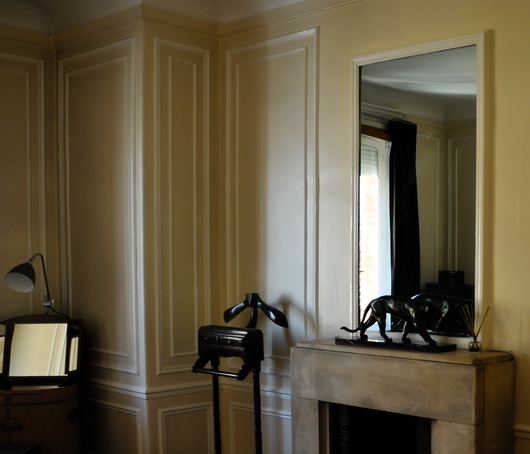
Below: Soft, calm, green-as-neutral accented with a small amount of black and oh-so-elegant soft and light silver...music to my eyes and what a color palette for a kitchen. Don't miss the gilt gold factor!
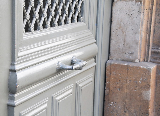
Below: Complementary colors on the color wheel, this warm blue and warm gold are perfect aesthetic companions. This hardware can translate into lighting fixtures, faucet, sink, hardware and other accents combined with blue cabinetry, countertop or flooring.
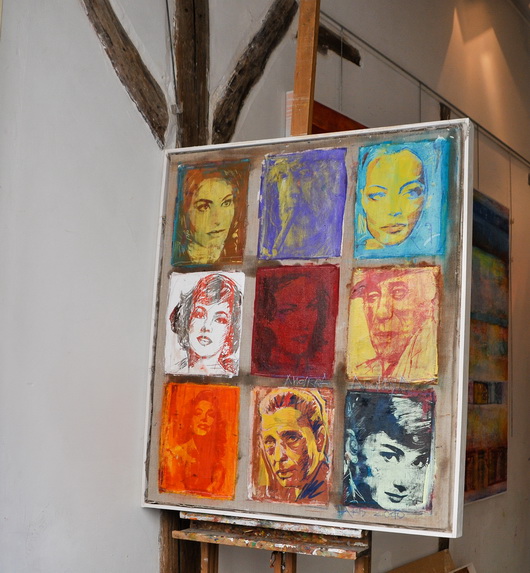
Below: Colorful artwork brings life into the kitchen as well as a feeling of culture, telling a story about the overall design of the kitchen. Anywhere you can find room for art in the kitchen, do it! I've been saying this since I started this blog in 2007 - art will stir the emotions in this very utilitarian space
Below: Industrial and authentically worn stainless steel meets elegantly worn wood flooring in the always wonderful European herringbone pattern. The cool/warm thing - always an interesting contrast

Below: That elegant look of paneling, but look closer and you'll see that it is applied molding - SO easy to do, even diy. Anywhere you can logically frame something will transform the kitchen into....Paris, and don't forget to frame the ceiling and possibly paint sections within the paneling
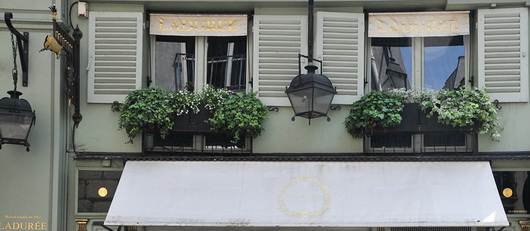
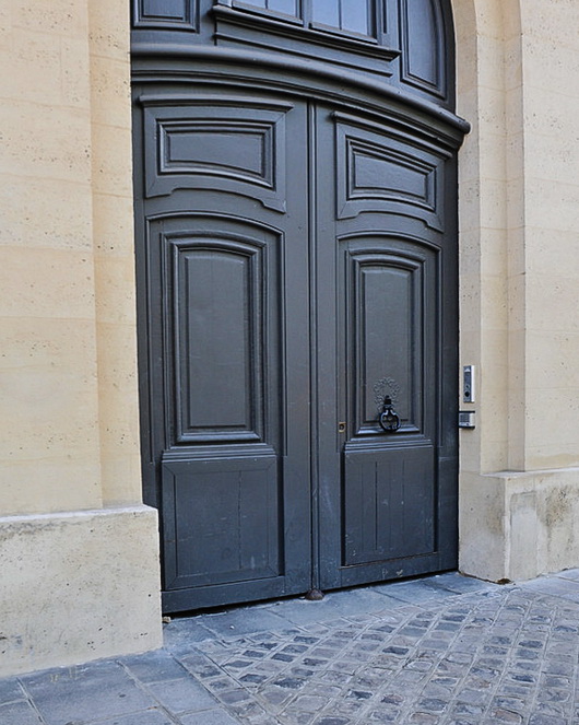
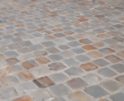
Below: These 3 images below feature a similar color palette, lovely for a kitchen. Again, the cool/warm factor is a natural, and the images show various combinations of lights and dark, each color, allowing the opposite color to pop. To my eye, these are all sophisticated yet easy to use colors in the kitchen. The very dark door MAY be a bit of a trendy color in kitchen cabinets today, but I would like it as a countertop color. Love the blue/gray street!
Below images pertains to the above grouping but is intentionally blurred to remove bad things that happen on the street!
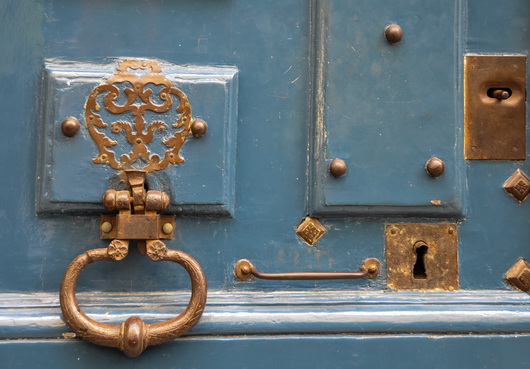
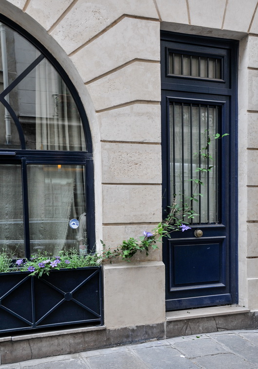
Below: Happy color as seen in the very traditional door design yet viewed as a friendly, casual design element. A color such as this blue can be used in an accent piece in the kitchen which is usually a better choice due to an otherwise potentially overwhelmingly heavy balance. Or, do small pops of color like the great purple color seen in the flowered vine, an analogous color to the navy door and window, but in a light color for added interest and contrast. Love the navy, beige and gray colors in that image.

Look for inspiration anywhere! Start a folder in a project management system of some sort that might be labeled color, inspiration, ideas, design concepts, what I love, whatever makes sense. Or, of course, in pinterest! It's a fabulous way to discover your own, very personal, definition of creativity. It's fun too!