Chalkboard Paint In The Kitchen

Do you like chalkboard (also called blackboard) paint? Yes, we've seen it fairly frequently in kitchen design, but it's certainly not a mainstream trend, maybe something on the periphery in my opinion, so embrace it if you love it.

Here's a chalkboard look with a difference! I can see something like this in a kitchen on a big wall at the breakfast area. It's very artistic, don't you think? I shot this image at the kitchen design fair in Germany and every so often I look back at my images to refresh my memory on special discoveries. Just like we notice design in hotels and other public spaces, trade shows are where you always find innovation so I knew I had to share this example of chalkboard paint. With so very much to capture at a show, I like to bring out bits and pieces of cool design concepts throughout the year.


For those who are creative, or who know someone who is an artist, this could be a superb way to add multiple themes via the chalkboard to the kitchen as the mood or season changes. Create designs on the blackboard that are formal, modern, urban, country, or an eclectic design. Make it cool and cluttered as is shown, or the opposite - super simple with one strong motif. Tired of the blackboard? Paint over it!


Chalkboard paint is easy to use and easy to do away with once you tire of it. I LOVE change in the home. I think it's so important to build in the ability to change a mood into my designs. Why keep everything the same for years??? Maybe the way to set your version of the chalkboard apart is to use a colored paint for your wall. You can get any color paint you wish. It could be interesting to do a chalkboard look in a very light neutral such as a white, off white, a sophisticated khaki or very light and soft blue gray.

The best bet is to experiment on a large piece of 1/8" thick masonite or other smooth surface, put it in position and live with it awhile before you make the visual commitment. Play with colored chalk. Create a variety of designs to test them for design, scale, proportion and contrast and when you like something you have drawn take a picture of it for future reference because you will be most likely trying quite a few artistic concepts on the board! But, definitely do it your way!


Red Kitchens for Valentine's Day!

By: Susan Serra

I've been working on this for days in spurts of inspiration! I'm not a huge fan of Valentine's Day; I mean, it's sweet and all that, but I've never really been excited about it, but for some reason this year red kitchens are beckoning to me to be enthusiastically showcased and I'm happily running with it!

You've got to be gutsy to go red, no doubt about that. You can do red in accents or in bold swaths of visual volume. I happen to LOVE red countertops with medium toned wood. Seriously, this is one of the unsung great combinations if the right undertones coordinate. 

I think red in traditional kitchens, which I don't have featured here, look sort of farmhouse-like and add lots of cheerfulness to a country kitchen. 

Red in modern kitchens are clearly meant to be a design statement - the form of the cabinetry itself is the intrinsic design statement. Here we go!!!

Below: HTH kitchen showroom in Copenhagen

Below: Nolte

Below: Express-Kuechen

Below: Marazzi Design

Below: Creativ, Euphoria

Below: Ballerina kitchen display

Below: Poggenpohl kitchen showroom in London

Happy Valentine's Day!!!

Kitchen Trends at IMM LivingKitchen 2013 - Blues!

As I walked throughout the different sections of the IMM Cologne Living-Kitchen fair in Germany, one of the common threads I spotted was the use of blue. The blues ranged from dark teal to more cobalt in color. Most commonly, they were deeper shades of blue with a touch of warmth. 

I found this color range to be dramatic and fresh. I would not call it a strong, mainstream trend at the show, but if you are considering blue in your kitchen design, here are some ideas for incorporating this different color, in different ways.

Below: It is not often that a dark color is designed as wall cabinetry with white cabinetry below, usually the opposite, but in this case, the tall, dark, toekick section adds a solid foundation to balance the upper section. 

Below: A perfect example of less is more, allowing the faucet to be featured as a sculptural piece.

Below: A quiet deep blue backdrop ties in with blue accessories, allowing the white cabinetry to "pop".

Below: A gutsy move to design in a blue floor, the gloss and richness of the color adds style. I'm not sure I'm fully on board with the choice of table on this floor.

Below: Graffiti as art, perhaps inspired by plants, surrounded by blues and greens and coordinating blue floor. I'm ok with the cabinet color, but I would have chosen a different backsplash to work with the graffiti.

Below: Simple, straightforward cabinetry that's interesting and very attractive to look at. The wood planking above adds needed warmth.

Below: An active mix of texture and clean lines and finishes, it's a good looking area which doubles as storage.

Below: I can see this color could highlight many other colorful accessories and useful items - I really like the use of this blue in this context.

I'm wondering - since we are moving ever more toward the kitchen as a living area, and as we coordinate with surrounding rooms, perhaps it's a natural time to consider using blues in the kitchen? Hmmmm...I think that's an intriguing concept!


Gray Kitchens For A Gray Day

This must be the most gray day in history! We're having a nor'easter, and it seems as if everything is gray. Well, not everything. The backdrop of the day is surely gray, but I happen to like this type of day, at this time of year. You have gray skies, then, especially now, there are still trees with beautiful, bright, brown, leaves, peppering the gray skies, that have not fallen yet, the brown tree trunks, some white snow, and green ivy as a ground cover. All this from my window. Gray, brown, white, green. It works for me. Another beautiful color palette by Mother Nature.

So, perfect inspiration for, what else, gray kitchens! Neutral, cozy (some), simple, elegant, charming. Lots of different looks in a gray color scheme. What are cold, gray, skies, to some, may be a cozy backdrop to others. Sort of like these kitchens, I presume. Most images have been collected from Desire To Inspire, a favorite blog with endless, absolutely endless, interior design ideas and inspiration. Each day, a new collection of perfectly themed images. Enjoy!

Trends in White Kitchens

I received this email from Elizabeth, a reader, and just had to share it with you. Here it is in its entirety:

"Susan- i ran across your site a few months ago and i am continued to be drawn to your work, photographs and thoughts as a source of tasteful inspiration for our kitchen. we recently purchased a home with a kitchen that needs updating so i am currently living and breathing kitchen design (i am a designer by training and so this is a dream project for me). Anyhow, I wanted to send you kudos on your work and blog. I would love it if you would post your thoughts on the resurgence of the white kitchen. it seems like every magazine i pick up these days has all white kitchens. is it just a trend? is cherry/maple.oak totally dated?"

white%20kitchen%201.jpgElizabeth, this is a great question! Thank you for your lovely comments and for your question. Here's what I think. I think there are a few things going on.

There are no ifs, ands, or buts...white is a classic in kitchen design, and its interpretation seems to continually reinvent itself over the decades.

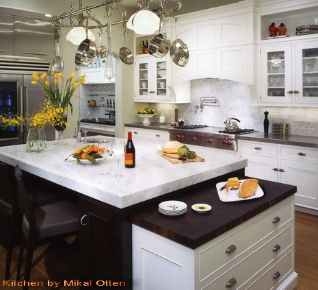
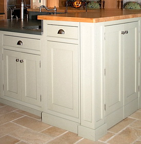
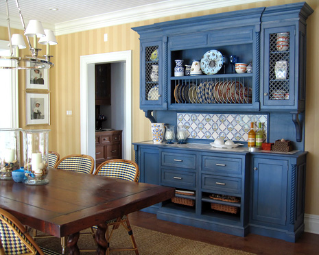
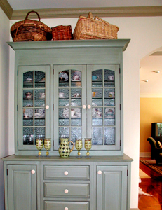
First, the white kitchen, in recent years, is being looked at as a "fixed architectural element" to the home...being used (although it may not be historically accurate) as a traditional/classic backdrop, becoming one with the other millwork in the home. White, as we know, is often seen in architectural features in a home, in paneling, trim, doors, stairs, etc., and I think there is often an underlying motivation to give built in cabinetry in the kitchen and other rooms a "permanence" in feeling in this (also quiet/safe) way...for many. Surely, white is not practical whatsoever in the kitchen, so it follows this line of thinking. The look, of course, can be one of elegance. Take a look at the white built ins in the dining room shot, you'll see what I mean, how they connect with all the other white doors and casings.

white%20kitchen%202.jpg


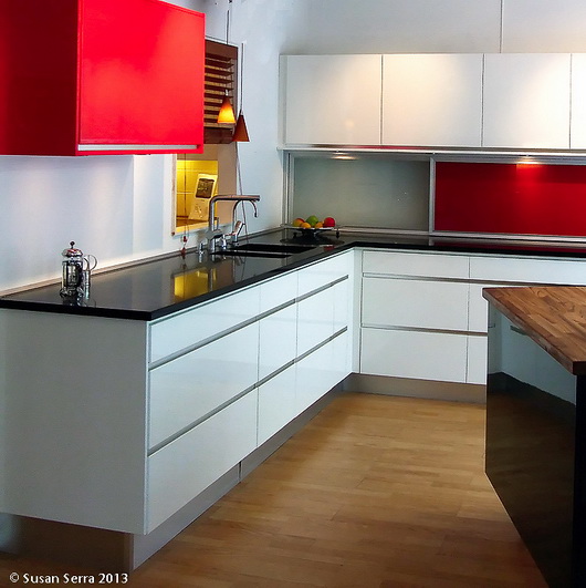
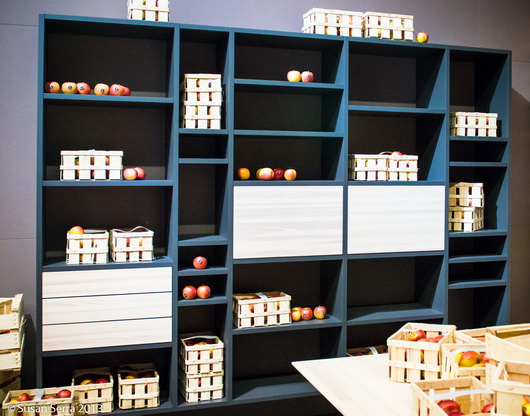
Secondly, it's easy to coordinate other design elements in the room, let's face it, it's a free-for-all design wise...countertops, wall color, tile, accessories. That is also a motivation for some, always. An offshoot of this is to consider that white is sort of a classic "utilitarian" shade, and the kitchen is a utilitarian room to many, wanting to play up that theme. Also, white reflects light, brightening up the entire space, lifting one's spirits substantially, particularly in a room with small or few windows.

The third reason is, I know there has been a reawakening, a redefinition, of the traditional style in kitchen design. I call it "the butler's pantry look." The clean, simple lines of today's white traditional kitchens, evoke the feeling of kitchens past. What was previously called a shaker style kitchen is now an upgraded look with the same door style, yet a bit more embellished in decorative detailing, but not too much. It's an evolution of styling, a redefinition. It's fresh and new.

white%20kitchen%203.jpg 

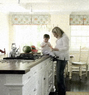
And, the fourth reason? I can put my finger on it exactly...2003, when the movie, "Something's Gotta Give" came out! The effect on kitchen design as a result of this movie was HUGE. Here's the google search page for it, complete with blog posts by my blog buddies Cote de Texas and Surroundings, even now, four years later! I heard about it and saw its effect with my clients. The U.S. was ready to move away from all of the highly decorative detailing of the decade before and into a "less is more" philosophy as well. And, that look, for those who like the traditional style, is still so very prevelent today, as a direct result of this movie. In fact, I've had these images (shown above) of the kitchen in the movie, that I have been meaning to create a post around since I started this blog, and, so, here they are.

Take a look at a previous post I did on the white model kitchen in one of the last, great, New York City residential apartment buildings to be built, still being finished as we speak. Some similar thoughts in that post.

Is cherry/maple/oak outdated? Quite the contrary. Kitchen design NOW is all about expressing yourself the way you want to, NOT to follow the pack. Although that said, there will always be trends. Watch out for trends, however, that's my advice, they can be quietly addicting. Maybe not the best way to invest in something that needs to last for, oh, a couple of decades or so. Do what speaks to you, be open to all possibilities, and look past the trends.

So, there you go! Oh, one last thing...is this look, as I defined it, a trend? Absolutely! Therefore, is it something to run from? No, not this trend, not if it is linked to the architecture of the home. Yet, awareness is a good thing.

white%20kitchen081.jpg

White Kitchens - And Your Kids!

I spoke with a Consultation client today, a mother of two very young children. She was struggling because she could not decide which white to choose for her cabinet color.

blue.jpgHer kitchen, at the rear of the house, could be seen from the front door, first through the living room, then through the dining room, then, into the kitchen. She also needed to select paint for her walls in these rooms. This entire space, these rooms, I'd consider to be relatively small in size.

Here's what occurred to me. First, as a mother who raised three kids in a white kitchen(!) I needed to discuss the inevitable...dings, nicks, marks, wear, even non-kid wear combined with kid-wear! It's a bad scene, and if it doesn't happen right away, in time, it will. When asked when will it show, I replied, it could be the next day or much longer, but show, it WILL!

khaki3.jpgWhat I suggested was a soft, neutral, elegant shade, such as a light/medium greigy/beige shade. This type of shade can serve many purposes:


It will serve as a foundation for many other colors

It will not call attention to the kitchen from other rooms close by

It will hide marks better than a bright white shade would

It can look very sophisticated 


 With a similar shade on the walls, a bit lighter, this kitchen can really flow, when you are in it, or when viewing it from a distance.  Many, many colors can be coordinated with this type of shade.

Alternatives we discussed were more creamy/yellow shades, but this top image of a kitchen I did, that's a nice shade too, has a bit of blue in it. Consider shades. They make a statement, hide the bad stuff (marks), and are just as easy to love as white, I promise! In the end, if you've just got to have white, of course, do it.

mom%20child%20kitchen.jpg


I Want This Cabinet Finish For My Kitchen - I Saw It In The Magazine!

I received a call from a client, which is not the first call of this type. The client loved a kitchen that she saw in a magazine, it just spoke to her. That's a great thing, that's really what I hope will happen for my clients, that in some way, they will just know when something is right.

You cannot predict when it will happen, or where. It could be a sample found in my showroom. It could be one of the kitchens I've done that speaks to a client, or it can be one from a magazine that is "the one." Sometimes, it is different elements of the kitchen that speak to clients. In this case, she loved a kitchen seen in a magazine, but she really responded to some of the colors of the materials.

P2050028a.jpgMagazines are great for inspiration. They are an important tool in the process. They can bring to life what you may not have been able to express, or even knew you wanted.

The thing to be careful of, however, is to really understand that the colors in a magazine, on the printed page you are viewing, can be very different from the actual material samples! First, the lighting in the environment where the photo was taken may have been augmented by photographer's equipment. When the image is taken, the camera itself changes the color, followed again, by the tweaking in image software programs to make the color what the art director wants or what the photographer wants. Then, comes the printing, and by the time the image gets on magazine grade paper, depending on what color the paper is, it's a very different color from the original material. And, we know that color is definitely seen and appreciated in nuances. Maybe you now see, this color nuance of the actual sample, as seen in real life compared to the magazine feature, has more of a pink tone than a yellow tone, a world of difference.

Use the magazines for inspiration, not to necessarily seek out specific elements such as the tile, countertop surface, cabinetry, paint color, since once you see the actual color or finish, it will be different. What you CAN do is match up any finish sample to the magazine page. Just today, a client and I matched up finish samples to the magazine page. That's fine because that's what the attraction was. Have fun!

Kitchen Color Chat - With Jill Clarkson

Jill was kind enough to lend her expertise in a kitchen chat (say that three times fast) about color. Jill Clarkson is an architectural color consultant and muralist located just minutes north of the Golden Gate bridge in beautiful Marin County. Jill Clarkson Color + Design service offerings include residential and commercial color consultations, custom designed and painted artwork, murals and wallpapers, home staging and redesign. Online color and design consultations are now available. On site consultations are available through out the San Francisco Bay area. See her blog www.jillclarksoncoloranddesign.blogspot.com or call 415 924 4204, for further information.

"Color in the Kitchen"

Kitchens today are becoming more and more colorful, most anything goes, which makes it a fun and exciting proposition to come up with a new color scheme. With so many surfaces to consider, such as the cabinets, the counter tops, the backsplash, the appliances and the walls, it may be a bit overwhelming but nonetheless the perfect place to express your creative vision. Warm colors can be used to create an inviting and convivial environment, fit for friends, feasts and conversation.

I'm sure you've noticed how when entertaining friends and family that there is a natural tendency for people to gather in the kitchen. It's the communal zone and the perfect place to add cheerful, friendly colors which will enhance the kitchen experience. For those that prefer a soothing and elegant space, a monochromatic scheme (see picture below.)

monochromatic kitchen

Using different intensities of the same color will provide interest without raising your pulse. For those a bit more daring, a complementary color scheme such as blue and orange or black and white will create a lively and pleasing space.

blue hutch yellow background


white kitchen blue background

When working with wood cabinetry the color of the finish needs to be considered. For darker, warm cherry finishes, a contrasting cool color such as celadon green will look fresh and clean. For cool white cabinetry you may want to add warm colors such as yellow, almond or biscotti. I think white cabinetry also looks fabulous with sage green and blues.

You can add warm colors with your textiles and accessories. For lighter wood cabinetry such as Maple or Pine you might want to consider going for a mid to darker shade that will really make the cabinetry pop. If you've invested a pretty penny on appliances, cabinetry or tile work then those things should take center stage. Use neutral paint colors that will allow the true stars of the kitchen shine.

red orange tan kitchenReds and oranges stimulate the appetite and will offer a luminous glow under candle light. If you want to lose weight you may not want to paint your kitchen apricot or salmon. Blues and greens are calming and can actually suppress the appetite. Complimentary colors, those found on the opposite sides of the color wheel, are always successful combinations when used in the right ratios.

A great rule of thumb is the 60/30/10 rule and stay away from using 50/50. Assign each color one of these percentages of kitchen real estate and be sure your colors work in harmony with your exisiting finishes and appliances. You'll be on your way to a great looking space! : )

Thanks Jill! I'm more conflicted than ever now, too many great combinations!


The Color Purple, No, Green


The green text on this right of this page is the tiniest bit too blue, it doesn't match the other greens on this page, which are more yellow. (Trust me, there's a connection to kitchen design...) UPDATE: I changed the green color, but pretend I didn't and read on...   ;-)

But, I LIKE this green text - it is different, but similar, therefore, it "pops", differentiates itself. The voices in my head are in a little conflict over this. My love of this green text is winning over my analytical voice, which tells me that it doesn't match the other greens. (Or, is that my mother's voice!?) I had an olive green text color in its place and it matched beautifully, BUT, it just didn't pop on the page like THIS green does. It's more a combination of many colors in the image, something I liked, also, against the white page.

On to Kitchens

Hochberger_01a.jpgI have one particular kitchen in mind where the paint color of the window and doorway, and baseboard casings match nothing in the kitchen, there being a blue green hutch that cannot be seen in the image in the link below, yet blends with (most) everything.

In this case, the client wanted very light walls without any sort of treatment on it, which to me, meant that white trim and casings would wash everything out, not to mention the cabinetry being an off-white. Can you say "bland"?

The decorator on the project was at a loss as to what color the trim should be, so I was consulted (I should have been consulted prior, anyway). The client chose the granite and the tile by herself. The family room has a wide opening to the kitchen, and the furnishings were more in the olive green family.

Due to the serious architecture of the house, I felt the trim color should be "serious" as well, which is why I ruled out a blue/green color. I felt it would have been too "candy cane", plus it would not transition well into the family room. I thought the color should be strong, yet feel somewhat neutral, yet with some color to it. Most of all, I felt the color should be warm, rather than cool, yet I did not see a tan shade here. Those were my intuitive feelings. I felt choosing a color which would sort of bridge several colors together, yet not match directly, was a good idea. The colors here are somewhat analogous, meaning, they are next to one another on the color wheel, which is one of my favorite ways to use color.

In the end, if I had my choice (and I didn't have a choice here in the following...), I would have chosen a different granite (if it had to be granite) and a different floor tile (if it had to be tile) and a different wall color, plus, I would have painted the niches up above, to have them stand out, as I believe they should. That's not to say it is not a terrific kitchen!

Whether you like it or not, you will have a reaction to this color. See it here.

Lesson: Don't be afraid of color! Your colors do not have to match. They should make sense in some way, and if they only make sense to you, that's ok too! Surrounding rooms have to be considered, as well as the architecture, other materials in the room, and wall treatment/color.  Most of all, colors are seen in context to one another. More on that at another time. But, to my eye, colors look best, and most interesting, when they are slightly off from one another, maybe tied in with another color as a bridge, maybe not. Go beyond "matching".

How about you? How are you going to use color in your kitchen, or how are you using it now in other rooms?