

The kitchen episode of the 2009 HGTV Design Star was so revealing and the design work so yeesh(!) (I take NO pleasure in this criticism) that I could not let it go after my previous post on this episode. A busy summer allowed my angst to go on hold for awhile, but tonight's Design Star finale put the pressure on me to share more insight on kitchen design issues from that episode!
My good friend and colleague, Kelly Morisseau of Kitchen_Sync and I have teamed up to deliver the insight. Kelly took the warm modern kitchen, and I took the Moroccan/Italian-fusion-ridiculousness kitchen. I've been to Morocco, I love Morocco, but Moroccan/Italian fusion?
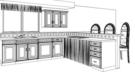
 Kelly and I are each equally comfortable with modern and traditional design. Together, we have decided to show our readers that great things can be done with stock cabinets. You just need creativity. Kelly understands this and has worked HER magic to design a better version, in many ways, of the warm modern theme, the second kitchen on this episode.
Here's another piece of insight: For those who are committed to producing good design, a kitchen meant to last 20+ years should not, but CAN be done in very short order.
That does seem like a contradiction! But, I suppose the HGTV "test" to design the kitchen fast has some merit to it. If one is creative, one should be able to think fairly quickly and come up with creative solutions. We know the "designer" was the cabinet distributor. There was obviously zero interest from that distributor to do something creative for the HGTV designers. Most likely, the producers didn't have a clue as to what is possible with cabinetry, so they logically did not push this issue. What a wasted opportunity all the way around and especially to the viewers. But, all is not lost! Here, then, is my take on a couple of quick solutions (quick: key word) for this kitchen renovation, as speed was a factor in this episode (although the design was obviously done in advance). My disclaimers:
- The clients' wants and needs are not considered, as I have no knowledge of what they are. Good design fundamentals, however, are shown herein.
- Very important: The appliance locations and window, Kelly and I agreed, were to stay exactly where they were originally. To completely redesign the kitchen would not be fair, we thought, since the appliances also remained in the same locations the second time around in that episode. Our point is to show what can be done creatively with cabinetry for functional and aesthetic purposes, given existing conditions/limits.
- A taller countertop was kept in as well for expedience sake in my case.
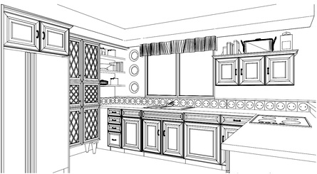
- My personal disclaimer is that my emphasis was on the design process, and I did not have the luxury of time to spend on other decorative elements such as choosing colors, tile, countertops, etc. I also did not take a lot of time to further enhance my drawings. That can take many hours. So, my drawings reflect a short amount of time devoted to decorative embellishments, but do include larger elements in the design itself which relate to the stated theme (um, Italian/Moroccan Fusion.) It took me an hour or two to develop both designs (collectively, not individually.)
- The microwave is on the unseen wall of cabinetry, opposite the sink wall. I do not like it on that wall. Because it was not in the main kitchen area in the Design Stars' renovation, I did not include it. However, each plan can be easily adjusted to add a microwave in the main area.
TWO IDEAS FOR THE MOROCCAN-ITALIAN KITCHEN
- My first plan is about being conventional but still interesting-It's meant to be simple.
- The island is removed. I feel it's an obstacle.
- The upper section of the plan now allows for a much lighter feeling. The wall cabinets are FLOATING on each side, a nice look. In fact, much better in my opinion.
- The corner wall cabinets are removed. Too much cabinetry; there was way too much! There is a whole other wall opposite the kitchen, which can accommodate lots of storage, so aesthetics need to be addressed as well rather than JUST storage...a VERY common mistake in American kitchen design. It's not all about storage.
- I would do away with the hood and do a downdraft. An island hood and a downdraft do not differ much in their efficiency. In this case, the bottom of the hood appears to be approximately 40" above the cooktop, which is basically, ineffective. To make the hood lower would mean that the people sitting at the higher bar would experience the hood to be quite low, if it were positioned where it should be.
- In both cases, as a concession to the loss of the island, countertops have been deepened, a cool benefit. One may wish to, then, install the wall cabinets deeper as well and use molding to cover gaps (a must do for stock cabinetry.)
- Also, in both cases, we are assuming that the soffit stays intact.
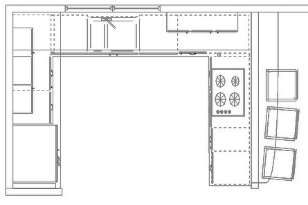

While this design, above, may appear to be simple and basic, it offers more visual logic. Also, a secondary layer of decorative detailing (not shown) will add to the theme.
The second plan, below, didn't take long at all, and reflects my desire to open up the space even MORE (and be a bit more stylish in the design). I do not expect the counter space, seen in my first plan, to the right of the refrigerator, to be used as a prep space in a significant way. I expect that space will be used for storage of small appliances, things like that, which will accumulate clutter quite quickly. Some or all of those items can easily go into the wall cabinets that I've designed to be easily accessible.
In addition, no one uses a 90 degree corner to prep at. It cannot be done. Therefore, again, clutter accumulates.
In the interest of achieving more openness, without a loss of storage or meaningful counter space, take a look at the second plan:


As I was putting this together, I could not resist one more quick tweak. In this version, the wall cabinet to the right is short and the pantry to the right of the refrigerator hits the bottom of the soffit. Take a look.
Wow, I was blown away with what Kelly came up with for HER version of the warm modern kitchen design! It's clearly elegant yet simple, interesting yet soft. It's GOOD design work, done with stock cabinets, and it shows what can be done by a designer who is creative and thoughtful. THIS is design work that is night and day in comparison to what we were left with in the kitchen episode.
Take a look! Kelly, what a great time I had working out the logistics with you! As far as design work on this project, we each saw our finished versions (for the first time) just before posting!
My work here is done. ;) I hope I have illustrated that a kitchen, often being done only once or twice in one's life, and lasting for 2 decades or more, should not be designed quickly. The function and beauty of a kitchen has everything to do with the experience and creativity of the design professional. The cabinetry is but a secondary player, the follower.