

Last month I went to see the Kips Bay Decorators Showhouse in New York City where there were not one, but two great kitchens, and I will feature the second kitchen soon. The walnut species kitchen and living area of this first kitchen were designed by James Rixner, interior designer from New York city. Here are my thoughts on this kitchen!
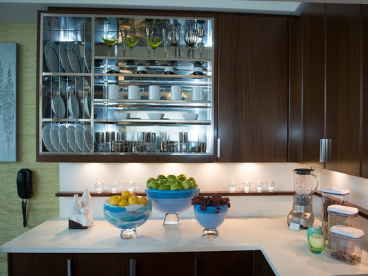
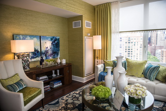
Below: The view from kitchen to living area. Someone tell me, what's not to like...not much! The kitchen is (relatively) simple, clean, modern, colorful and interesting. What I love is the use of white, seen in the kitchen and in the furnishings. To my eye, the white shade, especially in the kitchen, serves to reflect light, always a good thing in a small space and it also sort of tones down the feeling of formality.
In addition, the seamless white countertop and backsplash allows the space to flow, undisturbed by visual clutter (I'll get to that later.) Less is more is a mantra I always have in my head and having the strong interest of the rug as a patterned visual anchor...on the floor, in this case, is an excellent place to use pattern. I don't think I would have used the stainless steel apron sink, but that is another quibble where there is no right or wrong to attach to it. The rug's connection (and the floor as well) to the living area also makes perfect sense visually. Love.
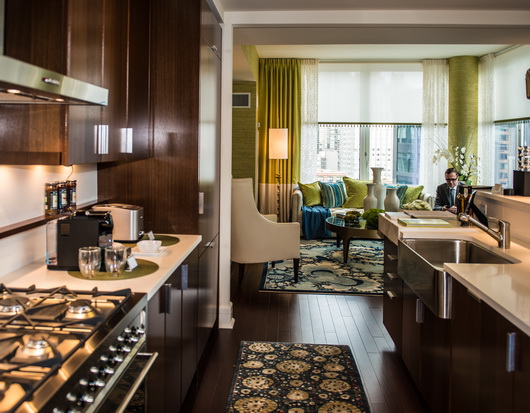
Below: Here is where I will talk about visual clutter and in one respect, it is a quibble. For those who have not lived in a New York City apartment (among my immediate family, 3 of us lived in NYC apartments for a collective total of 22 years) a few things out of place have a way of pretty much drastically affecting the feeling of spaciousness. To my eye, there are too many accessories in this kitchen. It's also a simple fix to edit the accessories here.
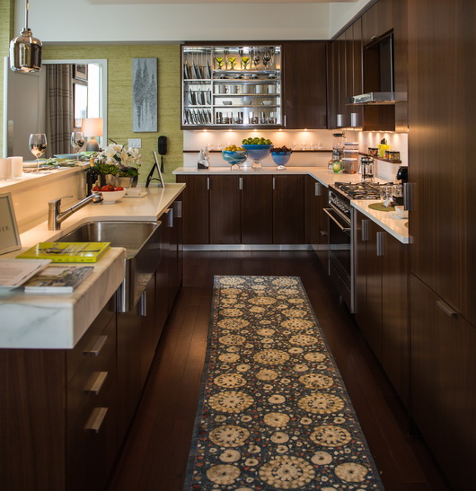
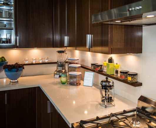
Below: Another quibble - the shelf is so shallow, I would have continued it across range or included a stainless steel shelf of the same dimension. You never know what a coop board will or will not allow, however.
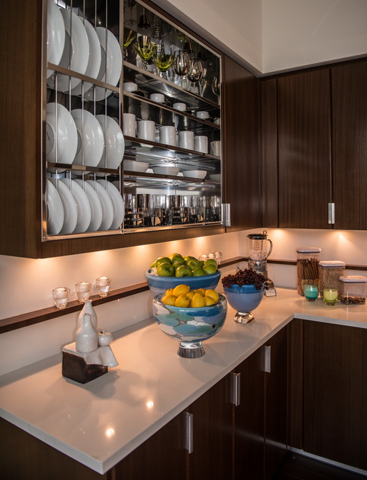
Below: A visually strong feature, I think I would have designed this stunning stainless steel wall cabinet to be in the center of this particular countertop section with an equal amount of wood on each side, probably ending in line with the base cabinet corner, but it's an interesting and creative feature, very much so.
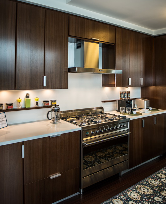
Below: I do really like the shallow wood shelf that runs along the backsplash. It is useful and a great feature, as it is elegant, simple, and just different. I like it.
Below: Another view of the shelf. It works for me. The stainless material throughout in various places ties in beautifully, accentuating a cool/warm feature, allowing each element to "pop."
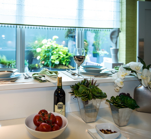
Below: Yes, it's a narrow ledge for casual dining, but, hey, it's New York City and you are lucky to have that alternative dining spot!
Below: To me, this is near perfect. I'm good with all of it. Too many accessories? Maybe, and that's a quibble.
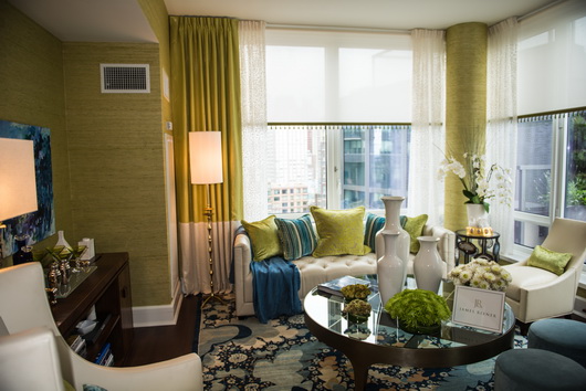
Below: Warm, stunning, lively, absolutely beautiful.
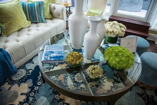
Below: Love the glass table and love the white. I also love the varying shades of blue and the analogous color scheme.
This kitchen is a beautiful execution with a feeling of elegance, the right amount of comfort and great function. What do you think?