Electrolux Kitchen Appliances - Design Competition

I had the privilege of being among an impressive group of design professionals serving as one of the judges for the Electrolux kitchen design competition, "The Kitchen Reimagined." We met in New York City in November at the offices of Interior Design magazine. 

Coming from different design disciplines, with me being the only kitchen design specialist, we dissected each submission from the global group of competition finalists.

Passionate dialogue, active listening in appreciation of all views of the design professionals in attendance and some open second guessing in search of verifying our instincts brought us closer to a smaller group of finalists. Time spent seeking to understand the points of view of all entrants eventually put the focus on the top 5 winners in the order we deemed appropriate. 

The entries to The Kitchen Reimagined competition were, in a word, inspirational - and that is the spirit with which we approached our work. Spirit, imagination and inspiration were celebrated attributes in seeking the best kitchen design submissions. Interior Design Editor in Chief, Cindy Allen, was our fearless leader for the day. 

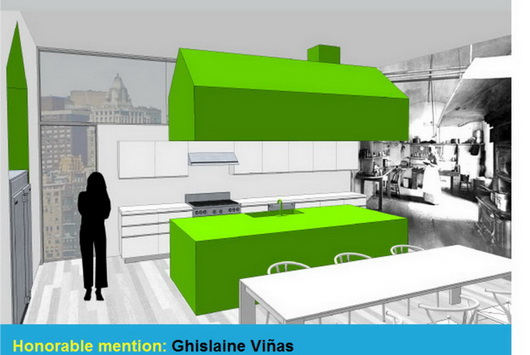
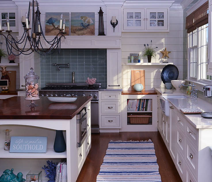
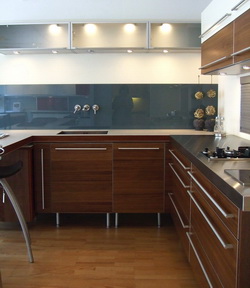
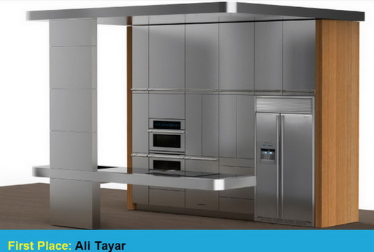
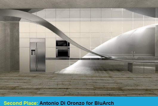
For me, participation in this competition as a judge was a privilege and an honor - and a whole lot of fun too. I think you will find much excitement in these kitchen designs which seamlessly surround Electrolux appliances. Very cool stuf.


Modern Kitchen

As a random feature, I'd like to show you a kitchen that would be interesting to talk about. In this case, it's a modern kitchen. 

It's always interesting to dissect the foundation and other elements that make up the framework of the design. There are several ways to "see" this kitchen. Images by the ridiculously beautiful magazine, Rum.

Below: Let's look at the largest view of the space. It's very strong, isn't it? Both the wood and the white, to me, are equally strong. This modern kitchen is striking in its simplicity with its super clean lines. Yet the texture of the wood makes a very striking...yet quiet...statement. It's strong, but sort of offers a feeling of security. An exciting mix of contrast on traditionally opposite planes (white used horizontally, wood used vertically) the white, larger in proportion and supplemented by furnishings, indeed serves as a paradoxical foundation. 

Below: THIS shot of this kitchen is a wow, no question about it. Can we achieve any more of a minimalist design? The shot itself is stunning. The wood texture and color radiates warmth and elegance. Clearly, the design is art...a functional and living sculpture.

Below: Well, the modern kitchen plot thickens! Now we see that this is a loft type space. A very open floorplan. The white continues from floor to ceiling to bedding to accessories. Two elements - wood and white. Strong rectilinear shapes focuses the eye toward (in one visual sense) floating and dominating vertical planes, a monument to the most important element of the space - the beauty of the wood. 

I must say that I'm not on board with living in this environment. It's not for me, but I ask these questions: Is the design is a reflection of the designer or the client? Is it a monument to the designer's ego or was it a concept the client was interested in experiencing? The origin of a design like this is of interest to me. Of course, one has to visualize the space with the tools of living. Are there children in the home? Clothing, books, toys, papers, all must have a concealed home and time taken to store used items when finished using them...or else. 

Can one live a 100% completely clutterless life? Seems a requirement for this type of living. Sure, I'd love to experience living in this way, but, as a second home, not a primary home and even so, I'd probably have to "test" it by renting a similarly conceptual home to see if it's a fit for how I live. It's living, functional, art, and it is quite amazing and wonderful, but the paradox and questions remain.

So, what do you think? How does this space make you feel? Would you like to live in these spaces, visualizing everyday living?

New Style White Kitchen - Scandinavian, Of Course!

Just when you thought there could be no more true innovations in kitchen cabinetry, I mean, you open a door and you close it. You open a drawer and you close it. What more could there be to that concept? 

How about this combination of little recessed spaces set amongst the cabinetry? I spotted this on the teriffic blog, Emmas Designblogg. Whether the recessed nooks are used for decorative or useful items, I think this is a fun idea. While you're at it, check out this link from Emmas blog too. Images are from Skona Hem. What do you think of this style?


KBIS 2008 Trends - It's a Mod Mod Mod Mod World!

 hp-logo-washpostcom.gif
FIRST, a big WOW to being named blog of the week by none other than The Washington Post! My blogging buddy, Joni, from Cote de Texas told me the news. The other blog pick of the week was So Haute, a good find. Back to you...

For those of you way too young to remember this movie, if not a mad world, it was a mod one at KBIS. Here are some examples, certainly not all, and to see the brand, roll your mouse over the image. MUCH more KBIS to come (this is nothing!) We haven't even seen kitchens yet!

kohler%201.jpg kohler%202.jpg walker%20zanger.jpg zephyr.jpg interlam.jpg elica.jpg blanco.jpg corian%201.jpg meredith%20idea%20center%201.jpg elkay.jpg


A Minimalist Kitchen

I don't think I'd call fellow blogger, Leah, a slacker, even though her blog is named More Ways to Waste Time. I think Leah's efforts definitely look productive, and with some "chic" thrown into the mix. A freelance writer, Leah interviewed me some months back for a piece on kitchen faucets for HGTV's website, yet to come out. Her point of view on home design, I find to be fresh!

Leah went on a walking tour of homes in California's Oakland hills. The homes were "eh", she needed a drink, but it was the last home her tour group went into, which was the surprise of the day. The kitchen stopped ME cold, when I came upon these images, and she said everyone was just wow'd. Simple, elegant, modern, yet, to me, warm. I really love this kitchen.

Things I'd tweak:  The window doesn't do it for me in this setting, but my guess is the owner wanted the home to stay true to its architecture. I don't get the round thing to the right of the hood. Maybe I'd add a run of stainless steel above the tile to go up to the height of the window, as I feel that's an awkward area, below the window. The window is too high. Just, sort of, to integrate the window in a more meaningful way. I'd revisit the plan. The cooktop/oven is unfortunately in a corner. Maybe they could have been centered on the beam...just random thoughts. Overall, very, very nice.

white%20kitchen.jpgwhite%20kitchen%202.jpgwhite%20kitchen%203.jpgwhite%20kitchen%205.jpg

Modern Kitchens 2007

Here is a collection of modern kitchens, snapped at the kitchen show a few months back in Las Vegas. I have not put these images up till now, and it's interesting to compare them with the Scandinavian modern kitchens I just photographed in August. Some of these kitchens were made to showcase appliances, and some were showcasing cabinetry. Perhaps you can see that the trend of tile walls is strong. A bright color trend is seen, as well as dark shades of cabinets in these images, also strong. Quite frankly, I think some of these are uninspiring, at least to my eye, a few others are good, and the second to last image is a great example of just way too much going on...putting different materials together just because you can!

What's your take...and preferences?


Modern Kitchens - Euro Style

Kitchen%20Showrooms%20_13a.jpgOne of my favorite blogs, freshome, was interested in the kitchen "scene" in Copenhagen, which I have not yet shown on this blog. I went to a good number of kitchen showrooms, every single one of them having wonderful looks and features within. Some features and styling are very subtle, almost imperceptible as being something special, unless pointed out, making the look all the more...I think "organic" is a one descriptive word, following Denmark's great, and historical, tradition for design excellence. So, I encourage you to look closely at these images in the flikr slide show.

Here is what I observed, which I shared with freshome, on that blog: "I LOVED going to Copenhagen's kitchen showrooms, seeing the latest, and very cool, design ideas. Large patterns on walls, beautiful, and textural wood grains, lots of dark charcoal or black, and white, cabinetry, these are some of the latest trends in kitchen design. I also noticed backsplashes with clear or colored glass sections positioned over painted, textured, walls, a very sleek look! Always fabulous lighting and always little splashes of color, a typical, and modern, Scandinavian touch."

Some of these trends are prevelent in the U.S. as well, as I observed at KBIS in May. I will do an accompanying post on those kitchens in the next few days. That should be interesting to compare! You will see a few country kitchens, too, very charming, I think.

Take a look at the kitchen slide show for many more images (all taken by me!)

And, please take a look at the freshome blog, and click on the top banner for the latest posts. There is much inspiration throughout this blog for the entire home. Enjoy!

White Hot Kitchen!

The last post really hurt me. Everytime I looked at it, and I'm not kidding, I had anxiety! The yellow, the orange, the brown...the pain was almost unbearable. And, I can't wait to do it again!

lonekitchen.jpg


So, now, for something a bit more current. Come with me, mod design fans, back to the future, and take a trip to Europe, (I'm not paying) in design style only, to where modern furniture design, truth be told, has its origins. In Scandinavia, in Denmark, to be specific.


Here's my good friend, Lone's kitchen. Lone (pronounced Lona) Bager is the owner of Kobenhavn Design, kobenhavn design, a to-the-trade supplier of modern Danish cabinetry, including wood countertops.  Lone is based in New York City, in the east village, and operates out of a fabulous design studio.

lone128a.jpg 


The philosophy of Danish design is that there is beauty in the "whole", as opposed to the individual pieces of the whole. The phrase "less is more" was invented just for this concept. It's about function, simplicity, and therefore, beauty. 

lone129.jpg
Note the simplicity and elegance of the cabinetry in the dining area behind the table in the second to last image. Pure function in classic proportions. The beauty lies in restraint. It takes a lot of discipline to allow this type of design to just "be". It's not so much modern, as timeless. Love it.

The cabinetry, affordably priced, is multiform and is available "to the trade" via Lone.