
A few weeks ago, Kathy Price-Robinson, a writer, knowledgeable on many and varied remodeling topics, asked me for comments on how to get the look, for less, of Lance Armstrong's kitchen.
I proceeded to write paragraphs (and paragraphs) on elements that I observed that one could replicate fairly easily. I'm thrilled to have been quoted in AOL for this feature, but, unfortunately, many of my paragraphs did not make the cut. There were some good points!
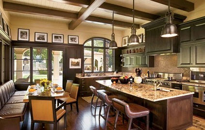
BUILT IN BANQUETTE
One could buy short stock refrigerator cabinets that are 24" in depth, mount the pieces on a platform of studs, put a sturdy top on top of them, and wa-laa you have storage and seating. Those cabinets should be somewhere between 12-15" tall depending on the structure below and above the cabinets and the height desired for the bench. Take a look at this earlier post I did on banquette seating.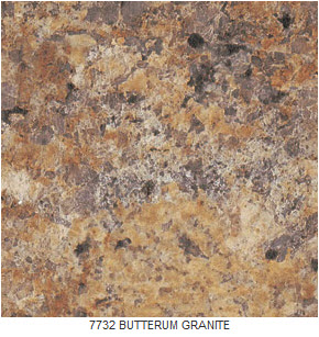 COUNTERTOPS
There are GORGEOUS laminate countertops now that truly look identical to granite or other stone except for the touch. They are worth a serious look. Alternatively, in one of my own kitchens, years ago, I used granite tile and wood trim which is an excellent second choice. I loved it.
COLOR "BLOCKS"
As we see in the image, one of the elements that makes the most impact are the sophisticated colors and shades in Lance's kitchen. Paint your cabinets an elegant, smoky color such as the green in Lance's kitchen. 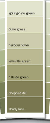 Note how the window trim, the island, the cabinetry under the curved window and the bench are dark, muted colors. Rather than feeling cluttered, it flows - this is the essence of this look. It is a close relationship of color from one material/surface to another. I would not advise matching these colors one to another...subtle differences only add interest and sophistication. Be aware of undertones in the color and assemble the colors together so you can see the nuances of one to another, but do not worry about matching.
There are 3 color stories in this kitchen..keeping it simple. We see the browns, the green, and the yellow/gold. The yellow-gold is seen in the chairs, countertop, tile and wall color. It adds a brightness, a "life" to the space as well as a unifying warmth.
To add to the feeling of "flow" the ceiling color continues from the wall color.
BACKSPLASH
Observing even more continuity, note the simple backsplash which coordinates with the granite. One or two shades deeper and softer than the granite, it allows the granite countertops to take center stage without competing with it. Less IS more, especially in a large kitchen. Think of this kitchen as "layers" or blocks of color, proportion, contrast and texture to understand how these pieces fit together.