Modern Kitchen Design - The Kitchen Furniture Look

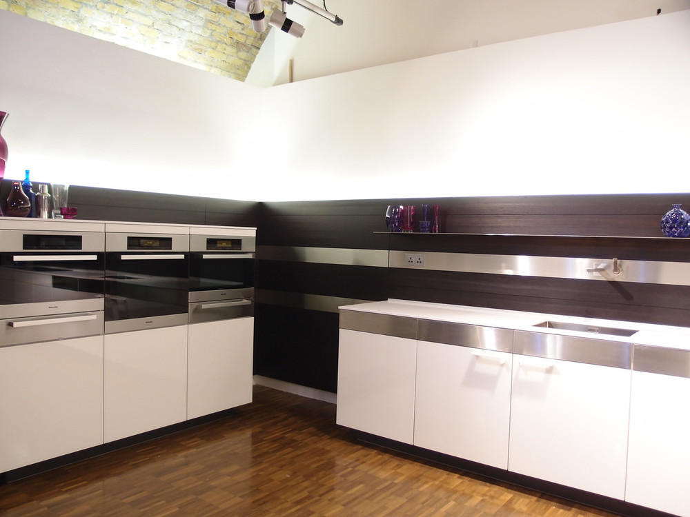
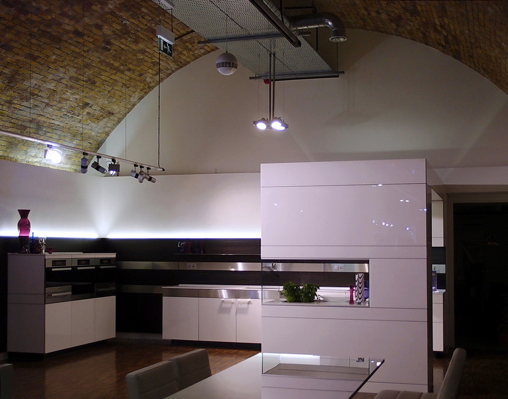
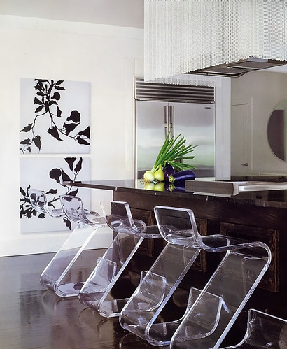
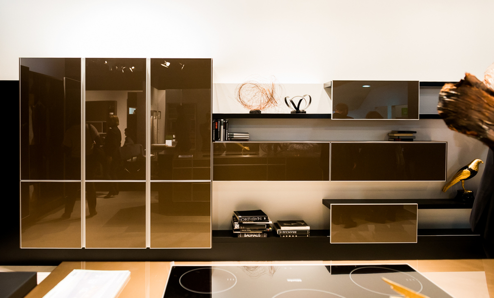
Let's dissect this brown, modern kitchen design. I took these shots of a display, a very large one, similar to a furniture look, as large as a kitchen is if not quite a bit larger, at the LivingKitchen design fair in Germany this year. I attended the show with Blanco America and it showed the very latest in kitchen design from Europe.

Although it's a display, which is meant to instill excitement and show innovation in design, we can still learn quite a bit from a kitchen as large as this one, especially if we are interested in design concepts far away from the typical, which I'm always open to! So, let's get to it. Here's MY take and tell me yours:

Pros: 

  • It's just an exciting design overall
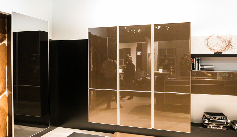
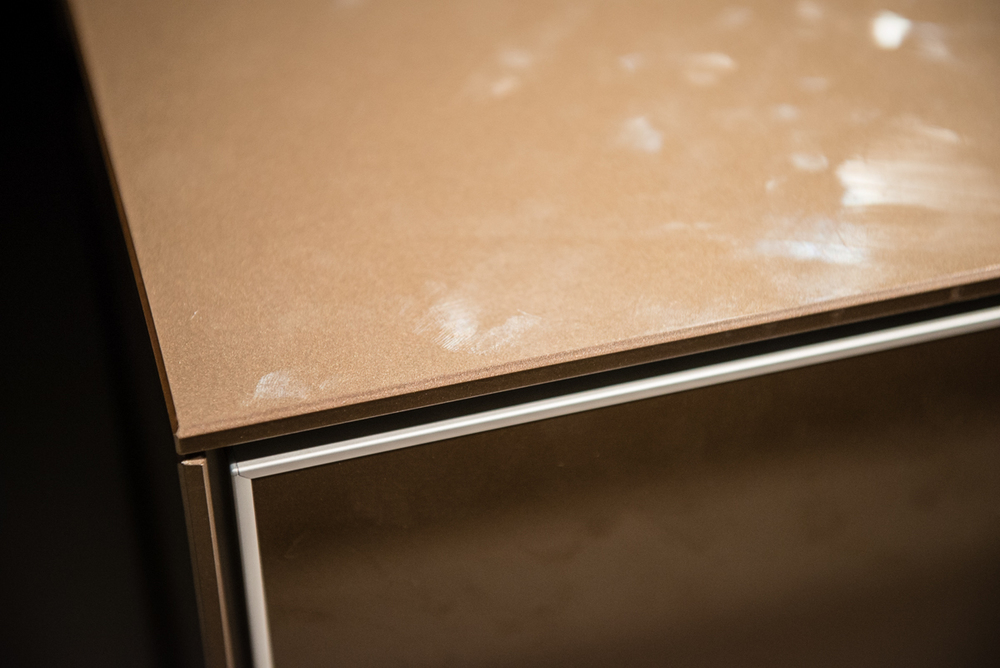
  • It's a unique color, one nor normally seen in a gloss door style
  • Who wouldn't love the fireplace and skin effect?
  • It looks like furniture
  • The eye has room to REST, SO important IMO!
  • I love the floating effect
  • I love the ability to change out decorative/useful items in open/closed storage
  • The horizontal lines are interesting, also the depths of cabinetry, etc.

Cons: 

  • Everything happens at the island - ok if there is ample room on all sides
  • The flooring is too sterile for me
  • As is, regardless of the warm color, it's a bit cold-I need art


Overall, I think it's gorgeous. My assumption is that the refrigerator might be situated down toward the fireplace, in the tall cabinet section to the right or maybe unseen, at the other end closer to the sink section of the island. Likewise, the ovens might be situated in one of these areas, perhaps concealed. The ovens could also be built into the island. 


If a design similar to this one worked out for my own kitchen space, I'd definitely try something like this. I think it's modern, furniture-like, while still being utilitarian.

What do you think of this design? Is it warm, cold, something in between? What would you change?


Mecox Gardens - Finding Design Inspiration

Saturday, I took a day trip out to the Hamptons. It had been gloomy most of the week, cold and miserable and the morning was a) a Saturday-yay! b) sunny c) much warmer - all good reasons to go exploring on the east end of Long Island.

Designers find inspiration everywhere and my day trip began with a visit to the stunning, new, Parrish Art Museum, a fantastic place to expand your vision. I cannot overstate what a beautiful museum this is. The backdrop of this elegant, organic building (in design and materials) was perfect for appreciating the art within.

This was followed by a stroll through the truly fabulous shops in Bridgehampton, a visit to Tom Colicchio's new, gorgeous, restaurant and hotel, Topping Rose House built in 1842, by the way and newly restored, and more sensory stimulation as I picked up a few things at a favorite market, Citarella. Even my purple potatoes in my salad nicoise were a visual pleasure! I do enjoy being in the Hamptons in the off-off season-it's easier to slow down and take it all in.

I allowed time before heading home, to stop at Mecox Gardens in Southampton. I've visited Mecox Gardens shops in New York City, Southampton and East Hampton many times. I love the design vignettes they put together in their shops and I also love the jumbled look of objects just waiting to be discovered.

Below: The main entrance

I hope these images convey the beauty and style of the objects. So many of these objects can make their way into the kitchen, now the most important living area of the home.

The modern kitchen has indeed been redefined. Since many of these objects have a sculptural quality to them, you can create a focal point that may be experienced as a foundation in a modern style but might also have a traditional, cottage, handcrafted, natural or other characteristic as a sort of companion to the modern object, often adding warmth. The modern kitchen may well have a mix of a few styles to create a unique look. Your personal take on modern interpretation will also benefit from guidance by a design professional to communicate the style message effectively. Take a look and be inspired!

The day was a mix of new and old, modern and tradition via art, architecture, home furnishings, even food. Taking some time out just to explore and soak in disparate types of beauty, just because, is a prescription for, you guessed it, design inspiration!

Crossville Tile - Kitchen Luxe

Crossville Tile invited me to view their tile in the kitchen of a fabulous designer showhouse, designed by Ulrich Kitchens, deep in the (highly desirable, trust me) woods in New Jersey. The show home, "Hidden Acres Estate" is part of the Traditional Home 2012 National Showhouse Tour. 

I don't normally associate Crossville tile with being a luxury tile brand, so it was with a good dose of curiosity that I attended this small but prestigious event.

While I love quality and I love beautiful things, I am always open to good design whatever the cost. Good design does not need to be expensive. Creativity does not need to come with a large price tag. Good design comes by way of making smart design choices regardless of cost (in this case, being open to lower cost products) and being a snob about seeking "the best" in every product or material is not always best for the design.

Sometimes more is less and usually, less is more. So, I'm a designer who has adopted an openness to a high/low price strategy in my design projects and particularly in my home long before the concept made an impact in design publications online and in print. I don't look down at it, I applaud it. Geez, this turned out to be a policy piece! Now for the pretty pictures! Comments below...

Below: I do like the strong continuity of the horizontal lines, but I think I would have brought the upper line up and around, then down, inside the hood section while leaving the lower horizontal line as is. The inside could be left as is or designed with another motif of some sort, tile or a decorative object(s) hung in that spot. 

Below: I do love the white grout used in the mosaic tile. This appears as a classic look and it's a smart design choice to use this middle shade of gold/brown which looks great with the granite and cabinetry. Charming!

Below: A closer look at how a well priced, simple, tile complements exquisite and formal accessories. High/low done well.

Below: A good look at this different pairing of mosaic and subway tile which just may skirt a "trendy" look - time will tell

Below: Clearly, a formal yet modern look that works

Below: How gorgeous are these chairs??

Below: A lovely arrangement at a gracious entrance from the kitchen to a nearby room

It was a lovely day!


Joss and Main - Scandinavian Rug Sale

We are excited to announce the sale of our rugs fir the first time on Joss and Main - a special sale for the next 72 hours. The rugs that we have curated in our web shop, Scandinavian Made, have these characteristics in common:

They are hand woven by an individual artisan

All the rugs, whether vintage or new, are made in Sweden

They are made with wooden looms

They are exclusively runners of different lengths and widths

They reflect the unique artistic aesthetic of the weaver and are an original piece of art

They have been carefully curated by me (Susan) and Kelly Donovan with our eyes focused on interesting design, use of color, pattern, texture and overall beauty

It's not always easy to visualize just how a rug may look in your home, especially when you are looking quickly through an assortment of patterns and colors. Here are some tips to find the right Swedish rug from our collection:

1. In an otherwise neutral space, a shot of color, any color, will bring the space to life! 

2. Think of these Swedish rugs as works of art and add them to the room's interior design in more formal rooms such as living areas, library, office, bedrooms, not just the hallway and kitchen.

3. Vintage rugs with a modern pattern look particularly great in combination with modern furnishings.

4. Change is good - change your rug with the seasons or rotate them in other rooms of the home.

We are so passionate about each of our rugs and are so happy to share this very, very old authentic artform with our readers. 

A word about rugs in the kitchen - these rugs are a no brainer in the kitchen! For color, comfort, gorgeous texture, visual warmth, workhorse strength and elegant design in the kitchen and/or breakfast room, they are not only perfect, they can absolutely elevate the design via their handmade quality. Love these rugs!


Poggenpohl Kitchen Showroom

During a recent trip to London, I had the opportunity to spend some quality time at Poggenpohl’s Waterloo kitchen showroom. This London trip was arranged courtesy of Blog Tour 2011, an idea conceived by Veronika Miller, founder of Modenus, to bring design bloggers to the London Design Festival. Luckily for me, a visit to a Poggenpohl kitchen showroom was on our agenda!

Following are interesting design ideas that I spotted at the showroom – and check out the Blanco sinks!

Below, highly textured wood cabinetry paired with sleek white and stainless steel-take a look at the lucite dining chairs and glass table-cool!

poggenpohl 1

Below, I'm thinking that, after removing the third bottle of wine during dinner, this higher position of the wine refrigerator should prove to be useful!

poggenpohl 7

poggenpohl 2

Below, a crisp/tailored undermount sink and separate drainboard by Blanco. I love the look of the separate pieces and the recycling bins below are perfectly situated.

poggenpohl 8

Below, another Blanco sink and interesting countertop shapes and forms.

poggenpohl 5

blanco sink 2

Below, note the difference in countertop thicknesses - the island is thick, the opposite countertop is thin - quite interesting to change it up.

poggenpohl 3

Below, exploiting horizontal lines...

poggenpohl 9

Below, sleek white cabinetry, playing with volume...

poggenpohl10

Below, on trend neutral, flesh tone shades in textured wood juxtaposed with sleek, glossy, cabinetry.

I have more images of this beautiful showroom I will share, but in the meantime, thank you to those at the Poggenpohl Waterloo showroom for giving us such a warm welcome!

Modern Dining At Las Vegas World Market 2011

I saw some great pieces, continuing my dining theme from Las Vegas World Market that I need to share with you. Some dining tables and chairs were simple and clean, some super innovative yet elegant, with very exciting decorative details.

Many of these sets are quite affordable. In some cases, it might be advisable to add on a glass top to protect the surface of the table. In some cases a frosted or other patterned glass top could look great and add protection. Oversized glass is also an option, which adds area for dining as well as a nice aesthetic statement.

Take a look!


Bermex Bermex Bermex Diamond Sofa Diamond Sofa Tip Top Furniture Aspen Home Temahome

The Intoxication of Paris!

Seven nights in Paris...it's taken me so long to begin this post because I just don't know where to start! How about I start with adjectives? Paris was:

incredible, amazing, beautiful, sexy, charming, colorful, historic, elegant, modern, rustic, delicious...and I'll add another "incredible!"

The view from our apartment below over the Seine:


My husband and I stayed for 7 nights. We rented a luxury apartment overlooking the Seine, decorated in blacks, reds, and browns. It was TRES chic! Ok...the luxury part? My husband received a trip from his employer for many years of service and truth be told, we could have made several nice trips out of the gift and stayed at decent places. Instead, we made one small trip and then, um, decided to BLOW the rest of the travel $$ after airfare, on a fabulous apartment. Yeah....we're glad we did. Sometimes you just have to blow the money, you know?

Which brings up an interesting subject. I never feel a need to stay within bounds of whatever I perceive my "class" to be (don't we all have a perception?)...which changes depending on my mood. Could I afford to stay in that apartment for an extended period of time? No! Should I feel comfortable in a luxury apartment that I could barely afford to rent for a week? Why not? And I did feel comfortable the moment I stepped into the building!

Prior to selecting the apartment, we were feeling responsibly frugal. The more we looked at apartments online, however, the more we were falling in love with the fantasy of living in Parisian luxe for a week!

As a designer, it is an experience to stay in beautifully designed surroundings. Good design that I can live in, even temporarily, is a memory for me and a thrill. I'll always have Paris.... :) For Steve, he, too, said let's do it and we thought Paris was the PERFECT place to indulge! 

The Kitchen Parallel

I can surely make a parallel to kitchen design. When it comes to material costs, of course, you must reconcile what your heart AND your head tell you and that is the tricky part. But, if you fall in love, say, with a walnut wood countertop for an island and if you truly can afford it, take care that your "default worry alarm" does not shut off your dream state, only to select a less expensive (but practical) material, crushing the dream yet leaving you feeling (yes, unnecessarily) responsible. Being frugal in a situation such as this when one does not need to be, in my world, is borING! 

Design beyond your comfort zone. Find creative budget solutions which are always out there to find and feel good about that. I've done that, to the max, actually. But, also feel good when you've just.got.to.have.the.....whatever. Go for it, spring for it, indulge your kitchen fantasy. You deserve it, you're worth it, and yes, the material thing you love does not have a pulse, but I sure get lasting joy from some of my possessions and experiences, even over decades, don't you?

Get the flash player here: http://www.adobe.com/flashplayer


Kitchen Design - Less Is More

I came across this picture of a kitchen, again, in Veranda magazine, designed by Benjamin Noriega-Ortiz. I immediately liked it.

This kitchen goes more under the heading of "highly stylized" rather than "highly personal". More "showcase", less "high end catalog". And, that said, it's a viable look. Glam meets function meets texture. There was no other image of the working part of the kitchen.

I like the variety of elements, but what I like more is the strength, yet, restraint. I need to continue to explain to my clients that less is more. Fewer, larger, shapes and forms will enlarge a space as opposed to many, smaller, pieces, door sizes, accessories, etc. This is not a good vs. bad evaluation, simply an observation and another way to design a kitchen. The look is simple and elegant, so that the individual pieces say something meaningful yet are linked together in other ways, perhaps in color or tone, if not style

Here, my eye sees a variety of styles:

utility (stainless refrigerator)

rustic (dark wood island)

glamour (beaded hood)

something hip/fun (plexiglass chairs)

elegance/sophistication yet modern (prints on wall)

modern/sleek yet textural (floor)

contrast (floor and walls)

There are common threads among these elements which tie one disparate piece to another and it's fun looking for them.  I'm actually pretty crazy about this kitchen, although I'd probably want to change the prints to something A BIT more personal...give me that. But those chairs...what a WOW!

One question that comes to mind is, what came first, or simultaneously? Was the flooring color picked first, knowing that those chairs would be used, which relate to the walls in terms of tone? Was the big picture seen from the start, or were pieces brought in, to build on the previous concept. How were the layers developed? It appears to me that there was a desire to have a strong foundation first and foremost, as seen in the flooring and the island being similar tones. Other than that, it's hard to guess.

What do you think??

More From The Architectural Digest Home Show

Here is more good stuff I saw at the show...let's look at tables. Tables send such a strong message about who lives in the home. Modern, traditional, formal, informal, textured, smooth, light, dark, light, heavy...these are just a few of the decisions one needs to make when contemplating the table in the context of the room and the home. Tables can also be a functional piece of artwork, and I am finding more and more, manufacturers are building and designing in practicality in terms of being able to refinish scratches, when they occur, which they will.

asia%20design%20studio.jpgHere is a lovely table. It IS a piece of art, at least to me. The table is made by the Asia Design Studio.  Designed by Na Winn, a talented Vietnamese artist.


cityjoinery.jpeg

I like City Joinery. I'm also a fan of the name. Made in Dumbo, they have a wildly smooth finish on their wood pieces, allowing the wood to be enjoyed, every piece of grain, pigment, characteristic. They make some great tables. I was also told that it's quite easy to touch up the finish when desired, or when scratches occur. The finish was flawless, yet, they tell you not to be afraid to do touch ups. I like that.

ericmanigian.jpgI also liked Eric Manigian's work. His work is very organic in its look and feel. Manigian designs with longevity in mind, and his pieces come from a small group of millers who provide him with wood from discarded or fallen trees. His designs are of a minimalist nature. After all, with wood as beautiful as this, with all its rugged beauty, that's really all you need.

Next...a slideshow of more, interesting, picks from the show.

Kitchen Ideas At The Architectural Digest Home Design Show

Lucky for me...New York is at my doorstep, so I must take advantage of special events when I can. I really looked forward to the Architectural Digest Home Design Show, featuring "the best in home furnishings from nearly 300 exhibitors" as the press release says. Last year, they say 23,000 people attended over four days...and it's not such a big space, so with an eye on the clock, we (me and Steve-my husband aka "Show Dog") got there at 10 am, when it opened.

When I go to design shows that are not kitchen-centric, sometimes kitchen items, like major appliances, are displayed or a few cabinet companies here and there. I don't really stop at those exhibits. What I think is more interesting are other manufacturers which are NOT necessarily kitchen focused. It allows me to look beyond the "typical' world of products manufactured for the kitchen and bath industry, maybe to find a use IN the kitchen of a product which was designed for elsewhere in the home.

In general, I observed lots and lots of natural woods, and other natural motifs and materials. The characteristics of wood, its grain, knots, multi colors, is prevalent in this show. Lots of white, too, some black, really, a little bit of everything. More modern style than traditional, for sure. Nature, I'd say, was the star.

Here are some random finds that I'd like to show you.  

natalieblake.jpgFirst are some beautiful tiles I found, by Natalie Blake. They are very large, and quite irregular. They are more wall art than kitchen tiles, but I think one or more of these tiles could be beautifully framed around a backsplash of another material. This is an image of a tree, encompassing many tiles, but individual tilse can be pulled out from this and other motifs to stand on their own. Approximately $325 each.


french%20design.jpgFrench design is exquisite, no? I've begun to dream more seriously about going to Paris (I've not been there before) and was delighted to see the beautiful French antiques from Ghislain  Antiques, in Paris, and in Stamford, Connecticut, just down the road. Beautiful metal cabinets, perfect for kitchen pantry storage, stools, tables, can be lovely in the kitchen, no doubt. 


scandinavian_icona.jpg


Another tile, imported from Italy by Wayne Tile. Situated in the back of a display against the wall, in the shadows, I found some tile I really liked for the floor, walls, anywhere.  it is named Scandinavian Mesh, but that's not why I liked it! It's soft, yet textured, a perfect warm modern tile. To me, it appears to be quite elegant.


7.jpgAnd, last, for now, I'm pretty crazy about these wall panels. What an idea! They can go anywhere. They are made in the form of columns, arches, and panels. I don't know about maintenance behind a backsplash, for example, but I do think it could be interesting to have glass in front of a panel with bolts holding the glass to the stone.  Look at the website...so many textures and colors. Very cool. Barnell Stone.

New Kitchen Chic - Boho Modern

I've been really busy recently working on my clients' kitchens. Deadlines of all sorts are always looming it seems, As a result, I've been remiss in bringing my readers beautiful and interesting kitchens! But, this blog is part of me and will not be denied attention! It tugs at me when I think about something or see something I find important in the process of kitchen design/remodeling, or information that is fun, or interesting that I have to share.

In that vein, yesterday, I think it was, or the day before, I was looking through interior design blog, decor8, which I often do to experience the VERY interesting "voice" of Holly, decor8's author,  Long story short, I was transfixed for a good hour (sorry, clients!) reading, thinking, analyzing, her words about a new look, feeling, focus, of interior design styling that decor8 feels is here, very much alive and moving forward. Holly calls it Boho (Bohemian) Modern.

At first glance, below, one could almost conjure up the words "shabby chic" but SC it isn't. Boho Modern mixes old and new, yet, it's more than "eclectic." Boho Modern is more born out of a deeper self expression, a confidence to style one's home with more personal conviction and personal focus as opposed to blindly (key word, here) following trends and/or images of interiors that manufacturers "suggest."

Anyone who knows me or reads this blog knows that I strongly encourage my readers and my clients to be much more personal in the kitchen in regard to styling, bringing in collections and (living room) artwork, sculpture, whatever. And, then, changing pieces as desired, not to think of the accessorization of a kitchen as being "done." Likewise, with cabinetry. So many possibilities, ideas, ways to mix pieces and on and on. The kitchen is the last bastion in the home that really needs to be kicked up about ten notches with the purpose to express one's self in this VERY soulful room. Sort of a paradox, actually.

Please take some quality time to read this post along with the comments (another gold mine of information.) Read this post as well, and the comments, more from Holly in the comments too. Great stuff. Here's MY interpretation of Holly's words in regard to Boho Modern kitchens. Have fun!!

Images from the fabulous Vakre Hjem & Interior (their website is down) and the last two images from Bo Bedre, always a favorite.


2182030996_b51fcf1e1d.jpg

 2182030926_f6c40dc966.jpg2181243015_0a7080e718.jpg2182030782_18f1d55c1c.jpg2182030678_ceba896b7f.jpg2181242781_c048a33c84.jpg2182030506_13c2b49b38.jpg2182280907_403753016f.jpg2182280943_9366987ca0.jpg

ICFF - more great kitchen finds!

Here are a few more wonderful things I found at ICFF. We missed another installment of Scandinavian kitchens yesterday due to the holiday (I was in the garden) and I promise to revisit these kitchens next week. But, I'm real excited to bring these to you. And, no, KBIS is absolutely not forgotten...just want to go through these ICFF items first. I hope you will be glad I did!

Armoire%20Iannone002.jpgHere's a piece I clearly remember seeing early on at ICFF. When I first saw it, I said "Pantry". In fact, it is called an armoire. That's ok. We can change the nomenclature and the use, right? Iannone Design Ltd., manufacturer, is a Philadelphia based design/build firm dedicated to the creation of eco-friendly modern furniture.

I'd like to see this armoire/pantry tricked out with roll out shelves, in custom sizes that I can design into a space, maybe with vertical dividers installed in an upper or lower space, who knows what options there are for this piece?? I can see quite a few already.

This is one happy furniture piece.


sbwstool_lg1.jpgThen, I saw these stools from SMC Furnishings. There is an increased interest in real, authentic wood, splits, cracks, grain variations, and all. I think it's a beautiful expression of what wood is, sort of like people, imperfect. Wait till you see the other very cool stools and benches they have.


FTF%20Design%20StudioAnd, to complete the look for today, is one of a series of tables from FTF Design Studio. Cool, white, chic, hip....it's Corian on the table top, and there are several styles of tables. The table tops are 1/2" thick. FTF also makes a great line of trays for many different uses, including kitchen uses. Very innovative, very modern. FTF Design Studio is the furniture line of Roseann Repetti and her husband, architect West Chin. I CAN see coordinating the table top with surrounding Corian countertops, or matched up with countertops of contrasting materials, such as wood, perhaps. Or, maybe Norweigian slate. But, I digress (again). It's just really very simple and elegant.


icff - glass kitchen tile style

summer-ses-detail.jpgBrooklyn Glassworks, a new company recently launched, redefines glass tile. Founded by artists Erica Rosenfeld, Dena Pengas and Brad Teasdale, they met several years ago at Urban Glass in downtown Brooklyn, where they currently teach. Over time, they each saw that their styles had strong similarities in their shared love of color, design, and form. More than glass tile, there is a line of contemporary lighting and limited edition furniture as well. All pieces are handcrafted in Brooklyn, NY. Colors for tiles are in seasons, spring, summer, winter, fall. Here are shades of summer.


veneto_mouldings2.jpgMore glass tile was seen at Stone Source, one of my sources for many years. Stone Source has really fabulous materials. They're lush and gorgeous and always stylish.  I was surprised to see the many choices that are available for their glass tiles. So many colors, sizes, moldings, color blends, and they do custom blends as well. There are a whole lot more colors for glass tile than just green! A great resource.

icff - Kitchen Chic!

One of the reasons I love to go to a show like this, a non kitchen focused show, is to be open minded and look for wonderful items that may not be designed specifically for the kitchen but can be adapted as a useful piece in the kitchen. Here are a few items which blur the lines between kitchen and other living areas. Blurring is a good thing!

zig_zag%20Tucker%20Robbinsa.jpgTucker Robbins, blending "authentic tradition and contemporary life" has some very amazing pieces which are used as either tables or stools. And, YES, the pieces come in varying heights, depending on how it is used in the kitchen. The image is just one style, but trust me, you MUST go to the website to see all the other great stools. 


 d.e.Sellers.jpg

I stopped and looked at this piece by d.e.Sellers.  I don't know why, but I thought of things like copper pots, cookbooks, large bowls, and other progressively smaller items as the shelves get smaller. I immediately thought it could be both useful and interesting in the kitchen. It is made of one piece of 4x8 material, the kind used in cutting boards! It's both art and function. I saw it in black on the floor, which looked great.


Pharos%20Lighting046.jpgI love this Pharos pendant lighting by Niche Modern. First of all, I enjoy the color palette. The pendants come in either transparent or opaque. I think I prefer the transparent, although they are both beautiful. The jewel tones are beautiful, and imagine the glow! They are available in either 40 watts or 75 watts. Please do me a favor and hang these low! Too often, pendants are hung way too high! Get that intimate, cozy feeling hung a little lower than normal.

So much more to come from ICFF and KBIS over the coming weeks. Stay tuned! 

icff - A crystal hood for the kitchen

I went to the Elica exhibit at ICFF on Sunday and stopped short when I saw the display of the crystal ventilating hood! Elegance is an understatement, it's crazy bling for the fish odors! They had another one on display too, which changed colors every few seconds. That's a WOW, if I ever saw one! Elica, divorcing from partnership with Zephyr, a well known hood manufacturer, will be in the U.S. under its own power (I couldn't resist.)

Talking about power, I know the next question is, how much? Well, let's just say it's the cubic zirconia equivalent of function, BUT, with 250 cfms per unit, they tell me they frequently install two over a cooktop. But, truthfully, they admit that they suspect many who purchase this are non cookers. What ever gave them that idea??  

crystal hood042.jpgcrystal hood043.jpg


And, here is the lighting fixture, Hungry, from Fabbian! I feel so uncreative, I never thought of a storage solution like that for utensils...


silver lighting045.jpgsilver lighting044.jpg


ICFF - cool stuff for kitchens

I went to ICFF yesterday in New York. What a show. It seems bigger than ever. ICFF is the International Contemporary Furniture Fair, and International it is....many countries are represented, grouped together in their own areas. This is a wonderful show. The products are highly creative, with such beautiful finishes, colors, textures, it's the best of the best I think in terms of creativity for modern design. I was crazy about this show. Lots of ideas for kitchens, creative, fun, or just alternative ideas. Really gets the creativity flowing.

table_large%20ICFF.JPGI will be putting products up from this show for some time, as I will from the KBIS show as well. There is not a "shelf life" that is just days after the show to be compelled to finish reporting on a show. There are so many wonderful items, it will surely take me months to get through the great items I've seen, so look forward to fantastic ideas and resources over time.

Here's your breakfast table in the city or the country! This table just thrilled me. I love it, and if I could have it in a circular version, I'd put my money right down on it. It's fantastic, don't you think? It's by Mark Cwik.  Love it!

barkskin%20ICFF.jpgAnd, along the same theme, from Caba Company, here is barkskin. A natural handmade wood material for wall coverings or anywhere your imagination can envision it. It is an organic, hand pounded bark material. I think it's fantastic. Why not on a backsplash, covered with 1/4" clear glass? It comes in colors, in very soft, subtle shades and in deeper, stronger textures as well.