House Beautiful Kitchen of The Year 2012 (KOTY) Designed By Mick DeGiulio

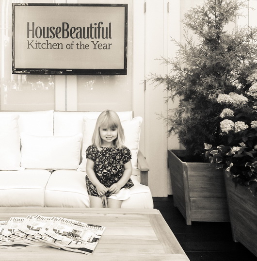
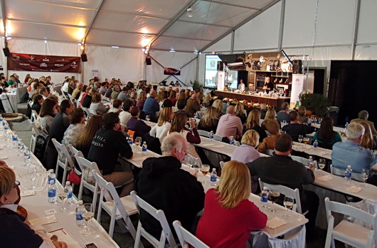
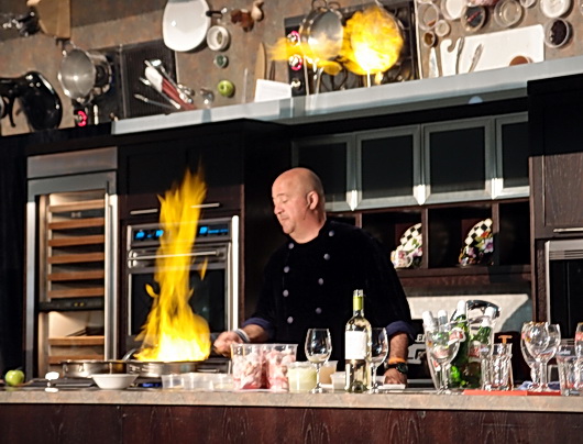
I always look forward to attending House Beautiful's Kitchen of The Year and this year was no exception - it's one of the highlights of the summer for sure! House Beautiful is such a great American brand (I love great American brands partially because they have trudged through so many crazy times-in this case since 1896) with lots of good old American sheer determination. Impressive, to say the least. But, I'm digressing a bit. Point is, I have great respect for House Beautiful and what it has stood for and this is a good excuse to express that!

This piece will be a critique, as it has to be, in one sense, since I've been a certified kitchen designer and owner of a kitchen design studio for many years. For this reason, my perspective on this kitchen must include both pros and (constructive) cons.

Mick DeGiulio designed the KOTY (Kitchen of The Year) for House Beautiful. I've known of Mick's work for many years. Mick is a talented kitchen designer and produces exquisite kitchens. At the press event last Monday, in opening remarks, Newell Turner, EIC of House Beautiful, said: "Mick DeGiulio is one of the best kitchen designers in the country, if not THE best kitchen designer." That last part immediately threw me for a loop and I can't not address it!

Being very involved in the kitchen industry in various ways, which includes having built/financed a website for kitchen designers that was in place for 8 years with thousands of members, serving as a judge of kitchen design contests, and having a wide circle of kitchen designer friends and colleagues, I know that there are MANY kitchen designers throughout the U.S. who do truly amazing (amazing) work. 

So, as a long time ally/friend/passionate advocate of the kitchen design profession and supporter of kitchen designers (the good, dedicated ones) the first part of Newell's statement has a good deal of merit to it, but the second part does not. It's very important to add in a little real world perspective. 

Following is my critique of this year's House Beautiful Kitchen of The Year, and here we go!

THE KITCHEN - THE GOOD

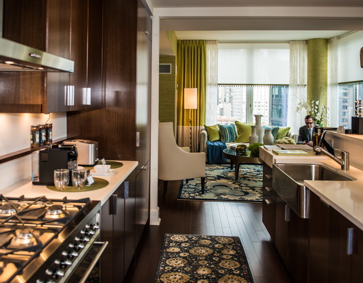
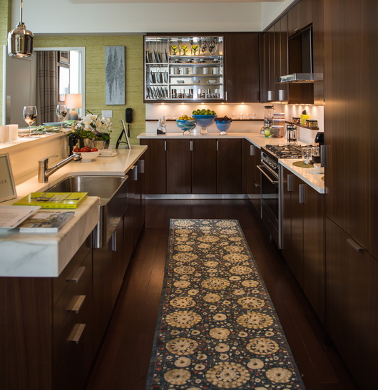
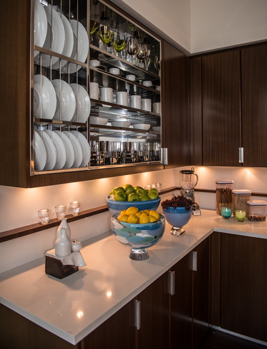
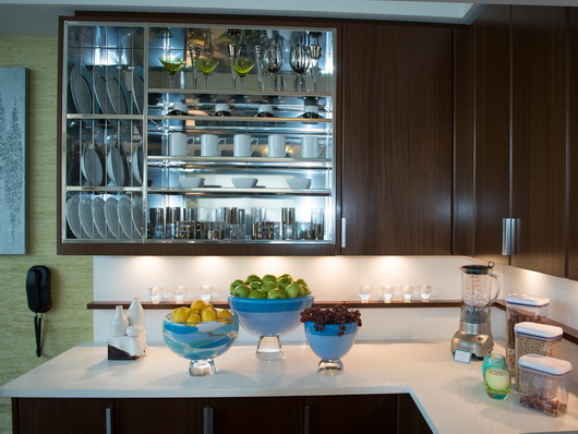
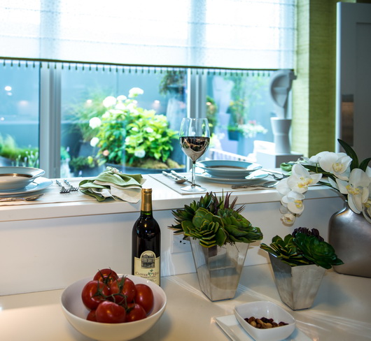
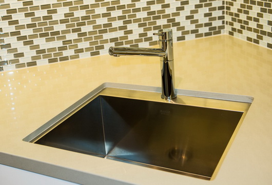
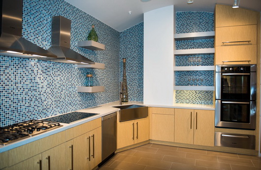
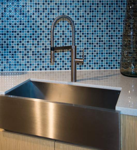
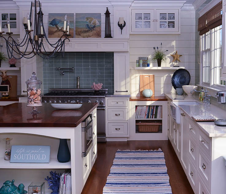
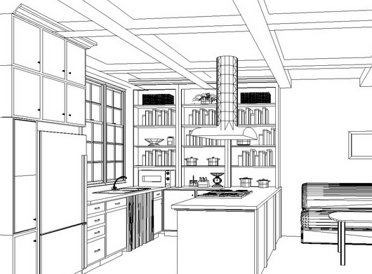
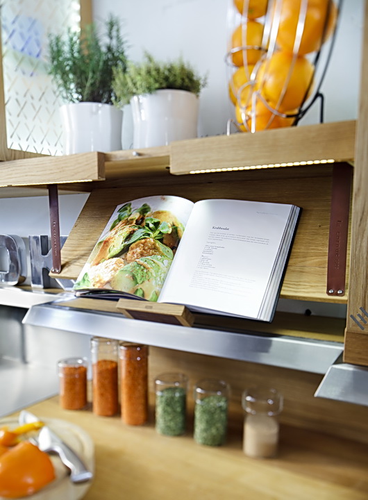
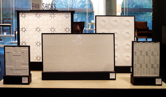
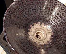
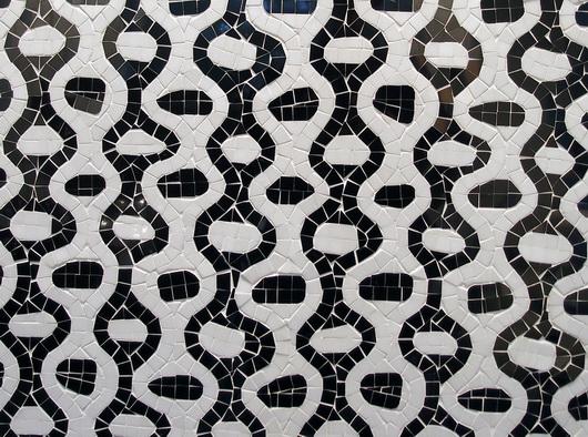
Open Shelf/Breakfast Section: The kitchen as a whole is lush, it's gorgeous, it's luxurious, it's stunning. The separate area, "la mattina", Italian for "morning" is a wonderful, highly useful area in which to prepare a light meal. The storage behind the backsplash of fabulous Ann Sacks tile with a beautiful visual depth to it, is a fantastic idea. I have seen a strong upswing in the use of sliding doors for upper, lower and tall storage this past year.

This backsplash storage area solves several problems - it reduces countertop clutter, provides a home for small appliances, is a virtually (visually) seamless design element and is great to use, ergonomically. It's very smart, too, to continue the tile on the inside of the storage area. The open shelves add charm, but not just charm, CHARM. Charm meets elegance meets usefulness in this open shelf feature.  Nice hardware and nice configuration of base cabinetry in this section. The non white toekick creates a floating effect for the cabinetry.

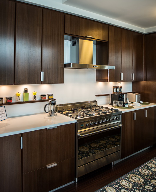
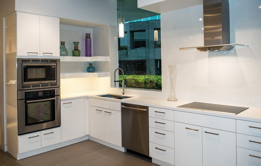
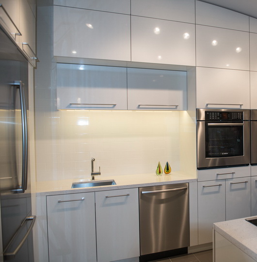
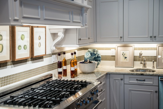
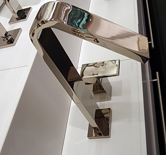
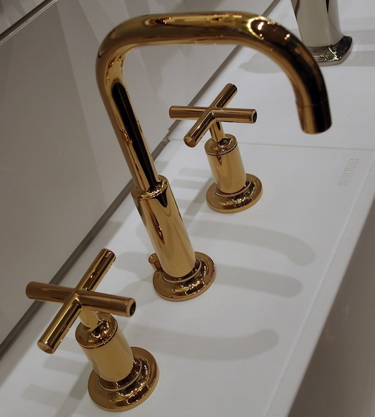
Chrome and Stainless Accents: What comes to mind next are the polished chrome accents throughout the kitchen. They are smart and stunning. This accent adds significantly to the luxe feeling all around the space. You do not normally see a wood hood trimmed in polished chrome, a simple but very creative touch. The polished chrome trim surrounding the tall appliances-oven and refrigerator, was also highly creative. The trim makes the refrigerator look high end and the ovens are just beautiful. Appliances by Whirlpool. I'm crazy about the brushed stainless steel handles on the white refrigerator. It could have been a no brainer to do a stainless refrigerator but white works well in this context.

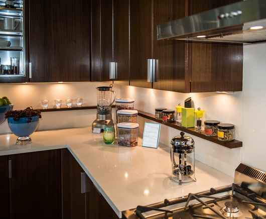
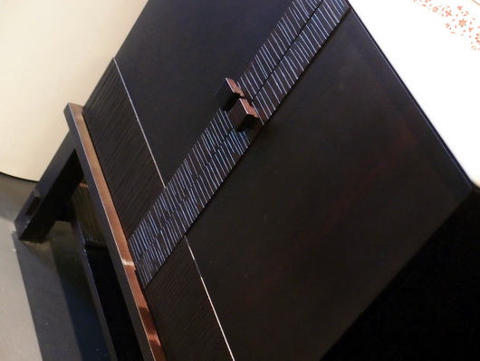
Cabinetry and more: The tall pot/pan storage with glass doors, dark gray lower cabinets, brushed stainless interior and polished chrome and glass exterior, left of the cooktop section is (that word again) stunning. This grouping of tall, dark, cabinetry visually balances the larger white cooking section to its right. Speaking again of the emerging popularity of moving panels, this design element, used behind the cooktop for additional storage is a useful and smart feature, especially with the dark gray contrast behind the panels which showcases colorful spice jars.

The cabinetry, (all) by KraftMaid, on the island is beautiful, and I love the hardware. The variety of countertop edges adds interest and is another opportunity to create unique design elements throughout the kitchen. I love the feeling of the zen-like sitting area - overall, it's all about comfort. 

High/Low Budget: This kitchen illustrates how one can selectively choose fabulous (and fabulously expensive) products as well as very affordable products. It's a strong trend in kitchen design today, and a smart one. 


Get the flash player here: http://www.adobe.com/flashplayer


THE KITCHEN - CONSTRUCTIVE CRITICISM

Misc. Observation: This has nothing to do with Mick's design or any sponsor - it's just an observation but as a kitchen designer, I can't resist. The wonderful non-cooking lite meal prep area with the open shelf feature begs for a refrigerator drawer due to the main refrigerator being situated so far away. Whirlpool does not offer an under counter beverage appliance, so that was not possible to include. I might also have wanted to include a single drawer dishwasher or a small, 18" dishwasher, given there is a good sized sink in this section.

The Island: Looking at the island when standing at the sink, the white dishwasher really stands out to me as being a very different white than the white cabinetry. In a kitchen with so many luxury touches and finishes, it does not work, especially, too, with a very modern handle next to traditional hardware.

First, there could have been a piece of the stainless toekick attached or otherwise adhered to the bottom white access panel for a continuous toekick on the island. Second, since this dishwasher does not take a front wood panel, a stainless steel dishwasher should have been used here. Here's why: the white (different colored) dishwasher is viewed as a large, unadorned white slab, visually incongruent with the busy surrounding cabinetry. The white monolithic refrigerator fares much better being separated via chrome trim from the different white of the nearby cabinetry. While the opposite argument is that a stainless dishwasher is visually "choppy", it's an upgraded and improved look, more conducive to inclusion in a KOTY design.

I do not love the island in general. I think it is too big (and I do love big islands) and/or it could have had a more interesting cabinet configuration, and general shape. I would have positioned the wood countertop section about an inch or so above the Caesarstone white countertop and made the Grothouse wood countertop thicker. I think a little dimensional interest with this separate countertop section would be a natural choice. I did not care for both countertops being on the same plane.

I would not have added the open shelf lower cabinet facing the table - it just does not seem to contribute design value to the kitchen as a whole or to the island, specifically. I would have included a 3rd white/dark gray cabinet there or designed something entirely different. As is, I would have added more space in the island seating area and taken away space from the cabinets at left - the seating area seems slightly out of proportion to the cabinets at left.

Actually, when viewing the island and cooking wall from the seating or dining area, the short/wide cabinets behind the island do not balance well with the tall, narrow dark gray pot storage cabinets just beyond. Balance and proportion of these lines seem off to my eye. One does not always have to follow the rules, of course, but I'm not seeing a visual connection here.

Cooking Wall: At the cooking area, I'm not sure if the hood, notched up into the soffit area above was intentional or a mistake. The execution looks a little awkward to my eye. It does look very out of proportion to the 30" cooktop in this particular context (although an enormous hood over a smaller cooktop is done in highly styled kitchens but is a design element used most often over larger cooktops/ranges.) I would have added a second 30" cooktop, two cooktops side by side, relating better to the hood, and configured the lower cabinetry differently. With an island this large and with multiple work areas in this large kitchen, this section needs more than one 30" cooktop!

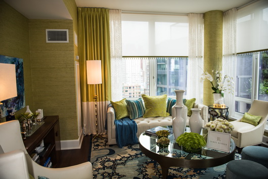
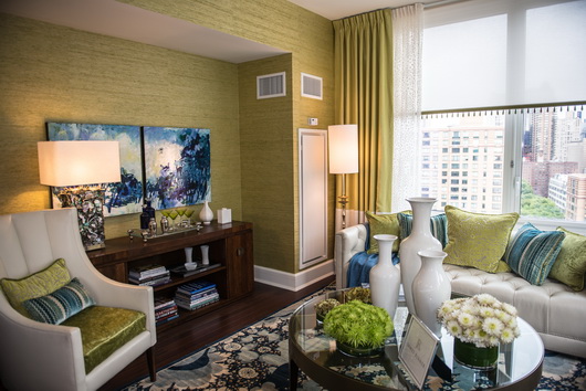
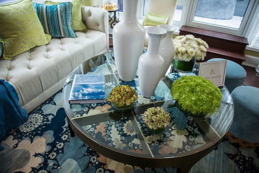
Living/Dining Areas: I like living flexibly, and I may have put casters on the upholstered chairs, loveseat, or both so that the furniture (by Kravet) can easily relate to the table or the island or both on a whim. There was ample room for a larger sofa, in part, to balance the very large island. 

I can't say that I am on board with the concept of a small dining table. With such a large kitchen (and a large island) presumably, the kitchen, being talked about as a living area, also requires either a larger dining area that is more proportionate to the island and other kitchen elements, or, a table that is capable of expansion. The living and dining areas looked unnecessarily small to my eye. 

I assume that the higher than normal coffee table can duplicate as a dining area. I did not sit and experience the upholstered chairs and table. I would like to have known who the TV serves, the dining or sofa area or both. I may have tried lining the right edge of the tv up with the left edge of the fire wood recessed enclosure. 

Refrigerator/Oven Wall: My eye very quickly wanted the trim area immediately surrounding the refrigerator to be brushed stainless steel to coordinate with the brushed stainless cabinet above the ovens and on the ovens themselves. I think that would have been a perfect opportunity to further tie in height-wise, the refrigerator and oven sections. Overall, this wall is a little awkward and the vertical lines in the center cabinet are busy.

Lighting: I would have added lighting within both backsplash storage areas and in the pot/pan cabinet as well. If it was there, I missed it.

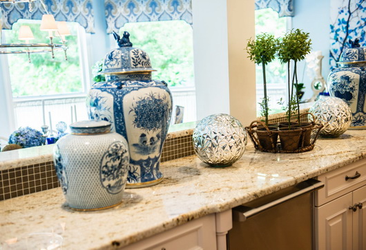
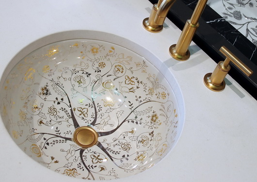
Overall: I would like to have seen more artwork. The lack of color was obviously part of the plan (except for Kohler's gorgeous sinks) but it did not leave me with a warm feeling as I experienced the space despite touches of linen and other textures, but with a cool, formal feeling overall. With this much time taken to critique the kitchen, there is no time to discuss the butler's pantry. I'll say this - awesome countertops and ceiling treatment! I mentioned that the various countertop edges were a creative touch and they are, but, and this is a quibble, I feel it was one "note" too many to do the thinly wrapped countertop at the cooking wall.

CONCLUSION

It is certainly unclear how much time is available for a designer to micro manage this (KOTY) project. I think it's important for a designer to do that (micro manage it) and I hope House Beautiful provides adequate time, and I also know, having designed and produced many projects this size, that it can take many months and super focus to get your head fully into the details to get it all right. Delegation to others vs. complete hands on control vs. a combination of these is also a factor in how a project comes together.

Some issues above are more significant to me than others. I leave it to you, the reader, to decide which issues are more or less important for you.

And, then there's this: everyone's a critic! Actually, I think I may be the only one! But, this critique and analysis has been done in the spirit of pointing out that there are many ways to experience a kitchen design as well as to offer my detailed professional interpretation and insight, hopefully, in a constructive and interesting (ok, I know it's a tome) way. It sort of took on a life of its own... I know one thing - it's an exciting event and it always stirs the senses!


French Kitchen Design - Paris Inspiration!

As the Tour de France (which I LOVE to watch every year, often multiple times a day) is heading toward the great finish in Paris this weekend, my thoughts this morning went to the incredibly inspiring colors, textures, materials that I encountered in the streets of Paris over a week long leisurely stay. I've been compelled to write about the Tour de France and kitchen design more than once!

I started looking at my many images of Paris. I began to look at which pieces within a given image could be used as design inspiration, to be translated into a kitchen plan. By looking beyond and around the objects in an image, you can bring a sort of abstract yet highly authentic design concept into a kitchen design. Open your eyes and your mind and the inspiration will come!

Inspiration for your kitchen design theme can come from travel, nature, your home town, a literary work, really, anything. It doesn't have to come solely from looking at images of other kitchens! By looking elsewhere for inspiration, in unexpected places, you can create a kitchen design that is highly personal. That, to me, is a very exciting way to plan the aesthetic layer of your kitchen!

I isolated 40 images that I felt had great ideas that could be translated easily into design concepts. Maybe I'll do a few of these posts. 

Below: Soft, calm, green-as-neutral accented with a small amount of black and oh-so-elegant soft and light silver...music to my eyes and what a color palette for a kitchen. Don't miss the gilt gold factor!

Below: Complementary colors on the color wheel, this warm blue and warm gold are perfect aesthetic companions. This hardware can translate into lighting fixtures, faucet, sink, hardware and other accents combined with blue cabinetry, countertop or flooring.

Below: Colorful artwork brings life into the kitchen as well as a feeling of culture, telling a story about the overall design of the kitchen. Anywhere you can find room for art in the kitchen, do it! I've been saying this since I started this blog in 2007 - art will stir the emotions in this very utilitarian space

Below: Industrial and authentically worn stainless steel meets elegantly worn wood flooring in the always wonderful European herringbone pattern. The cool/warm thing - always an interesting contrast

Below: That elegant look of paneling, but look closer and you'll see that it is applied molding - SO easy to do, even diy. Anywhere you can logically frame something will transform the kitchen into....Paris, and don't forget to frame the ceiling and possibly paint sections within the paneling

Below: These 3 images below feature a similar color palette, lovely for a kitchen. Again, the cool/warm factor is a natural, and the images show various combinations of lights and dark, each color, allowing the opposite color to pop. To my eye, these are all sophisticated yet easy to use colors in the kitchen. The very dark door MAY be a bit of a trendy color in kitchen cabinets today, but I would like it as a countertop color. Love the blue/gray street!

Below images pertains to the above grouping but is intentionally blurred to remove bad things that happen on the street!

Below: Happy color as seen in the very traditional door design yet viewed as a friendly, casual design element. A color such as this blue can be used in an accent piece in the kitchen which is usually a better choice due to an otherwise potentially overwhelmingly heavy balance. Or, do small pops of color like the great purple color seen in the flowered vine, an analogous color to the navy door and window, but in a light color for added interest and contrast. Love the navy, beige and gray colors in that image.

Look for inspiration anywhere! Start a folder in a project management system of some sort that might be labeled color, inspiration, ideas, design concepts, what I love, whatever makes sense. Or, of course, in pinterest! It's a fabulous way to discover your own, very personal, definition of creativity. It's fun too!


Kips Bay 2012 Kitchen

Last month I went to see the Kips Bay Decorators Showhouse in New York City where there were not one, but two great kitchens, and I will feature the second kitchen soon. The walnut species kitchen and living area of this first kitchen were designed by James Rixner, interior designer from New York city. Here are my thoughts on this kitchen!

Below: The view from kitchen to living area. Someone tell me, what's not to like...not much! The kitchen is (relatively) simple, clean, modern, colorful and interesting. What I love is the use of white, seen in the kitchen and in the furnishings. To my eye, the white shade, especially in the kitchen, serves to reflect light, always a good thing in a small space and it also sort of tones down the feeling of formality.

In addition, the seamless white countertop and backsplash allows the space to flow, undisturbed by visual clutter (I'll get to that later.) Less is more is a mantra I always have in my head and having the strong interest of the rug as a patterned visual anchor...on the floor, in this case, is an excellent place to use pattern. I don't think I would have used the stainless steel apron sink, but that is another quibble where there is no right or wrong to attach to it. The rug's connection (and the floor as well) to the living area also makes perfect sense visually. Love.

Below: Here is where I will talk about visual clutter and in one respect, it is a quibble. For those who have not lived in a New York City apartment (among my immediate family, 3 of us lived in NYC apartments for a collective total of 22 years) a few things out of place have a way of pretty much drastically affecting the feeling of spaciousness. To my eye, there are too many accessories in this kitchen. It's also a simple fix to edit the accessories here.

Below: Another quibble - the shelf is so shallow, I would have continued it across range or included a stainless steel shelf of the same dimension. You never know what a coop board will or will not allow, however.

Below: A visually strong feature, I think I would have designed this stunning stainless steel wall cabinet to be in the center of this particular countertop section with an equal amount of wood on each side, probably ending in line with the base cabinet corner, but it's an interesting and creative feature, very much so.

Below: I do really like the shallow wood shelf that runs along the backsplash. It is useful and a great feature, as it is elegant, simple, and just different. I like it.

Below: Another view of the shelf. It works for me. The stainless material throughout in various places ties in beautifully, accentuating a cool/warm feature, allowing each element to "pop."

Below: Yes, it's a narrow ledge for casual dining, but, hey, it's New York City and you are lucky to have that alternative dining spot!

Below: To me, this is near perfect. I'm good with all of it. Too many accessories? Maybe, and that's a quibble.

Below: Warm, stunning, lively, absolutely beautiful.

Below: Love the glass table and love the white. I also love the varying shades of blue and the analogous color scheme.

This kitchen is a beautiful execution with a feeling of elegance, the right amount of comfort and great function. What do you think?


House Beautiful KOTY - And Kids!


By Kelly Serra Donovan

The much anticipated House Beautiful Kitchen of the Year descended upon Rockefeller Center in NYC yesterday.  I was lucky enough to attend, my inaugural visit, and see the fantastic display in person this year.  And, consequently, so were my two daughters, Chloe 3 years and Annabelle 6 months, courtesy of a last minute emergency that kept my childcare unable to come through.

From the moment we clumsily pushed the extra wide double stroller through the gates, we were greeted with nothing short of hospitality and grace, despite the marketing staff most definitely not anticipating a bottle-sucking, mommy-tugging crowd amongst the early visitors to their "press only" debut. Susan sent an email the day before asking if it was ok, with a reply "it's fine with us!" They handled the underage party crashers with aplomb, even doling out an extra name tag so Chloe could rub shoulders with Newell and Mick.
 
This hospitality was tangibly conveyed (over and over again by House Beautiful staff-and others) once we were inside the event, as we instantly felt as if we were in a cherished friend's warm and cozy home.  The wooden ceiling beams and heringbone floors offered a nice contrast to the clean lines, stark shades (save for a rich pop of blue from the beloved Kohler Jonathan Adler Atlantis Sink), and ever so slight industrial edge of the Kitchen of the Year.
 
I'll save the full nuts-and-bolts review for our resident expert, Susan, to follow shortly, but I would certainly be remiss to not shout from the proverbial rooftops my appreciation for the welcome reception and accommodation we received from the House Beautiful staff.
 
Susan here: Oh, and Newell...Kelly and I enjoyed chatting with you and when Chloe, uh, whipped the nametag lanyard against your shins, you didn't skip a beat! :)

As Kelly, Chloe, Annabelle and I departed the event en route to the Bryant Park carousel and lunch, Chloe proudly wore her nametag through the streets of New York (and insisted I keep mine on as well...which I did.) I think House Beautiful just scored a positive brand connection with one member of Gen Z.


Bosch Appliances + BLANCO = The Perfect Couple

The two German brands, Bosch and Blanco, came together logically and flawlessly throughout the new Bosch, Thermador, and Gaggenau showroom in Irvine, California. I was invited, along with others from the media, to attend the opening of this big, beautiful, state of the art showroom.

The reception area of the Bosch/Thermador/Gaggenau showroom

Two words: German Engineering. It's immediately apparent how perfectly these two brands go together aesthetically, not to mention their beautiful, precise, engineering-the fit and finish is superb. 

But, here's the thing -  although the Bosch portion of the showroom is quite minimalist and of wholly modern design, if you look past that, it's easy to see that both of these brands' products (most of them) can transition easily and logically to a range of kitchen design themes, from modern to traditional and beyond. Some faucets are more clearly suited to one style or another. Others play very well in a variety of styles.

For the price point, you get a WHOLE lot of style, substance, precision and performance. More pretty pictures from this fabulous showroom...

Did you know that Bosch has a slide in range? Allows the design of a clean backsplash

Note the sink cutout - it's interesting to see the sink section. I like that look.

Blanco and Bosch are the happy couple!

Sleek, simply designed built-in appliances

Note the small stainless sink detail surrounding the countertop cutout - cool

My absolute FAVE combination of Blanco faucet finishes and I love Blanco's silgranite sink-talk about performance!

Perfection in the details

Try this combination - Truffle (color) and a traditional Blanco faucet

I always love a cooktop and under cabinet oven combination-so elegant

Note the lower divider in the sink and the rich, beautiful, faucet finish

A combination kitchen/display area for multiple appliances

Yes, Blanco does a stainless apron sink + the beautiful, sculptural Culina faucet

Can you see the quality shine through in these pictures?


Crossville Tile - Kitchen Luxe

Crossville Tile invited me to view their tile in the kitchen of a fabulous designer showhouse, designed by Ulrich Kitchens, deep in the (highly desirable, trust me) woods in New Jersey. The show home, "Hidden Acres Estate" is part of the Traditional Home 2012 National Showhouse Tour. 

I don't normally associate Crossville tile with being a luxury tile brand, so it was with a good dose of curiosity that I attended this small but prestigious event.

While I love quality and I love beautiful things, I am always open to good design whatever the cost. Good design does not need to be expensive. Creativity does not need to come with a large price tag. Good design comes by way of making smart design choices regardless of cost (in this case, being open to lower cost products) and being a snob about seeking "the best" in every product or material is not always best for the design.

Sometimes more is less and usually, less is more. So, I'm a designer who has adopted an openness to a high/low price strategy in my design projects and particularly in my home long before the concept made an impact in design publications online and in print. I don't look down at it, I applaud it. Geez, this turned out to be a policy piece! Now for the pretty pictures! Comments below...

Below: I do like the strong continuity of the horizontal lines, but I think I would have brought the upper line up and around, then down, inside the hood section while leaving the lower horizontal line as is. The inside could be left as is or designed with another motif of some sort, tile or a decorative object(s) hung in that spot. 

Below: I do love the white grout used in the mosaic tile. This appears as a classic look and it's a smart design choice to use this middle shade of gold/brown which looks great with the granite and cabinetry. Charming!

Below: A closer look at how a well priced, simple, tile complements exquisite and formal accessories. High/low done well.

Below: A good look at this different pairing of mosaic and subway tile which just may skirt a "trendy" look - time will tell

Below: Clearly, a formal yet modern look that works

Below: How gorgeous are these chairs??

Below: A lovely arrangement at a gracious entrance from the kitchen to a nearby room

It was a lovely day!


Bosch Appliances - Cooking Up A Storm!

I just returned from the fabulous new Bosch showroom in Irvine, California, a beautiful facility that includes state of the art appliances and beautiful kitchen vignettes which showcase the full line of Bosch appliances. 

There is a hallway describing and celebrating the Bosch commitment to precision engineering and sustainability, specific areas for training purposes including a theatre with chairs one can take a nap in easily, and the centerpiece...a huge (huge) kitchen outfitted with Bosch appliances including an amazing wall mounted herb garden. One can test appliances...and then clean up using the gorgeous BLANCO sinks and faucets, seen throughout the entire showroom.

The Bosch central testing kitchen

The kitchen images will follow in my next post with lots more good information on Bosch appliances, but I think you'll understand that my instinct in writing this first post follows with my wanting to show you the result of all of these precision and user friendlly appliances - the food!!! Let's go there first. Below are Carmen Natschke and Andie Day hard at work!

Carmen Natschke from Decorating Diva and Andie Day from Lifestyle blog

Together, we all (members of the media invited for the very first look at the Bosch showroom, flown in from around the country) cooked lunch together and wow, many types of food were cooked fast and with precision. It was an incredibly delicious lunch - after all, that's what the appliances are all about: performance, ease of use, and we need the fun factor in there too that operating great appliances bring to the party!

An upward look at a floating, nearly floor to ceiling herb garden

And, below, this is how a good number of us cook....

Oh yes, I do love to go to these brand retreats - I come back wiser (most important) and definitely well fed! More soon on Bosch appliances and BLANCO sinks and faucets AND gorgeous kitchen shots from this beautiful showroom.

For My Martha Stewart Radio Listeners - Summer Kitchen Style!

What a pleasure to be on Martha Stewart again, today, my third appearance. It's always fun and inspiring to chat with Brian Kelsey on Morning Living - he has so MANY quick, out-of-the-box great ideas on making your home your personal sanctuary - not to mention creative laboratory!

Here are tips on summer style for the kitchen that I prepared, which, at this writing before the show, I'm not sure we will get to cover. Please add yours too!

  • change out kitchen/breakfast room rugs for a casual/summery look
  • de-clutter countertops (de-clutter at the change of each season to keep ahead of clutter accumulation & dust)
  • gather vases nearby in different sizes for freshly cut garden flowers for a fragrant (and colorful) and ever changing treat from nature
  • speaking of vases-flea market finds of mason jars add a country vibe – better yet, paint the inside of these fun jars bold or pastel colors
  • start an indoor kitchen herb garden - you'll have success via increased daylight over spring/summer months
  • change/remove window treatments for a lighter look
  • replace the breakfast room seat cushions for a fresh look
  • have outdoor cooking equipment accessible & rethink/rearrange indoor summer storage needs - i.e. salad bowls, stainless skewers, grill racks 
  • keep outdoor dishes/glasses/flatware accessible
  • keep outdoor platters accessible
  • fill a glass bowl with limes and lemons for a citrus and color vibe
  • fill a mason jar with fresh herbs in a little waer – savory scent will last nearly a week
  • keep kitchen stocked with easy nibbles – cheeses, nuts, olives & drinks for spontaneous alfresco dining
  • use your COLORFUL plastic dishes and glasses and for easy living
  • stylish melamine trays are great for multiple uses-colorful
  • add sheer breezy panels on windows
  • fresh hand towels in summer colors
  • fresh fragrant candles, hand soap, citrus potpourrin
  • natural fibers – baskets, fiber rugs, placemats for that earthy organic look
  • coastal themed decorative objects – on textiles, jars of shells, nautical prints/paintings
  • hunt on the beach for driftwood, sea glass, shells, rocks
  • bring outdoor terracotta pots - even the large ones, indoors for indoor garden style-a great look

See my pinterest board for Martha Stewart summer style listeners!

A bundle of fresh colored summer rugs


Gaggenau CX480 Full Surface Induction

Last week I attended an event in New York City to introduce the Gaggenau CX480 full surface induction cooktop to the US. I had seen this amazing cooktop at The Living Kitchen show in Cologne, Germany just over a year ago, and I would not be overstating it to say that it was the buzz of that show.

Here's what this amazing piece of cooking equipment does:

 It is full surface induction which makes the entire cooktop into one big cooking zone

  • It has TFT touch display - This means it has LCD touchscreen technology
  • Cookware is automatically recognized by shape, size, and position
  • Heat is produced only where it is needed
  • The booster function increases heat output by 50%
  • If cookware is moved, the cooktop detects the new position
  • Cooking settings can then be immediately transferred
  • It has intuitive operation

The ability to create a good (hot/fast) sear, in my cooking repertoire, is important - I sear meat or fish at least once a week. It is one of the easiest and most "professional" ways that any homeowner can cook just like a celeb chef. Nice sear...

Gaggenau introduced the CX480 at a pop up location that I cannot "not" show you. Gaggenau truly exemplifies fantastic design and product innovation at its best.

I have followed Gaggenau's product line since the mid 80s and have owned some of their products. They perform. They last. They are gorgeous!

Likewise, Gaggenau creates amazing (not an overstated word) displays in showrooms, shows and events. So, take a look at this fabulous pop up showroom which was only open for less than a week! 

I do love Gaggenau - there is "nothing not to like" as we say in New York, so New York was the perfect place to introduce this cooktop. 


Joss and Main - Scandinavian Rug Sale

We are excited to announce the sale of our rugs fir the first time on Joss and Main - a special sale for the next 72 hours. The rugs that we have curated in our web shop, Scandinavian Made, have these characteristics in common:

They are hand woven by an individual artisan

All the rugs, whether vintage or new, are made in Sweden

They are made with wooden looms

They are exclusively runners of different lengths and widths

They reflect the unique artistic aesthetic of the weaver and are an original piece of art

They have been carefully curated by me (Susan) and Kelly Donovan with our eyes focused on interesting design, use of color, pattern, texture and overall beauty

It's not always easy to visualize just how a rug may look in your home, especially when you are looking quickly through an assortment of patterns and colors. Here are some tips to find the right Swedish rug from our collection:

1. In an otherwise neutral space, a shot of color, any color, will bring the space to life! 

2. Think of these Swedish rugs as works of art and add them to the room's interior design in more formal rooms such as living areas, library, office, bedrooms, not just the hallway and kitchen.

3. Vintage rugs with a modern pattern look particularly great in combination with modern furnishings.

4. Change is good - change your rug with the seasons or rotate them in other rooms of the home.

We are so passionate about each of our rugs and are so happy to share this very, very old authentic artform with our readers. 

A word about rugs in the kitchen - these rugs are a no brainer in the kitchen! For color, comfort, gorgeous texture, visual warmth, workhorse strength and elegant design in the kitchen and/or breakfast room, they are not only perfect, they can absolutely elevate the design via their handmade quality. Love these rugs!


Kitchen Design Consulting

I've just opened up my schedule to do kitchen design consulting for homeowners who need smart solutions for tough kitchen design issues.

I have offered this service before and have helped many homeowners work through important design, construction, product issues and more.

To avoid mistakes, design errors or just to get that second opinion to help work through a project that you may only do once or twice in your life, is certainly invaluable. Taking this step makes good sense in the "big picture" of your project.

I've purposely reduced my workload in a few significant ways, so I have a little room in my schedule to add this service back into my design practice and help you work things out. Being able to get back to meeting and helping so many nice people came right to mind!

Go to this page on kitchen design consulting and you will see what to do next.

I look forward to hearing about your project. Smart solutions, flexible problem-solving based on solid real life experience and a heartfelt interest in doing what I can do to help will point the way forward.

-Susan


InSinkErator Instant Tap for New Moms

We've posted before about our affinity for the InSinkErator instant tap.  However, the lovely folks at InSinkErator were kind enough to send over another unit and this devotion was taken to new heights immediately upon installation.  To clarify, this is the home of a second time new mom, with a newborn and a toddler under the same roof.  For the uninitiated, that means the need for lots and lots of purified water, both cold and hot, meals on the table before you can say "I don't want pasta tonight, mom!" and most importantly, an abundance of coffee.  STAT.

The InSinkErator Indulge Instant Water Dispenser has found so many uses in my home and I'd wholeheartedly consider it a must for new parents. Here are just a few uses I've found for it just two months in: 
  • First and foremost, instant hot water for my beloved Starbucks Via instant coffee any and every time of day. 
  • Easy and fast filtered water to drink endlessly and quench my nursing-induced thirst, and a quick filler-up of sippy cups.
  • Readily available boiling water to warm milk for bottles. 
  • Instant boiling water for frequent bowls of oatmeal, and pots of aforementioned pasta water. 
  • Fast opening of stuck-on caps of jelly jars and maple syrup jugs. 
  • Instant, and much needed, cup of tea at the end of the night, without the risk of waking the baby with that pesky tea kettle whistle.
The design of the Instant Tap spout is sleek and minimalist and is a beautiful complement to my mostly-country kitchen.  It's highly unobtrusive and a pleasure to use, with smoothly functioning hot/cold levers and a high-neck spout.  
Just a few of the features, from their site: 
  • Hot and Cool — Dispenses near-boiling 200°F and cool drinking water
  • Graceful high-arching spout swivels for greater convenience and stylish integrated levers provide a dramatic look
  • The hot lever automatically shuts off while the Stay-On™ cool lever remains on for easy use
  • Durable all brass dispenser construction
  • 5-Year We Come To You™ In-Home Service Warranty
  • NSF® listed
  • For use with InSinkErator's Stainless Steel Tank and F-201 Filtration System (tank not included)
  • Available in 11 designer finishes: white, biscuit, chrome, polished nickel, satin nickel, French gold, mocha bronze, black, matte black, brushed chrome, and oil rubbed bronze
All in all the InSinkErator has been a fabulous addition to our newly chaotic home, and those few minutes I can save, while previously waiting for a pot to boil or constantly refilling my old Brita, are treasured these days.  

Tile Trends - A Brief History Of The Kitchen Backsplash

Everywhere I look, I see small rectangular tile used on backsplashes and upper walls in the kitchen. It's getting a little bit worrisome to me. It's worrisome because, having been a kitchen designer since the very late 80s, I have perspective. Perspective helps my clients, and I hope it helps you too.

It started (my professional association with tile) with 4x4 ceramic glazed tiles and pretty fruit and vegetable or flower designs, often seen with corner motifs, sort of that Country Floors look. Definitely gorgeous. Funny, I'm seeing it more and more frequently again and it's still every bit as beautiful. Like Terracotta flooring, it was very popular, then went away. Now it is returning, at least on the periphery, to fashion again.

Then came 4x4 tumbled marble tile or matte, earthy, or light shades with fancy border tile. Tile was laid on the diagonal as a lower border against the countertop with a thin border tile above with square 4x4s above that (not on the diagonal), all over the backsplash on the diagonal with a square border at the countertop level, or maybe just in the cooktop area.

Later, probably near the start of the 2000s or a bit later, we began seeing 3x5 subway tile, which we still see, although not nearly as often as a few years back in terms of the "big trend". A very popular trend, subway tile harkened back to a more simple time, a period look, yet removed from the olde world look of tumbled marble 4x4s from the 90s and early 2000s. Mosaic tile in every possible color and material came on the scene first as an accent, then later on the entire backsplash.

Glass tile, too, in aqua/blue shades, emerged as a very popular option some years back for the modern kitchen, especially in the mosaic form but was/is also seen in subway sizes large and small.

In the past couple of years, maybe a year earlier, we saw a strong trend toward very small rectangular, then longer rectangular subway tile shapes. These shapes are seen in matte finishes, iridescent and/or glass finishes and in typical glazed ceramics, and of course, marble, travertine, etc. It seems that at this moment, everyone LOVES small rectangular tile.

It occurs to me that I should not show full kitchen shots of my clients' kitchens to emphasize my point because in a sense, it certainly could be construed that I am encouraging the point of view that their kitchens be perceived as dated or "in waiting" to become dated. Classic or dated? That seems to be the question. 

The inspiration of this post came to me as Kelly and I recently looked at images of my work going back close to 20 years. When I viewed simple kitchen cabinetry, meaning UNadorned with the old world moldings, etc. of the 90s/early 2000s, which usually included a 4x4 tumbled marble backsplash, the kitchen looks dated due to the tile backsplash, and the cabinetry does not. That holds true for other tile motifs that I mentioned above, seen in other kitchens. Granite countertops? Yes, they played a role to a certain point, but this post is about tile.

These tile images except for the top image, are from Home Depot....probably a pretty good barometer for what is on trend for the unwashed masses. I shop at Home Depot too on a (rare) occasion, or in a pinch but hopefully with a designer's eye, so put me in that category too.

We all think that a tile type or shape is classic and in one sense, it is. When you see that particular shape nearly everywhere you look, especially in a very high end kitchen in a crazy expensive home, it may be amazingly beautiful, both dream worthy and swoon worthy, but it's still a trend. Possibly, it is a huge trend and from my perspective, probably a tile trend that will last 10 years or less (kitchen trends last much longer than fashion, but alas, they then trend downward fast.) Therefore, your kitchen will look dated to most of the world at large as a new shape and material has made its debut to the masses, washed and unwashed.

What is the answer then to deal with trend cycles? Next post, I will share my thoughts on how to think through the backsplash tile issue. I will talk about what is classic, what is trendy, if you should or shouldn't care about all this because "I love my kitchen anyway", and we will figure it out. I have several solutions for you to deal with this issue.

I already knew my responses to much of my work in terms of what is dated and what isn't, but when Kelly sat with me and said, as only a family member or very close friend would say: "that's dated, this is dated, that's dated too, you can't add that/submit that/show that" it told me what a young, design savvy woman thinks and sees right away, NOT being fully immersed in the kitchen world as I am-she is more general interior design focused. She knew immediately from her perspective what "felt" dated as I knew from my different perspective. I thought that was interesting, which was the inspiration for this post. Talk soon....


Introducing Scandinavian Made - Unique Ceramics & Hand Woven Rugs

As you’ve no doubt noticed, we’ve recently added the newest member to our family of brands under the Susan Serra Associates umbrella, Scandinavian Made.  You’ve heard us talk at length about Scandinavian design and style, as it’s the foundation of not only our heritage but our professional aesthetic as well.   Leveraging this passion, we are now bringing the best of authentic Scandinavian handcraft to your home with a carefully curated selection of one-of-a-kind vintage & newly woven rugs, and handcrafted ceramics direct from a select group of Scandinavian artisans.  Each of these artisans has never before presented their work in the US, and we are honored and privileged to be the vehicle for their debut on American soil.   

Take a peek inside our shop and you’ll be greeted with intricately textured and colored hand woven rugs, rich with a long history of an ancient Scandinavian craft and storied beginnings. 

Vintage Vara Rug

You’ll find delicate, ethereal ceramic work from Bornholm Artisan, Charlotte Thorup, and bold statement pieces Simon Koefoed. 

Charlotte Thorup's Wall Hanging Tile with Folds

Simon Koefoed's Puzzle Bowl

Dynamic texture, complex relief, and luscious glazes characterize Hanne’s work, while the dynamic duo behind Clib Klap allow rich hues to take center stage in their simple but strong colorblock vases.    

Hanne Bertelsen Oval Vase Bowl

Clib Klap Colorblock Vases

Ninna’s work shines in its simplicity, featuring a singular, stunning graphic line to define and elevate her useful, everyday pieces. 

Ninna Gotzche's Lidded Jar

Karin celebrates the organic and rustic nature of clay, using mottled, rich glazes and highlighting the subtle perfect imperfections of the medium.  

Karin Blach Nielsen's Stoneware Red Vase

We’ve thoroughly enjoyed poring over the works of each and every artisan and choosing the items that we felt best represented our aesthetic and that of our customers.  We hope you enjoy these pieces as much as we do.  They are intended to live with you through generations, bringing with them beauty and joy, and weaving artistry and hand craft through the fabric of your home.  

Electrolux Kitchen Appliances - Design Competition

I had the privilege of being among an impressive group of design professionals serving as one of the judges for the Electrolux kitchen design competition, "The Kitchen Reimagined." We met in New York City in November at the offices of Interior Design magazine. 

Coming from different design disciplines, with me being the only kitchen design specialist, we dissected each submission from the global group of competition finalists.

Passionate dialogue, active listening in appreciation of all views of the design professionals in attendance and some open second guessing in search of verifying our instincts brought us closer to a smaller group of finalists. Time spent seeking to understand the points of view of all entrants eventually put the focus on the top 5 winners in the order we deemed appropriate. 

The entries to The Kitchen Reimagined competition were, in a word, inspirational - and that is the spirit with which we approached our work. Spirit, imagination and inspiration were celebrated attributes in seeking the best kitchen design submissions. Interior Design Editor in Chief, Cindy Allen, was our fearless leader for the day. 

For me, participation in this competition as a judge was a privilege and an honor - and a whole lot of fun too. I think you will find much excitement in these kitchen designs which seamlessly surround Electrolux appliances. Very cool stuf.


La Cornue - Kitchen Le Magnifique

I had the pleasure some weeks back of dining in New York City with Xavier Dupuy, president of La Cornue, my colleague and friend, Leslie Clagett from the blog KBCulture and a couple of PR people, always useful to fill in the blanks for a brand. I very much enjoyed this type of intimate setting.

I love up close and personal meetings with manufacturers. It helps me "get" the culture of the company which always trickles down to my understanding the quality of the product and the type of people who actually manufacture the product. 

Mr. Dupuy spent a fair amount of time talking about his factory workers - the length of time many of his employees have worked for La Cornue along with past generations of these employees' families who also worked at the factory. Lots of interesting stories. In times like these, it's nice to hear that. Mr. Dupuy takes immense pride in those who manufacture his products. This was not a short conversation!

La Cornue is a luxury brand of ranges and rotisseries that are made in France. Now, La Cornue is expanding their line of luxury appliances by adding a collection of custom made cabinetry (complete with the familiar metal banding if desired) called Culinary Architecture Memoire and a collection of handcrafted sinks. 

I've studied French kitchen design over the years. It's different. Here's why: the design emphasis is close to equal in regard to aesthetics and function. Function to the French (and to most other cultures other than, um, us in the US) does not mean that every single space gets filled for storage ... just because the space is there to fill. 

The negative space of the room is strongly considered an aesthetically important piece to the design of the kitchen, equal or nearly equal to functional pieces. What does that mean? It means an "unfitted kitchen" or a collection of islands or sections of cabinetry is preferred as opposed to continuous "runs" of cabinetry such as L-shaped, U-shaped kitchens, etc. Minimum wall cabinetry is also a part of La Cornue's kitchen design philosophy to achieve areas where the eye can rest.

Of course, the cooking area is considered the most important piece of the design ... after all, we know how seriously the French take their cooking!

A lovely evening, interesting insight into a brand and its philosophy, gorgeous products.

Kohler

And here is the last, and I hope you'll agree, the best post of the series on my trip to Kohler's headquarters at Kohler, Wisconsin. The trip was a visual feast! It was also an actual feast throughout the weekend since my trip was centered around the Kohler Food and Wine Experience - a weekend event (among many all year 'round) that I highly recommend which takes place in October of each year. 

The piece de resistance of Kohler Village, to me, is the Kohler Design Center. A three level building of beautiful products and room vignettes in beautiful settings surrounded by fabulous materials, products, accessories and design elements, I want to share some of this gorgeousness with you. Without further ado...here we go (all images have been enthusiastically taken by me)!

Please see MORE images on my pinterest board, "Kohler's Design Center", and follow me!

I was so excited and wanted to take as many shots as I could that I did not stop to take note of each and every fixture, fitting or designer's name. If you have questions, please ask and I'll get the information to you!

Below, a stunning interplay of warm and cool tones in a graphic, strong, yet elegant setting

Below, this is a part of a larger master bath which is designed via a universal design philosophy

Below, modern, sophisticated, whimsical...creative

Below, an interesting combination of patterns and proportions that works beautifully

Below, I'm not sure what else to say besides: ahhhhhhhhh. I'm relaxed.

Below, I feel like a superstar being in this space, perhaps somewhere in Paris?

Below, a closer look at beautiful warm design elements set against the purity of white

Below, I feel like I'm living in a loft in Soho - very cool design elements...always love the cool/warm mix

Below, a stunning environment that feels like it's in a penthouse - a warm modern design

Below, seen in the image above from a different angle. I'm on board!

Below, simply stunning, elegant, perhaps Will and Kate's powder room?

Below, I'm awed and excited - I think I'd like to hang out in here!

Of course I knew that Kohler is all about design and function but visiting Kohler's headquarters was a reminder as well as a series of new visual lessons about their quest for beauty, innovation, always a celebration of tradition and a commitment to a strong and clear look to the future. Sounds like copy text, doesn't it? Can you question Kohler's intense interest in design in the most open way, celebrating all design styles? I can't. Just look at the previous posts just below this one. Kohler is a giant in the kitchen and bath industry...for very good reason. I'm also very proud to call Kohler a great American brand. 

From this....

to this, introduced in 2010, the NUMI!


I hope you've enjoyed these posts. Don't forget to see more fabulous images on my Kohler's Design Center board on pinterest! Kitchen images are on that board too!!

Kohler Design Center - Kitchen & Bath Plumbing Products, Furniture, Tile

The best part of my trip to Kohler's headquarters in Kohler, Wisconsin a couple of months back at the invitation of Kohler, was to visit the Kohler Design Center (how could I have said that without four "Kohler's" in the sentence??) A beautiful brick building in which all of Kohlers brands are showcased, it is a place that will take a design aficianado hours and hours to go through. There is something for everyone.

First, there were selections from Kohler's furniture brands such as Baker and McGuire...

There was a display of stunning Ann Sacks tile and down the road, a tile store with the complete line

But here's what I REALLY came to see, below....and which did not disappoint. In fact, it made me see, as I learned about Kohler through the factory tour as well as discussions with Kohler designers, the incredible depth of design talent, commitment to design, and breadth of style that Kohler embraces and has embraced for decades. 

DID YOU KNOW that for nearly 40 years Kohler has offered an Arts/Industry Program in collaboration with the John Michael Kohler Arts Center in nearby Sheboygan to emerging artists? There have been nearly 400 artists in residence since the program's inception. These artists may work in the Kohler Co. pottery, iron and brass foundaries and enamel shop to hone their skills and explore their vision in functional and sculptural forms.

It was the Kohler family's desire some decades ago to celebrate art by introducing artists to freely reinterpret their products with a fresh vision and point of view. This philosophy has made Kohler's products known for beauty, creative design and originality. From many years in the kitchen and bath industry, I can tell you that Kohler's product introductions each year always excite the senses!

Ok then, time for the good stuff!! I do not have names on these pieces, but ask me what they are and I'll find out for you. These are random shots of product displays that I took from the first floor of the Design Center.

Ann Sacks tile below-looks like fabric!

And there's MORE....

There is so much to show you from this trip to Kohler's Design Center that I cannot leave out what rivals anything you have seen so far, and that is a peek at the fabulous kitchen and bath vignettes situated on the second floor of the Kohler Design Center. Coming soon. Can't leave them out!

As you can see, this is truly a destination. Who knew? More soon


Kohler Food and Wine Experience & The American Club Resort

My weekend at Kohler, Wisconsin, at Kohler's gracious invitation, included attendance at a tempting array of food and wine related events of my choice. As I said in my previous post, I would go back to the Kohler Food and Wine Experience in a heartbeat. The vibe was fun, stimulating, insightful...and quite tasty. From beginning to end, all of my experiences, every one, were sincerely, and very solidly, positive. But first, a bit about the historic American Club Resort. (this season's winter image below)

A Forbes Five-Star Resort Hotel and AAA Five Diamond Resort Hotel, the American Club Resort was founded by Walter J. Kohler, Sr., originally to provide rooms for immigrant workers who were employed at Kohler. A Tudor style building and interiors, the wood paneled hallways and public spaces lend an air of history and traditional design that is at once comfortable and inviting. The rooms? The word "divine" comes to mind. The bathrooms? Perfect...or certainly, near perfect if one wants to quibble (not me.) But, the weekend (an annual event in October) centered around food and wine, so here's a little taste (pun intended-image from the seminar on baking with apples-yum-I almost died when this was passed around!)

Celebrity chefs included Alexandra Guarnaschelli, Jacques Torres, Charlie Trotter, Andrew Zimmern, Jon Ashton and many more. Tastings, seminars, the Kohler Chefs' Challenge and signature events such as the Taste of the Vine are just the beginning of a very, very packed schedule of events. 

Parts of my itinerary included a cooking demo with Alex Guarnaschelli (she is truly hysterical), the Taste Of The Vine wine event, cooking demo with Andrew Zimmern, a seminar on baking with apples and a few other great cooking demos. To escape into the world of food and wine, for me, was sweet in more ways than one. The program was run so efficiently, with such attention to detail and with a whole lot of entertainment value, it was a super enjoyable experience.

Winter activities abound at Kohler Village. Check out Kohler Village's winter outdoor activities. Take a look at the Demonstration Kitchen events. Dog sled demonstration anyone? Check out these very cool winter events on the weekend of January 28-29. OR, just forget all those outdoor activities and studying how to slave in the kitchen and go to the Kohler Waters Spa - "dreamy" is an understatement. I went, I zoned out, I exfoliated.


Thermador Freedom Induction Cooktop

"Heat without boundaries", the holy grail for cooks, chefs, heater-uppers ... Thermador introduces a new cooktop with revolutionary natural mapping technology. What is that and what does it mean?

Imagine the following: you are sauteeing ingredients for Thanksgiving stuffing-let's say onions, celery, and sausage (I'll also add apple chuncks in mine) in a large pan. Another spot on the cooktop is needed to cook the fresh cranberry sauce. Don't forget the turkey stock - the stock pot needs a place too.

At different times of the cooking process each piece of cookware needs to be the center of attention, maybe moved to the front or off to the side to simmer or have more intense heat. The ability to move cookware around a cooktop at will is flexibility and freedom for any kind or type of cook. It's what you can do with the new Thermador Freedom Induction cooktop

 I saw this technology first hand at IMM Cologne, Germany, last year, and thought it would be quite awhile before we saw this technology in the US. This is big news, as this Thermador cooktop is the first cooktop with this innovative technology in the US, complete with 30 international patents.

Other features per Thermador's press release:

  • "A 6.5-inch, full-color touchscreen display that recognizes pot shape, size, and controls power setting and cooking time   
  • Surface area to accommodate a 21-inch x 13-inch pan with the largest cooking surface in the industry
  • A range of 4,600-watt maximum power output with Boost feature and 15-watt minimum power output

The Thermador Freedom Induction Cooktop surface is made from transparent ceramic glass, which allows for the integration of the color touchscreen. In additional to the touchscreen interface showing the position of all cookware on the cooking surface, the touchscreen also performs live updates as cookware is moved to a different position, giving the home cook an intuitive cooking experience." MSRP is $4949.

A game changer!